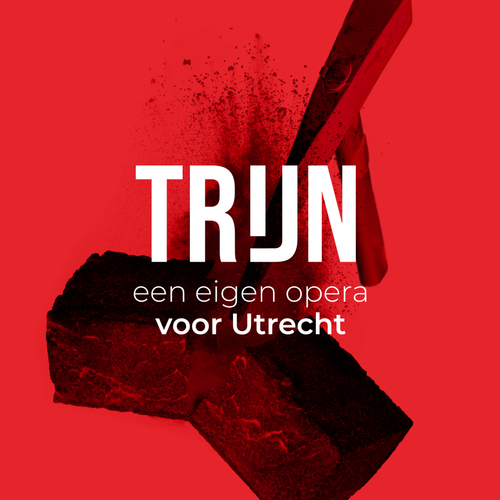
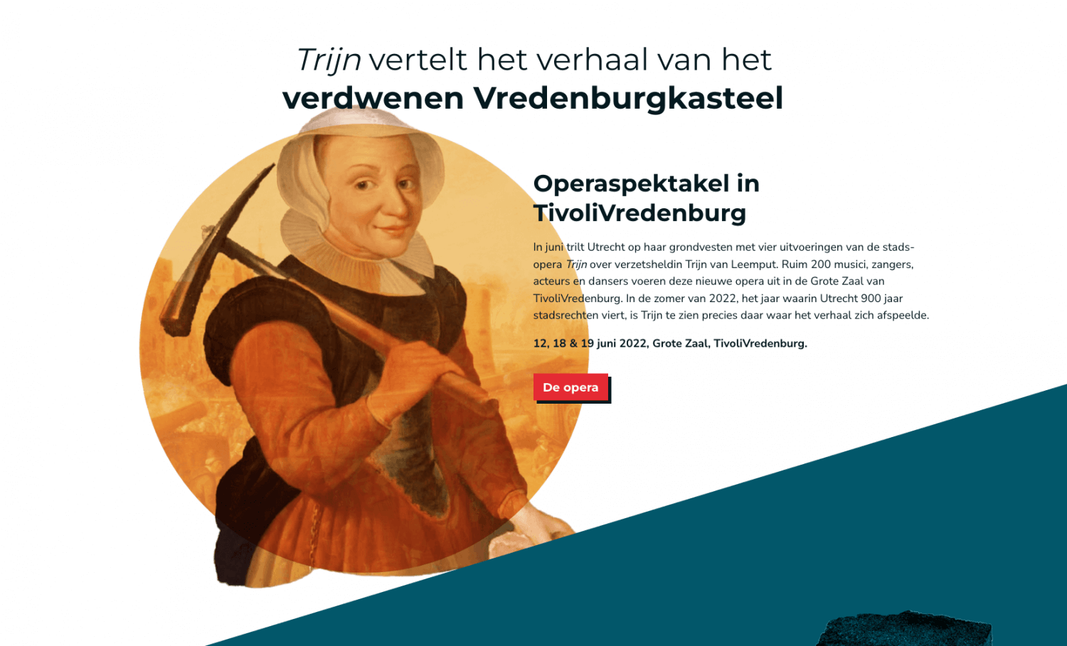
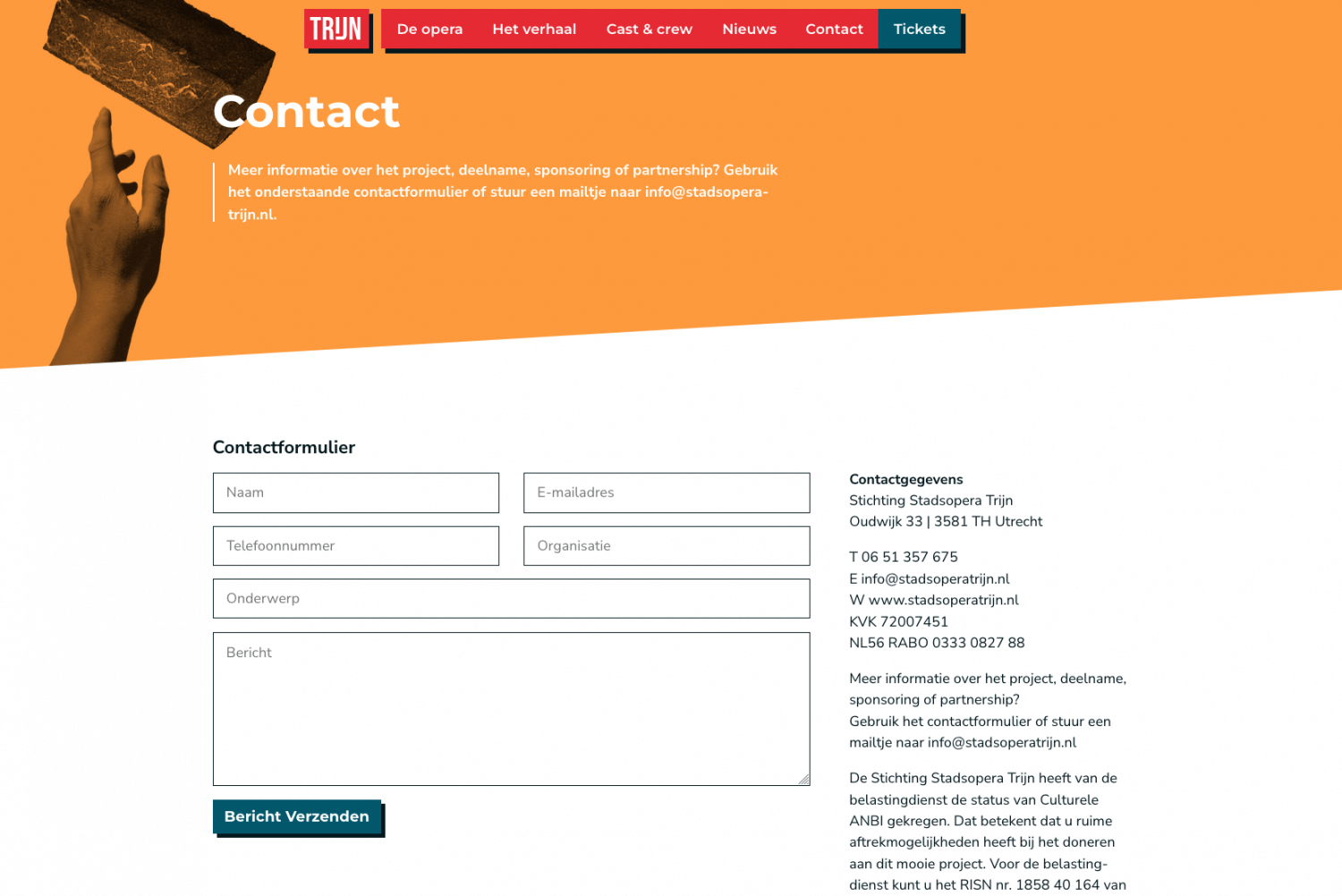
For “Stadsopera Trijn” I designed all visuals and developed their website. The result is a consistent visual language across digital and physical mediums. Stadsopera Trijn produces a newly written opera revolving around Trijn van Leemput, a figure from the 16th century living in Utrecht, who tore down the city’s castle and walls after the conflict with the Spanish ended.
The main colours are red and white – the same as Utrecht’s coat of arms, with the red amped up just a “little” but to give it a bit of a kick. Read on to know more about the process and see more elements that are part of the visuals. Be sure to check out the website!
Breaking down a castle, but make it modern
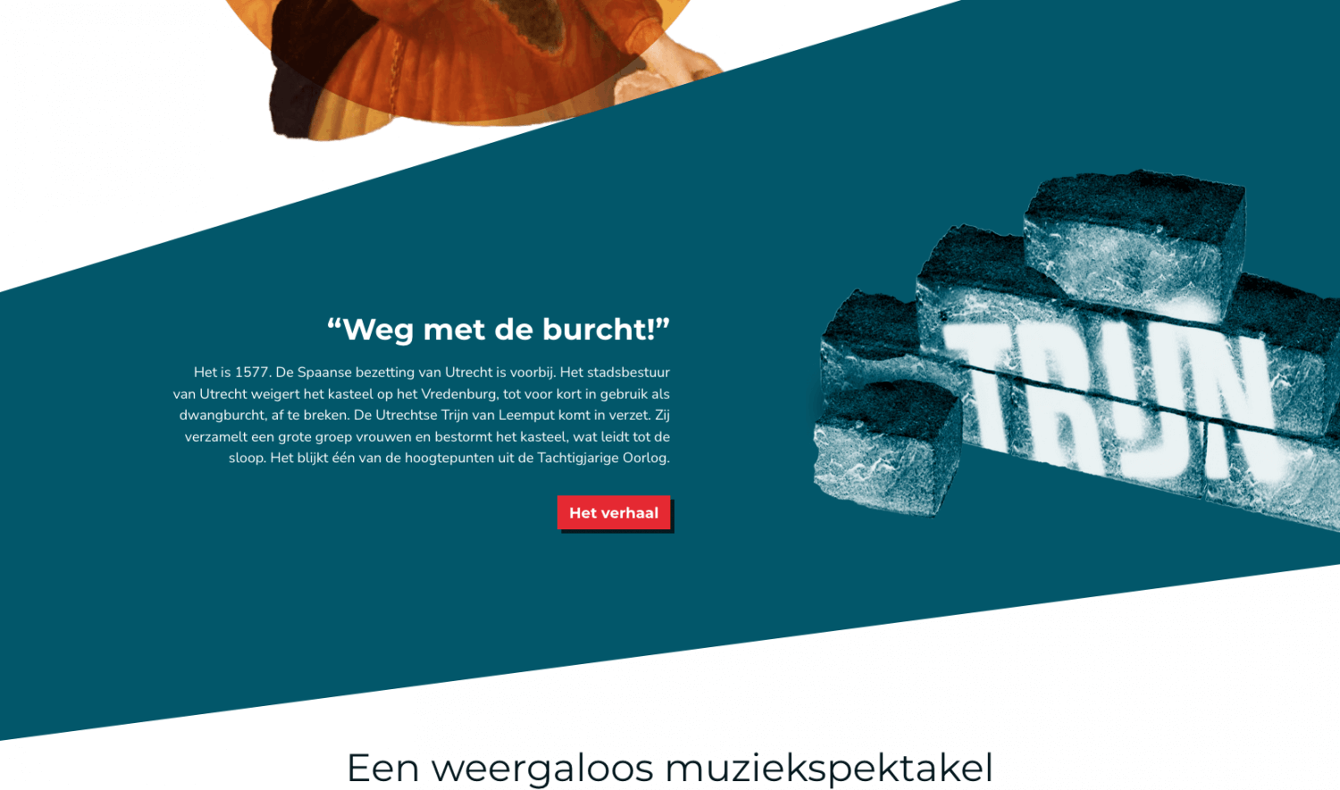
I always enjoy having to present a dated concept in a new and modern way. It’s an opportunity to bring back history in ways that would otherwise leave it undiscovered. To centre the visual concept around the hilariously simple image of a brick came to me in one of the meetings I had with the organizers of the opera – it just so happened that we sat down in a café with an exposed brick wall. Being a graphics designer is hard y’all!
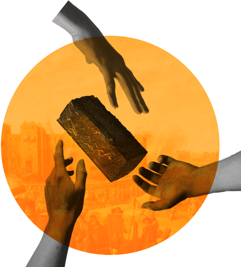
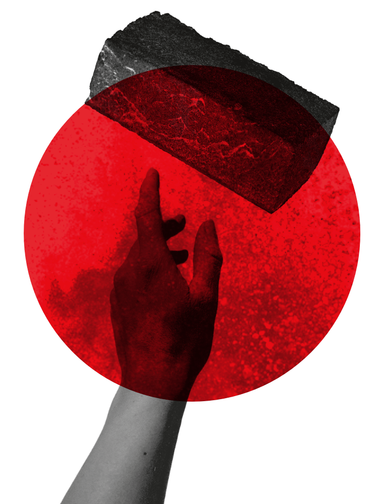
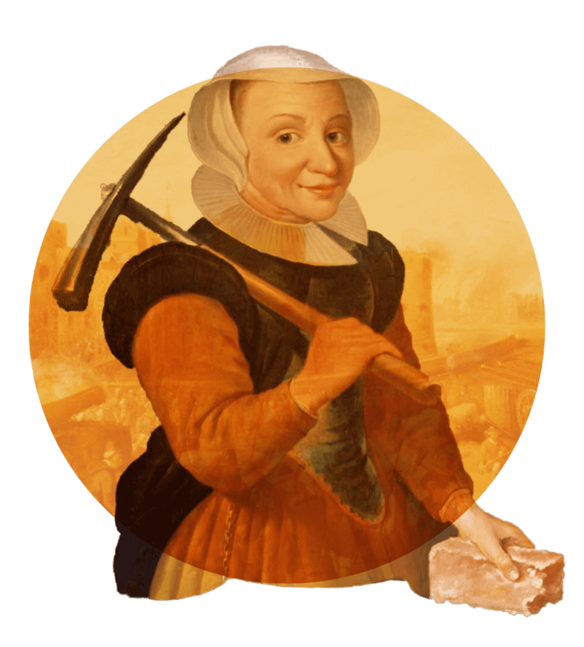
Trijn van Leemput actually tore down the castle and city walls with a pickaxe, I’m not kidding. It’s factually true. Together with a horde of women she stormed the castle with pickaxes in hand and they chopped the whole things down until there was nothing left. I boiled down this whole situation to a simple image: a pickaxe breaking a brick.
Wait, a castle?
Like any modern opera production a big selling point is how relevant the story is in today’s times. We’ve heard it time and time again. For Trijn that is no different. But what does in fact make it relevant is the story’s connection to the city of Utrecht and how many an Utrechter actually has no clue that the city used to have a formidable castle with city walls, let alone what happened to it and that there’s a horrifyingly modern shopping mall on its exact spot right now. Ah, the beauties of urban development.
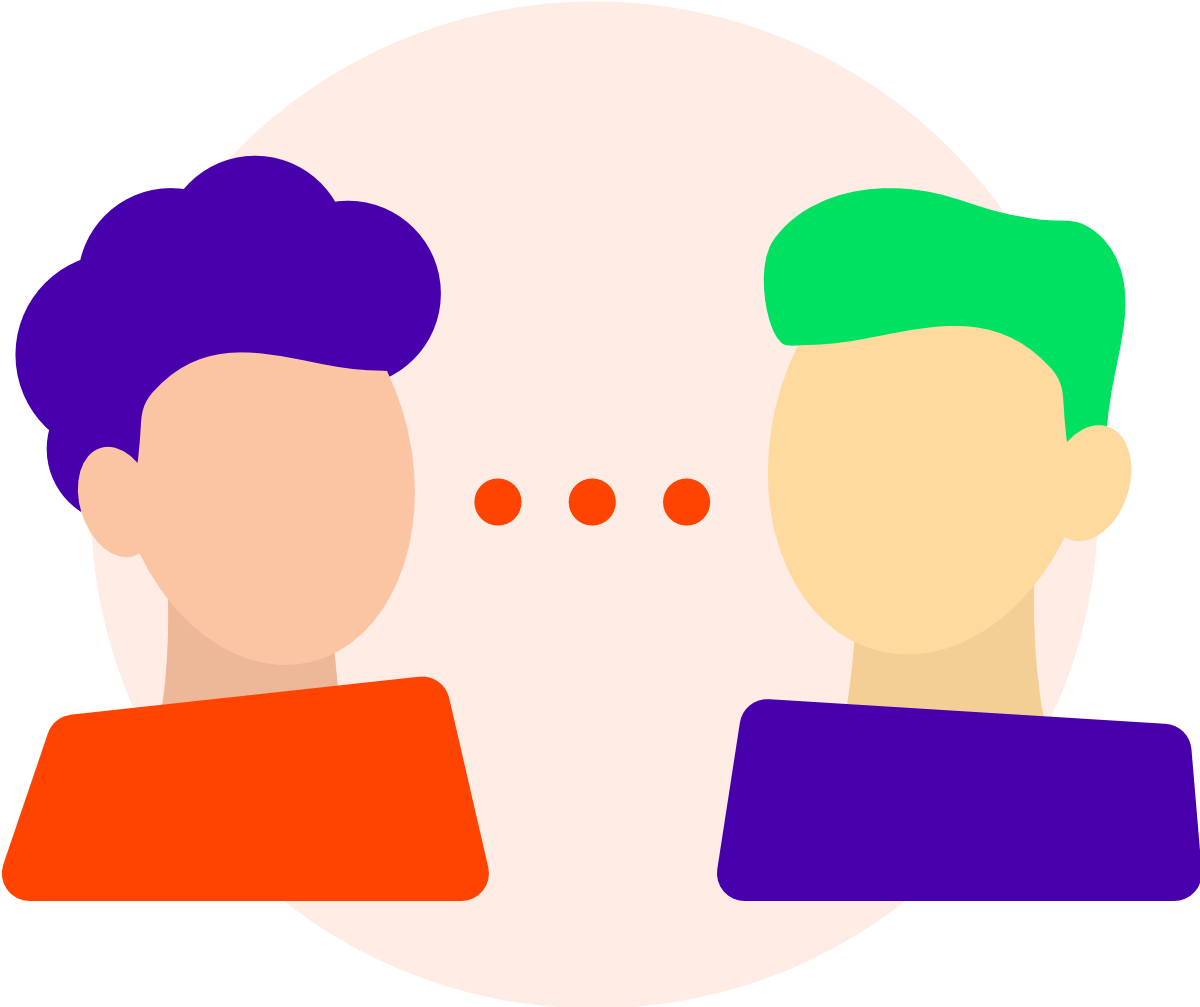
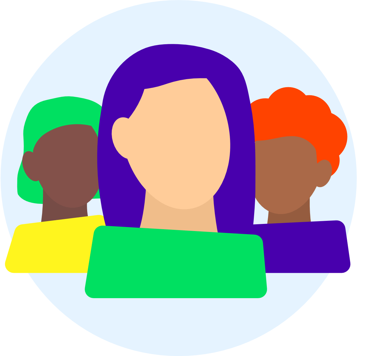
Queercare.nl
For COC Limburg I designed and developed their Queercare website concept: a place where LGBTQ+ people in Limburg can turn to to chat with other people in the community and find info about available LGBTQ+ care.
Vibrant and active colours are the heart of this design, telling the visitors that your colours are welcome here, just like the community is full of all different colours. Throughout the website abstract avatars are used, sometimes based on the people that run the chat.
Visit the website here and have a look around!
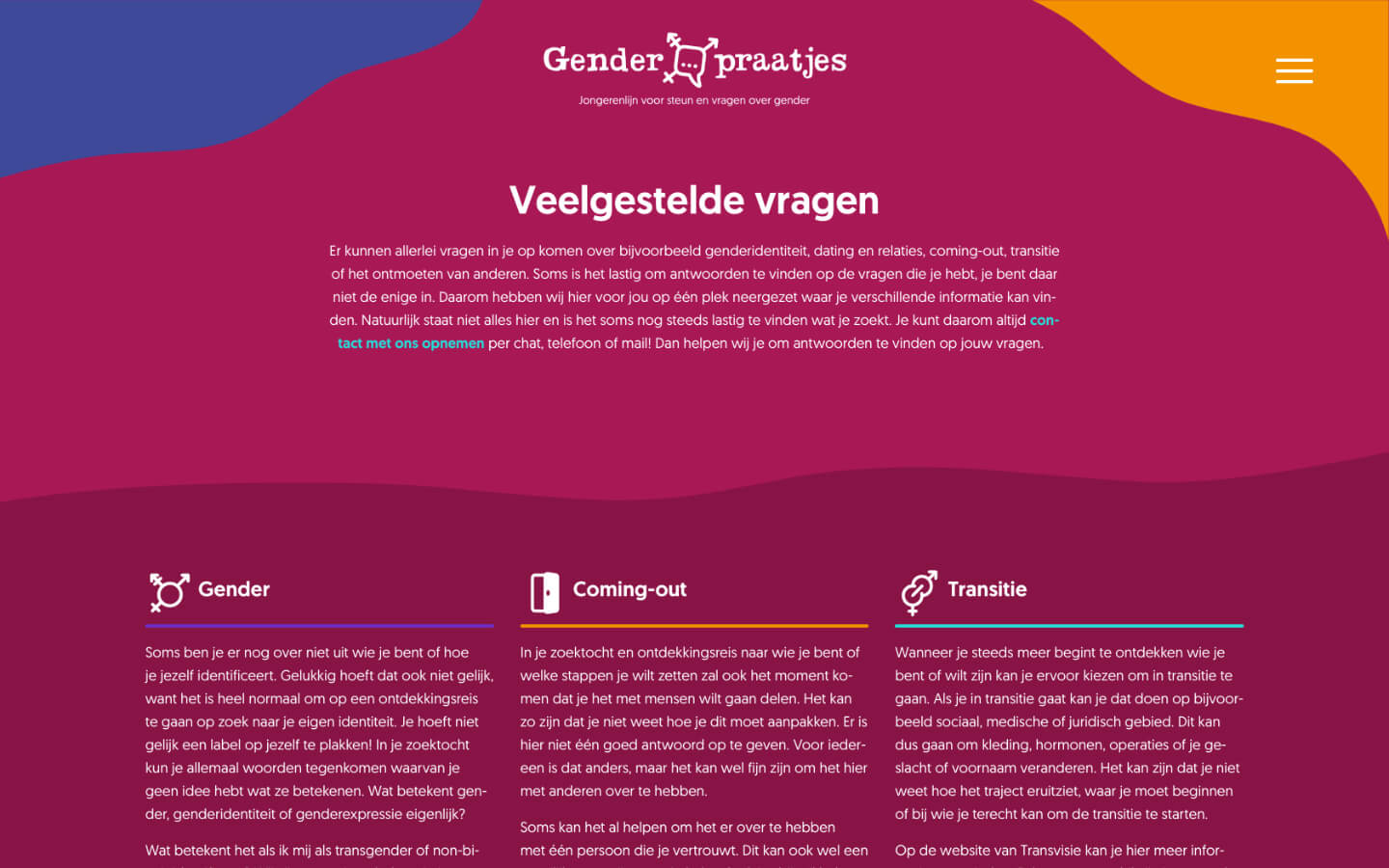
genderpraatjes.nl
Genderpraatjes.nl is a helpline for youth and young adults questioning their gender and seeking help, information or simply someone who listens.
I’m very honoured to be a part of this project as the designer and coder of the website. As a non-binary person myself I feel closely connected to the subject at hand. To be able to help others through building this website means the world to me.
Fluidity
The design relies on fluidity. Straight (pun intended) shapes are scarce. The fluid shapes, lines and colours are a warm, comforting bath while at same time visualising the fluidity of gender. Aimed at young people, the website takes on a fun and dynamic character.
Even more important than design, is of course its functionality. A visitor should be able to reach out for help on any page. Every page should be clear and helpful.
Collaboration
I take great joy in creating websites like these. It’s a collaboration, not a job. I don’t create websites like this to earn money – I do it because I love making websites and making them for the best of causes only further strengthens that joy. Are you looking to strengthen your online presence as a cause, artist or anything else? Let’s talk!

semhak.com
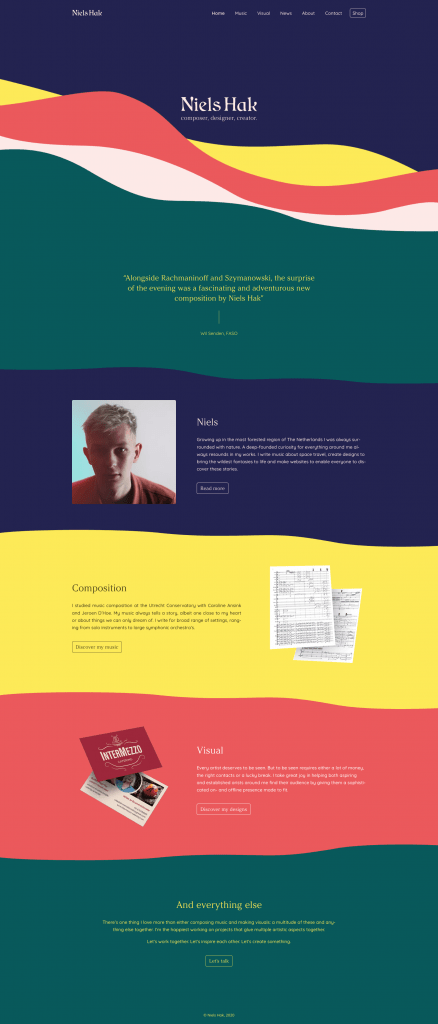
You guessed it, the website you’re browsing is a portfolio in and on itself. It’s the 2021 version of what I’m capable of as a webdesigner and artist.
The website started out with different colorschemes that somehow still relate to eachother. The colors are reminiscent of the seventies, yet wholly modern. Even though the website as a whole seems abundantly colorful, the full color scheme is only made up of 6 basic colors that all intertwine through the different schemes. Red, green, yellow, blue, brown and pink to be exact. Not a color more, unless you count black and white, but we don’t do that here now do we.
Of course the most important principle of a website is usability, and as with any website that’s been at the core of this design. Visual splendor and glitter has only been added in a non-destructive way – the website is still easily navigatable. And yet it feels like a living artwork.
Do as I like to do: go to homepage on a big screen, put your browser in full-screen mode, lean back and let de waves calm you down.
gagipetrovic.com

For composer and musician Gagi Petrovic I developed a minimalist yet recognizable website. By combining a modern font in text and a unique and classic font in titles the website is a combination of both modernity and tradition.
Check out the website here!
eleabekkers.com

For mezzo-soprano Elea Bekkers I created a website to bolster her online presence tailored to her not only as a singer but as an artist as a whole. It has space for biography, concerts, projects and more.
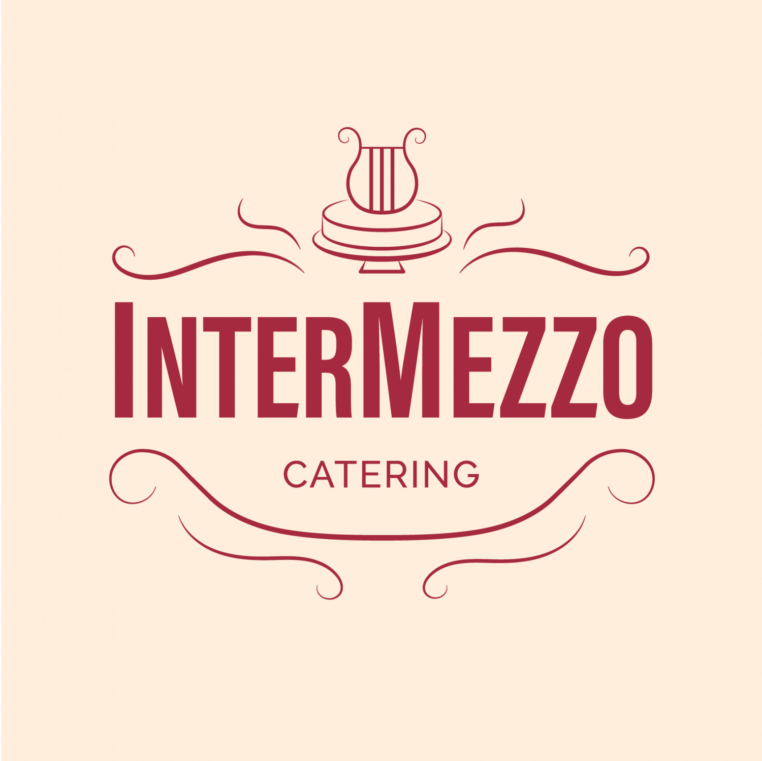
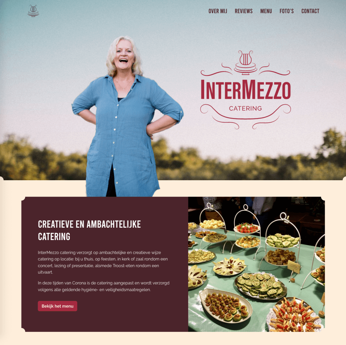
InterMezzo Catering
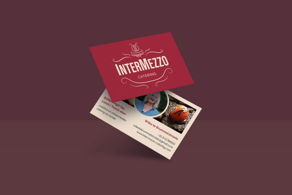
For InterMezzo Catering I had the honours of creating a logo, a visual language and website.
InterMezzo Catering is run by mezzo-soprano Wilke te Brummelstroete who, with her love for hospitality and hearty food, bakes and cooks the most wonderful food. She specialises in catering for cultural events, like classical concerts.
The visuals are reminiscent of vintage logo’s and etiquettes, poured into a warm yet modern colour-palette. Old-timey decorations are combined with flat, minimalistic surfaces and bold typography.
Check out the website here: intermezzo-cartering.com.

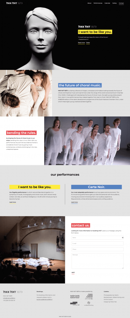
nkknxt1819.nl
For NKK NXT 18/19 I created a website portraying their performative portfolio, all the while sticking to the brand identity earlier created.
annatrombetta.com
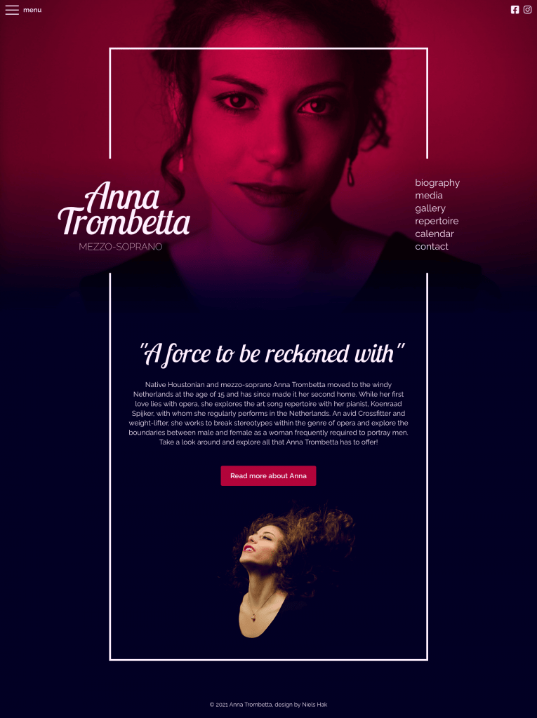
For mezzo-soprano Anna Trombetta I designed and created the website annatrombetta.com. As a classical singer it can be hard to stand out, so I made sure to give her website the shine it deserves. Subdued mysterieus colors complement a modern font and the landing page gives a taste of what Anna is about: a force to be reconed with.
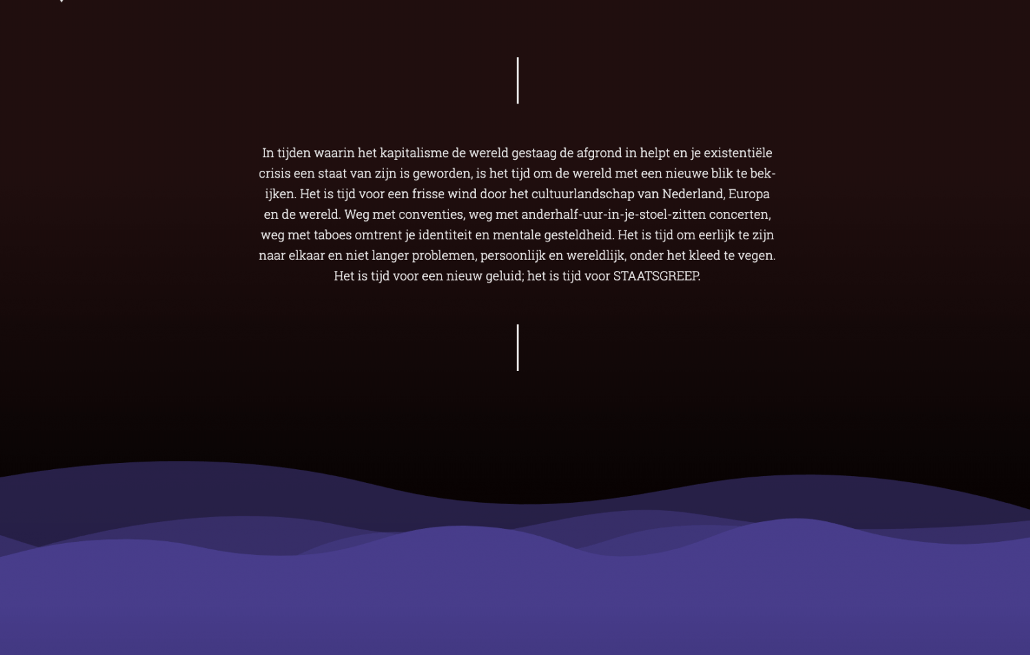
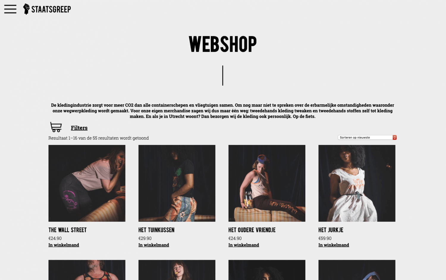
staatsgreep.art
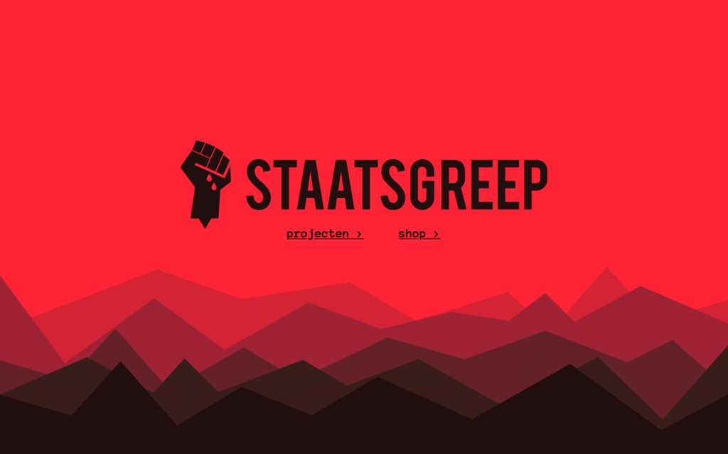
A brand identity and website for STAASGREEP.
In 2017 together with writer and mezzo-soprano Elea Bekkers I founded “Staatsgreep”, an art collective focussed on radical new art. With Staatsgreep Elea and I want to take modern art out of high-society theatres and operahouses and bring it to the audience instead. By adressing modern issues in a confronting yet accessible way they make art part of modern-day society again.