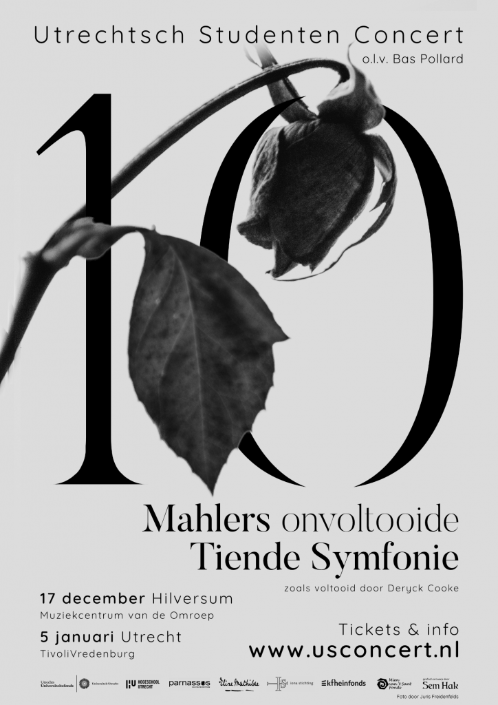
For the Utrechtsch Studenten Concert I designed the visuals for their winter 2021 program.
This winter the USConcert is playing the infamous Tenth Symphony by Gustav Mahler, as completed by Deryck Cooke. This symphony is rarely performed because of its obscurity; Mahler never finished the symphony himself, but a completion was attempted by multiple people, of which Deryck Cooke is one. A performance of the piece is a rare sight already, but a student orchestra performing the piece makes it even more special.
For the visuals I went with a contemplative and solemn feel while still being striking enough to leave an impression on passer-by’s. The symphony, which he wrote during a turbulent personal period, marked the end of Mahler’s life. The music is heavy and gripping, with musicologists suggesting the music at times refers to Mahler’s feelings towards his wife cheating.
The rose is a nod to the visuals I made in 2016 for the same orchestra, but then for Mahler’s Second Symphony, which featured mainly roses in full colour. The sharp ends on the numerals mimic thorns.
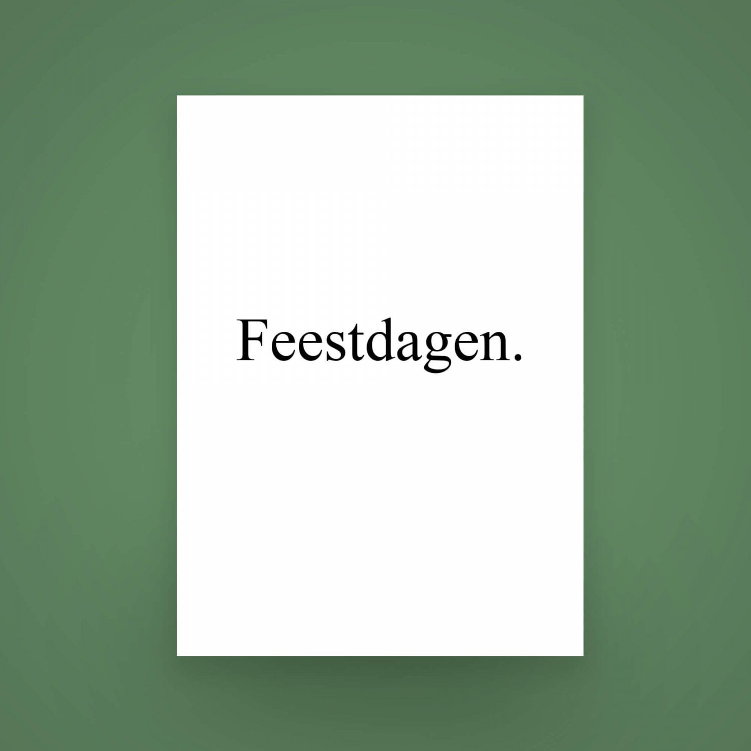
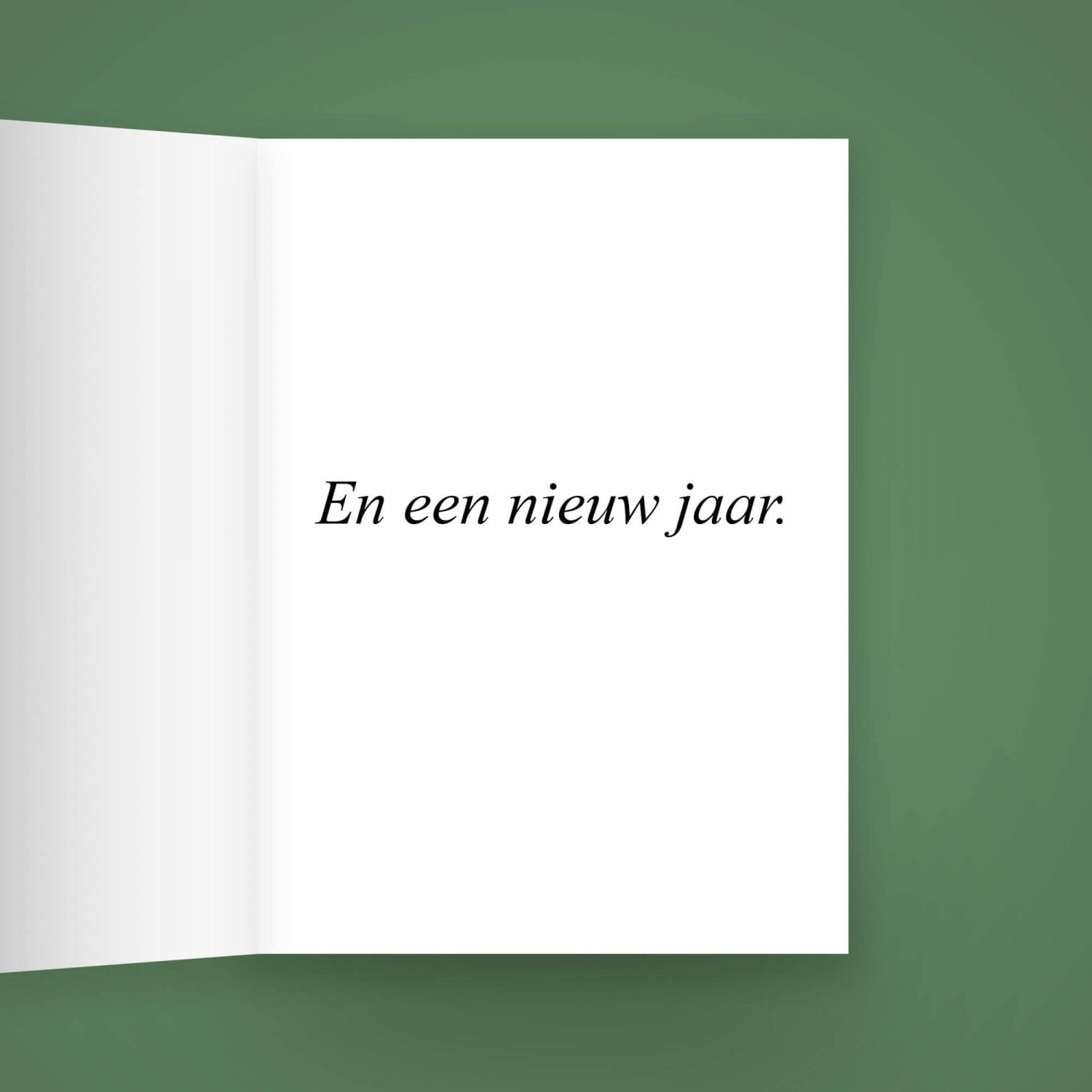
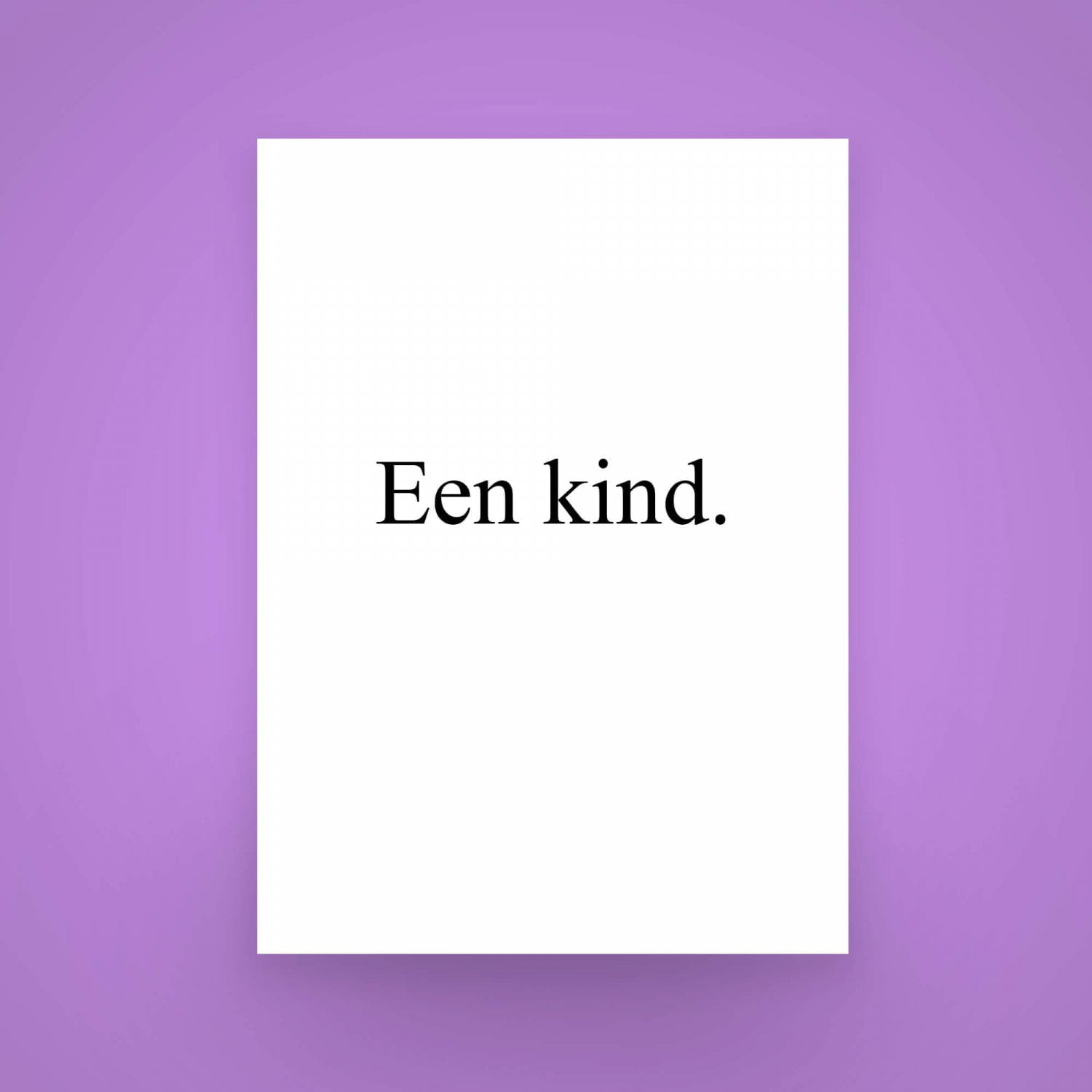
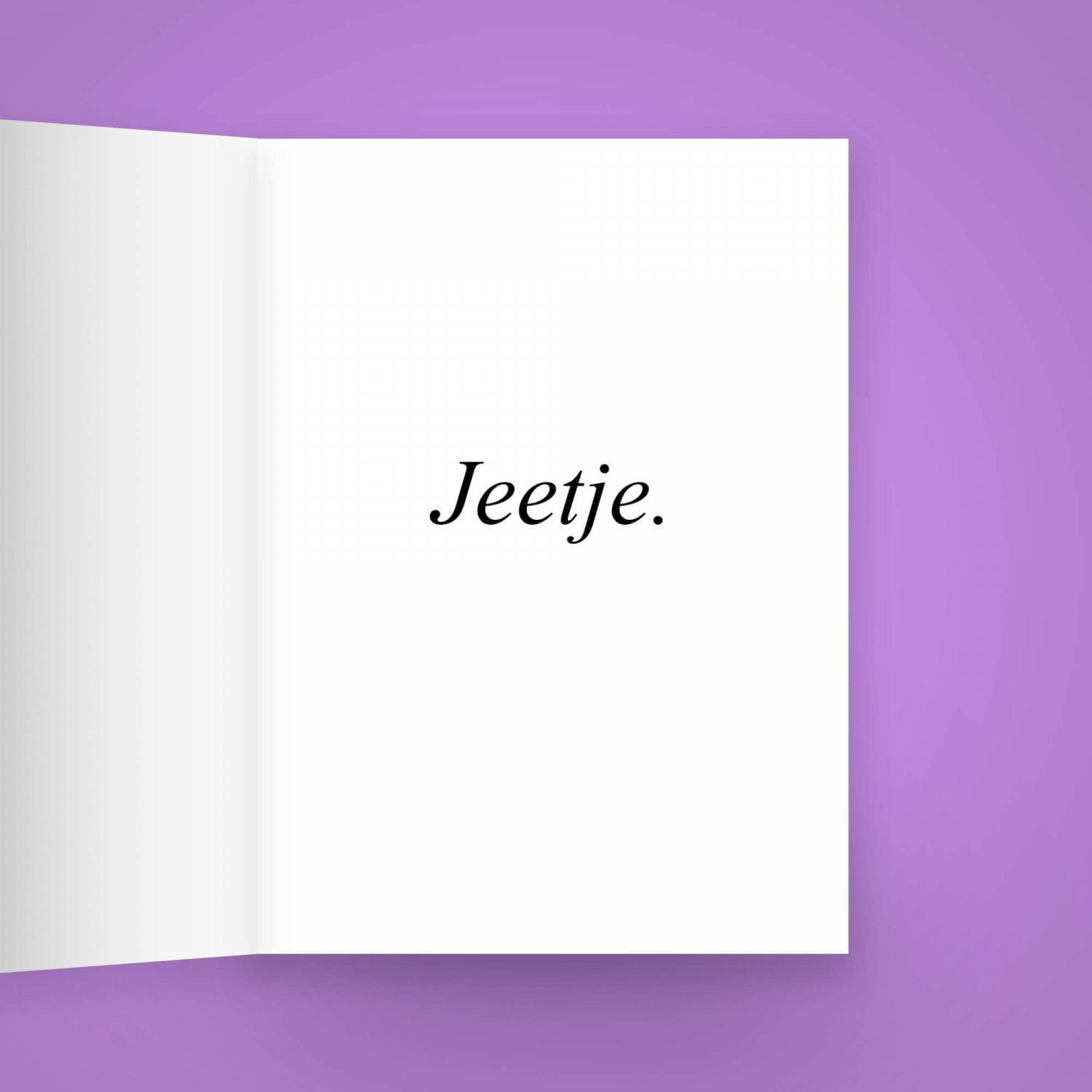
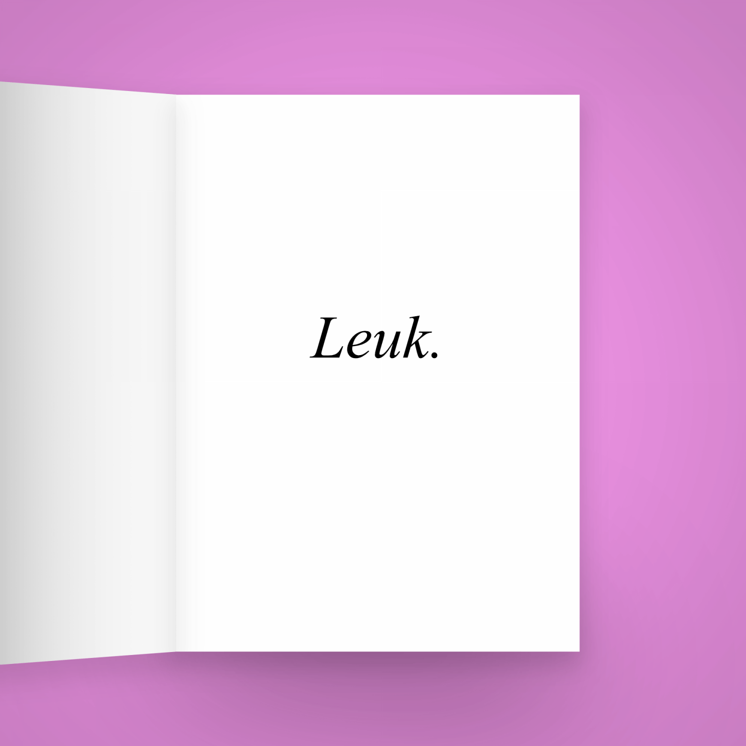
Festive Wishing Cards
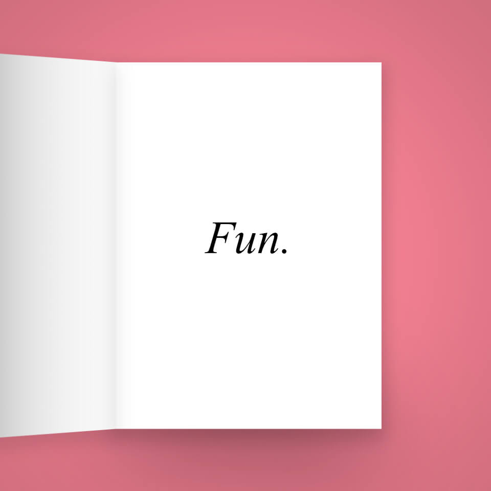
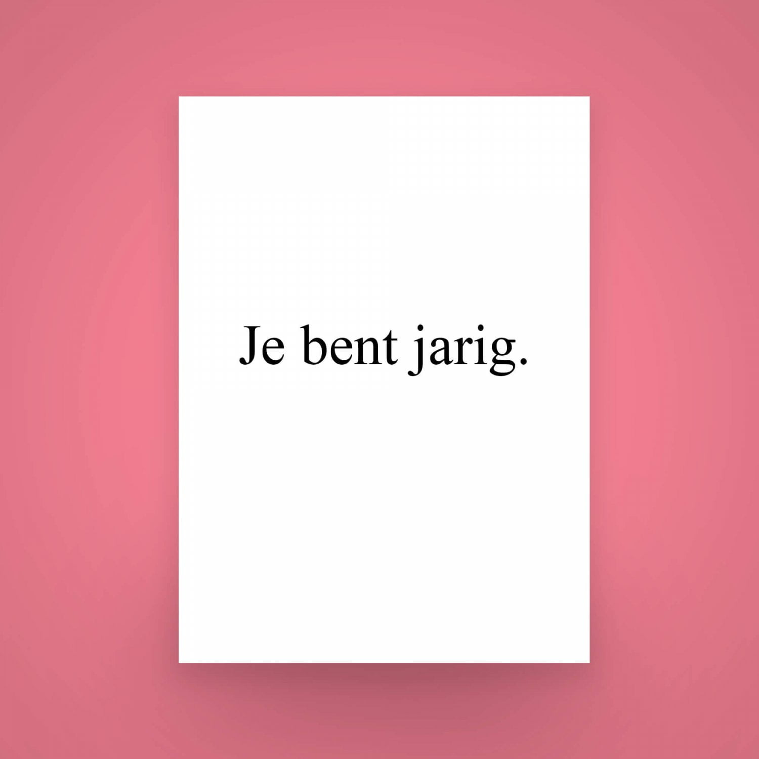
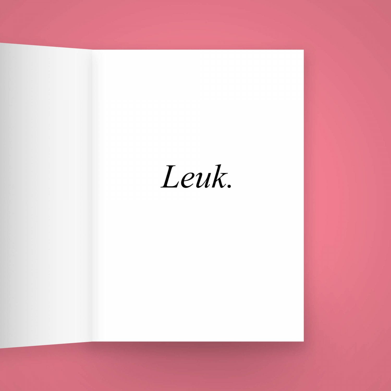
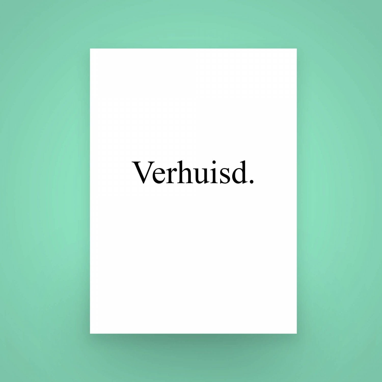
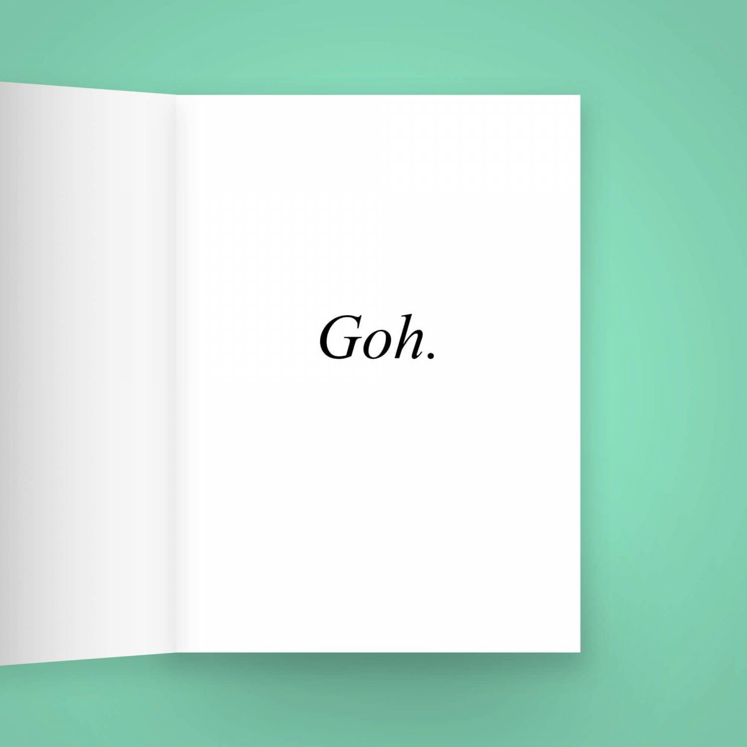
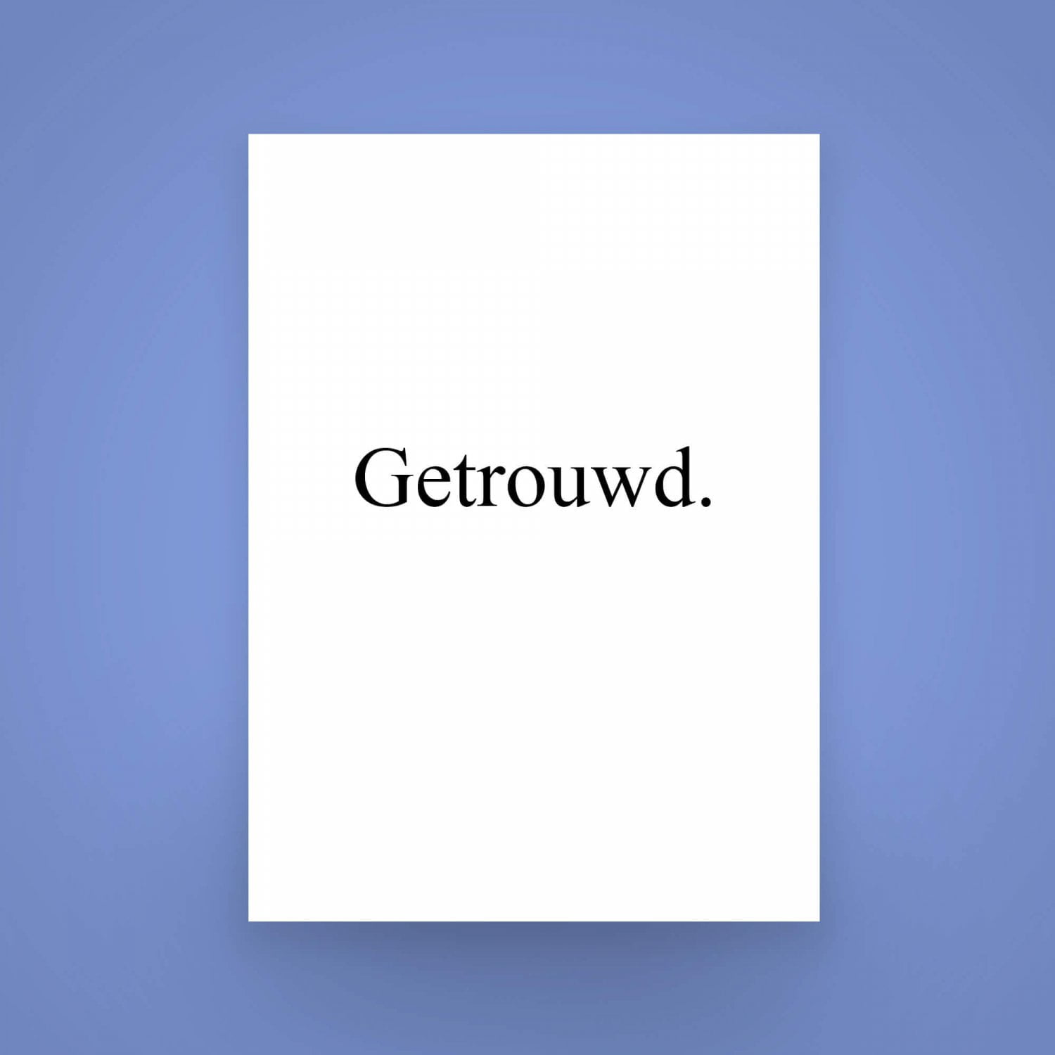
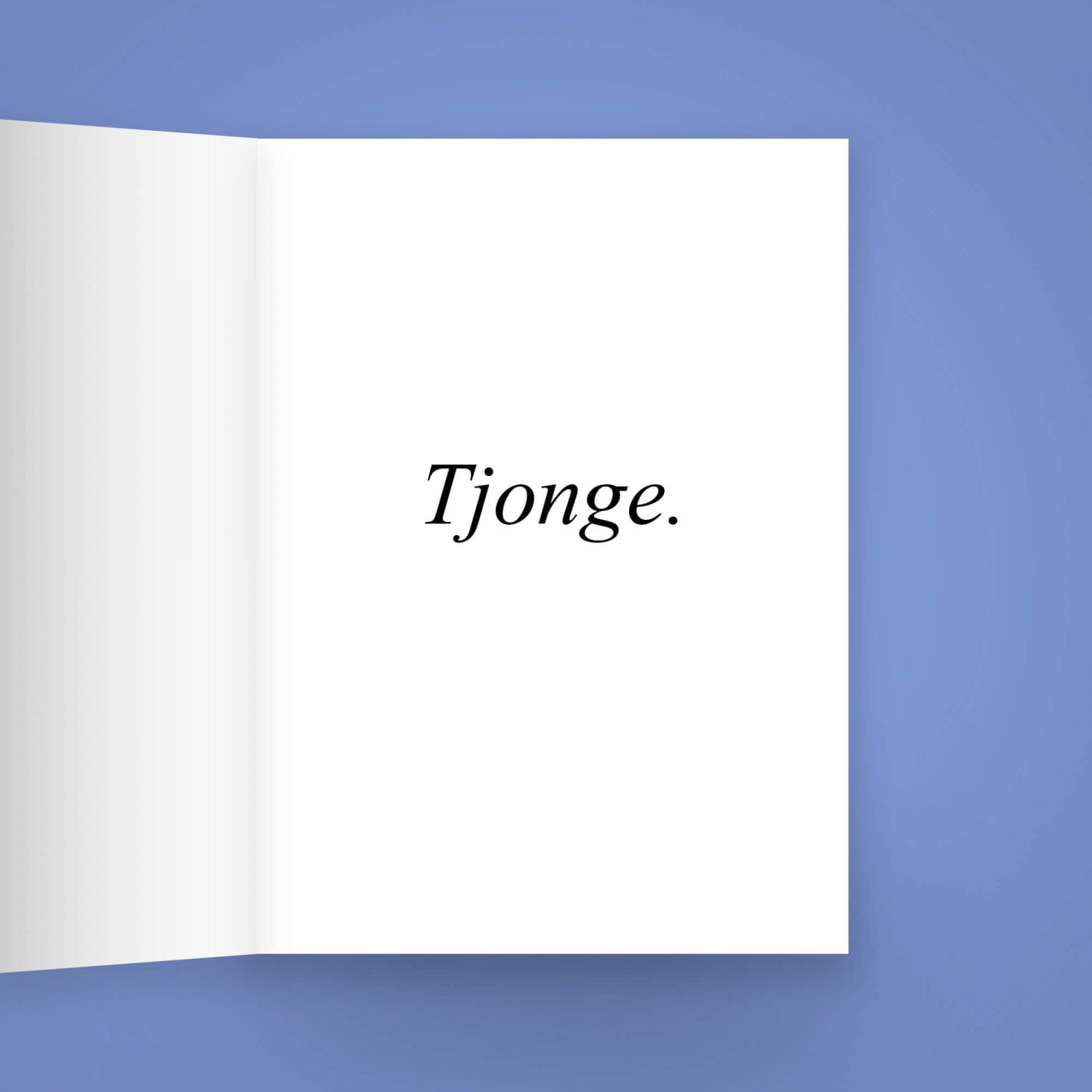
Sometimes, the wishing cards from the shop around the corner just don’t cut it.
You want to give someone a card that says exactly what you mean, without the extra pictures and decorations. You want the subject person to feel special, to feel like you wished them well, right to their heart. That’s where my series of perfectly sane “Festieve Wenskaarten”, or Festive Wishing Cards, comes in. In romantic Times New Roman in resolute black on a sensible white background, the recipient cannot possibly be clueless to your best wishes.
The cards are available in both Dutch and English. Get them using the button above!
Order Festive Wishing Cards

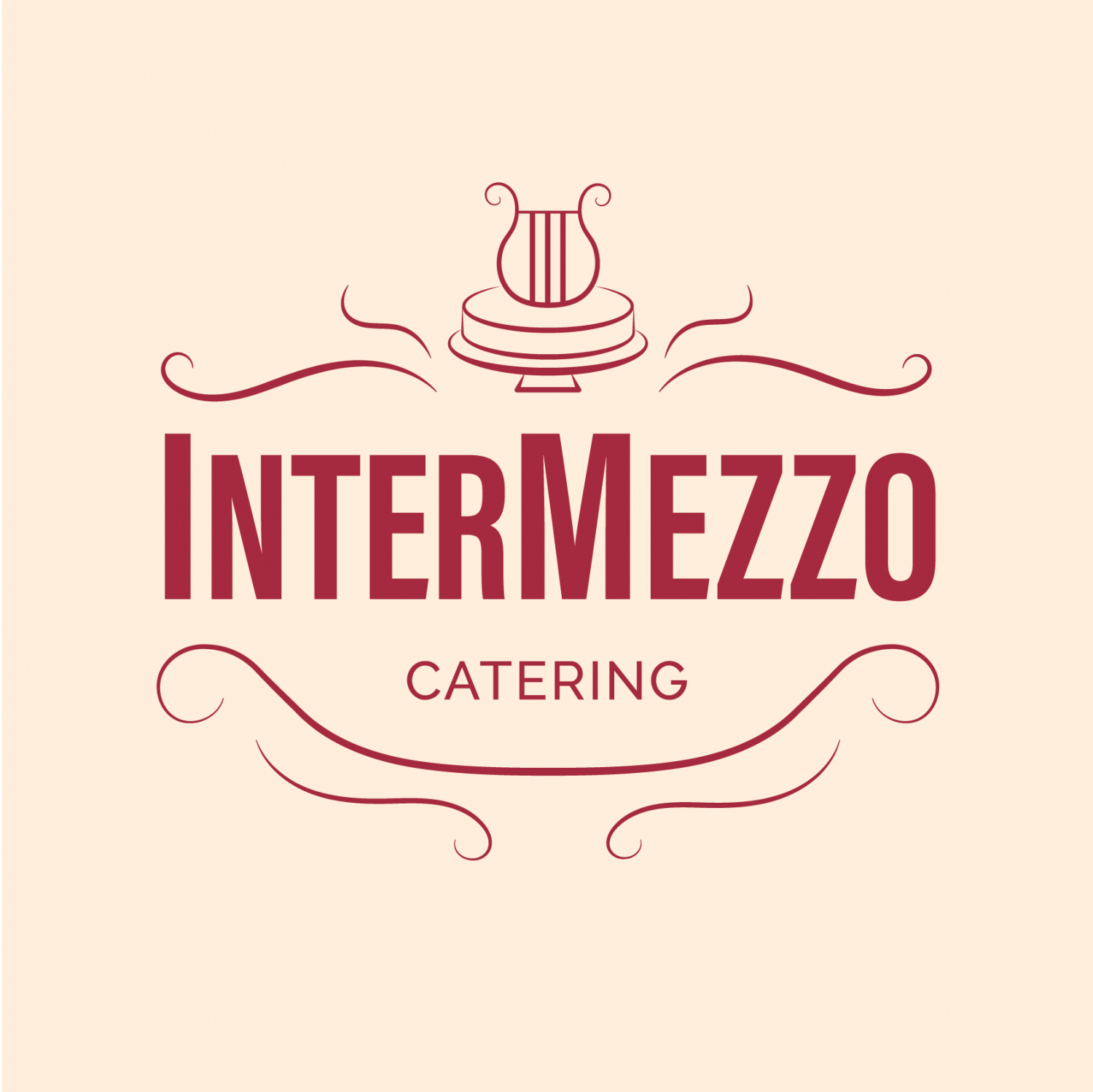
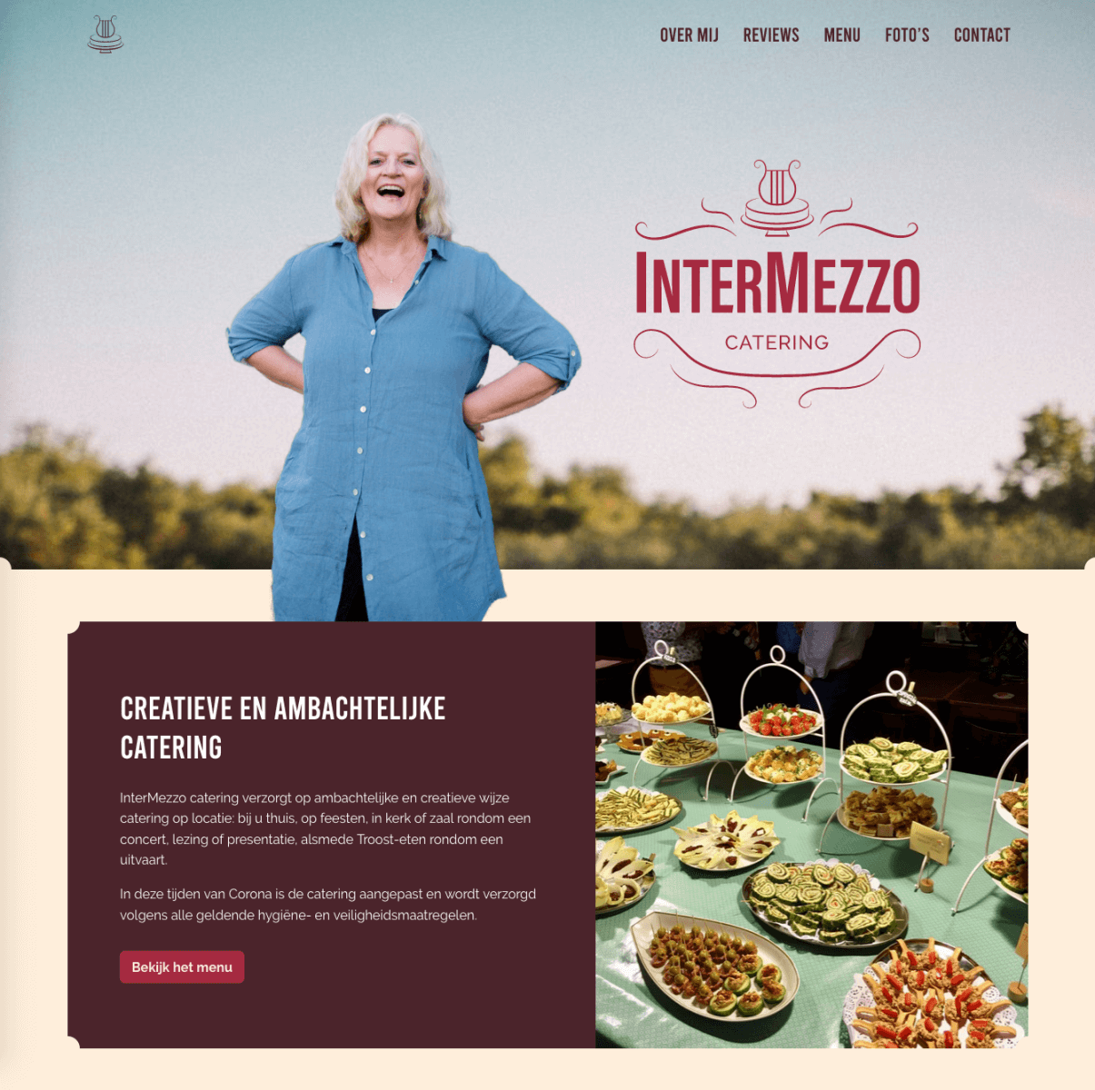
InterMezzo Catering
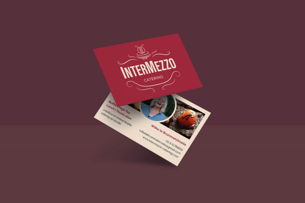
For InterMezzo Catering I had the honours of creating a logo, a visual language and website.
InterMezzo Catering is run by mezzo-soprano Wilke te Brummelstroete who, with her love for hospitality and hearty food, bakes and cooks the most wonderful food. She specialises in catering for cultural events, like classical concerts.
The visuals are reminiscent of vintage logo’s and etiquettes, poured into a warm yet modern colour-palette. Old-timey decorations are combined with flat, minimalistic surfaces and bold typography.
Check out the website here: intermezzo-cartering.com.

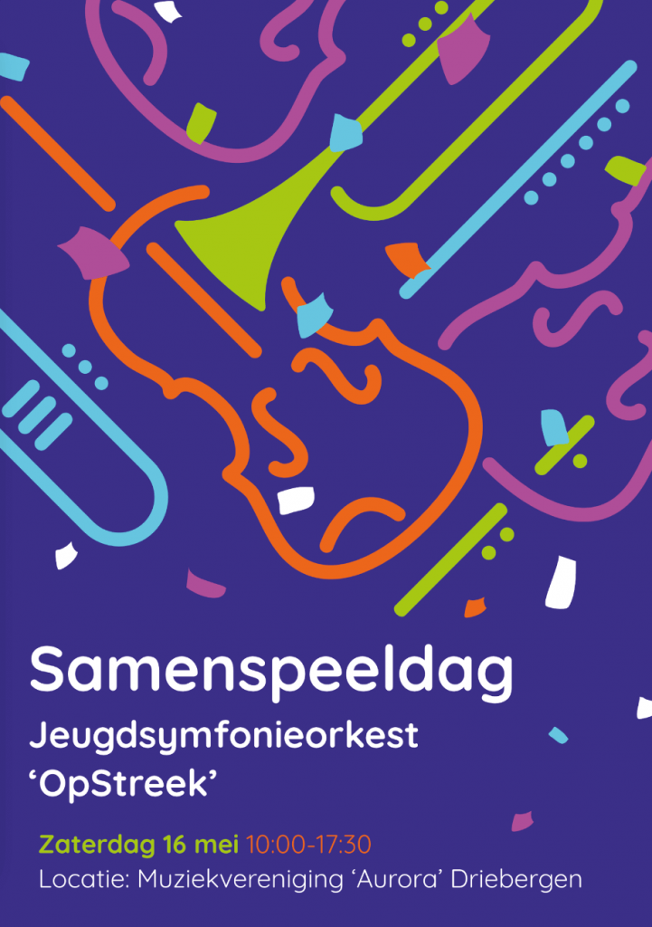
Samenspeeldag Opstreek
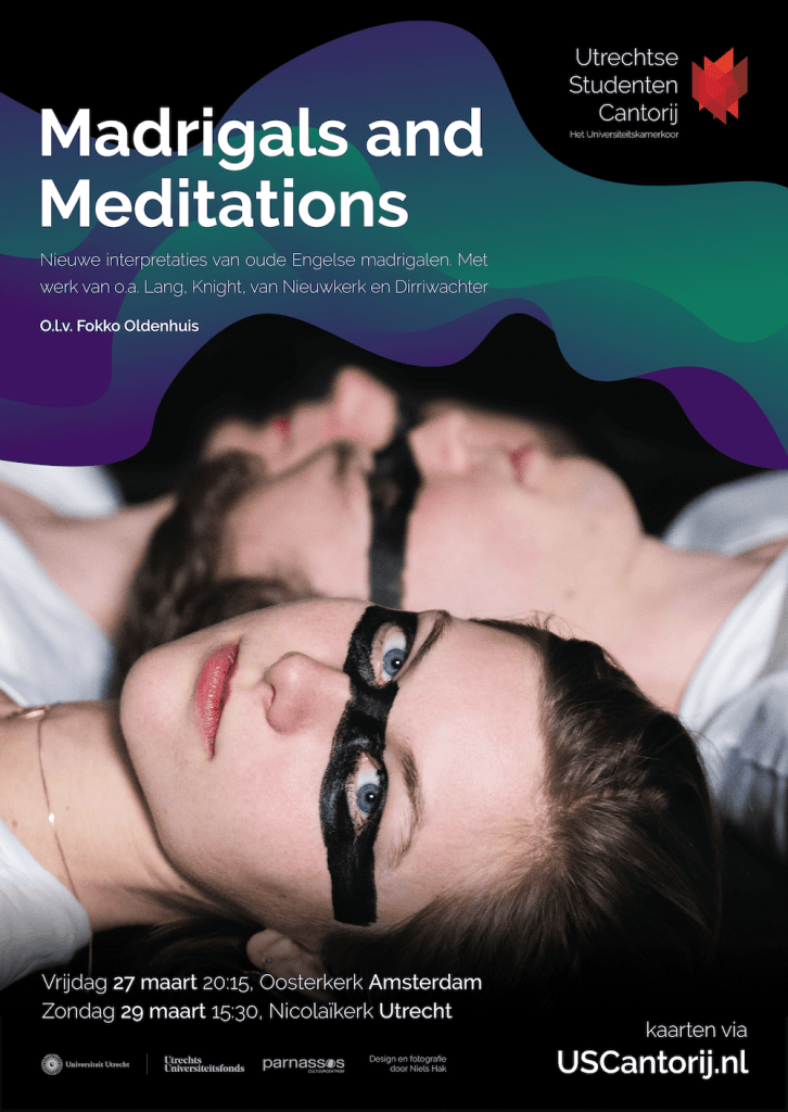
Utrechtse Studenten Cantorij

From 2020 onwards I design the promotional materials for the Utrechtse Studenten Cantorij, such as posters and flyers for their concerts.
The assignment is a new and interesting challenge for my skills to combine photography with graphical elements to create a uniform style which continues through the different iterations of the posters.
Eine Alpensinfonie
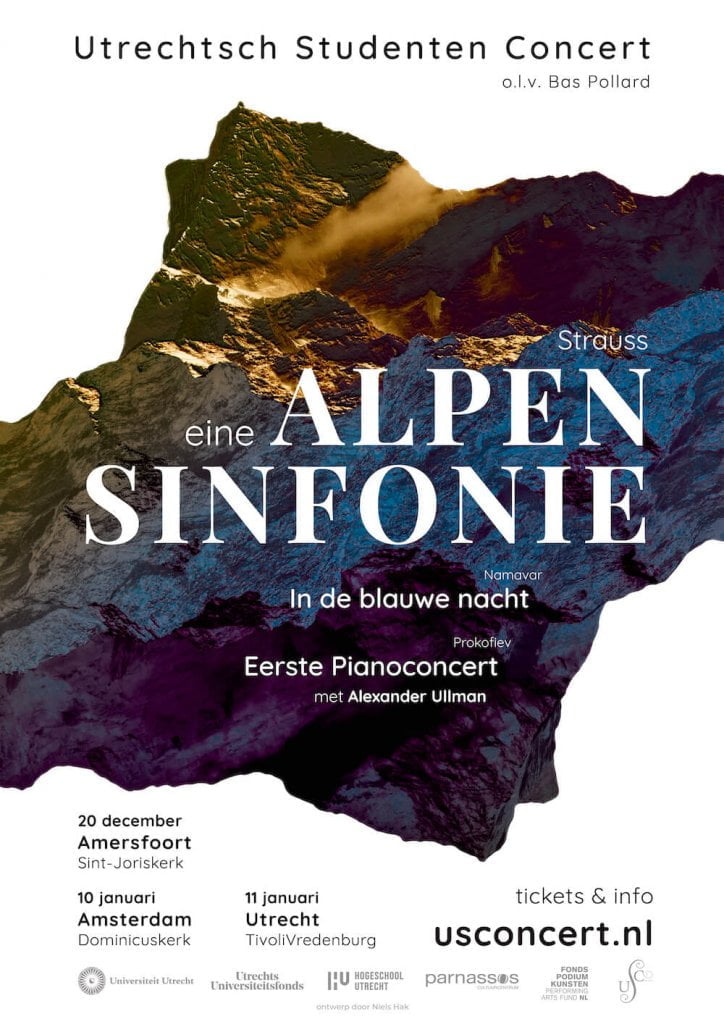
For the Winter 2019 project the USConcert performs the beautiful and impressive Alpensinfonie by Richard Strauss. A piece like that deserves some impressive promotion, so I designed a poster and visual style for their project. The poster was printed in poster and flyer format and spread in Utrecht and Amsterdam.
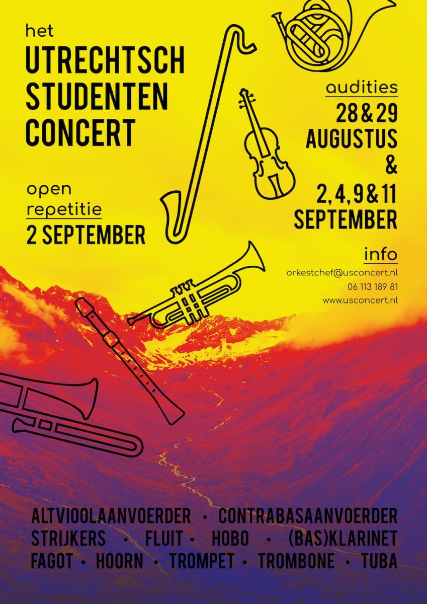
USConcert auditionposters
Two posters for the upcoming auditions of the Utrechtsch Studenten Concert. The overall theme forebodes the upcoming program, including Eine Alpensinfonie by Richard Strauss.

NeSP “Schijn bedriegt”
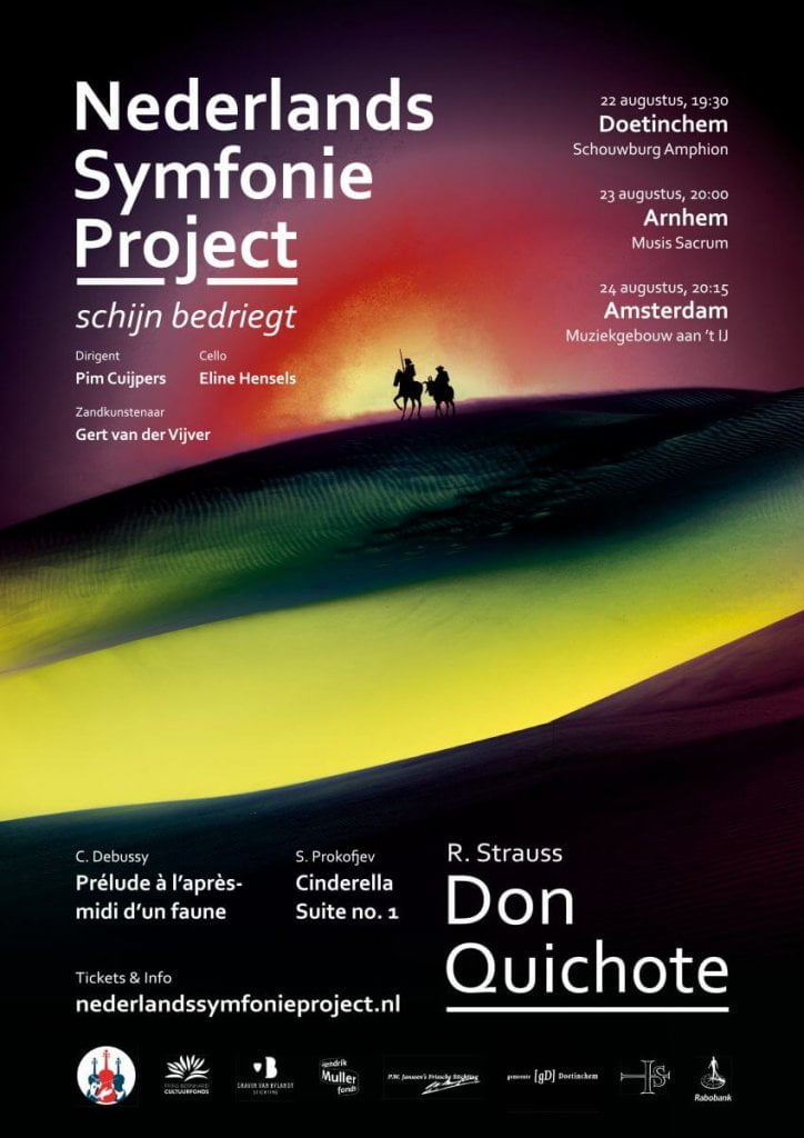
For the Nederlands Symfonie Project (Dutch Symphony Project) I designed the poster for their 2019 project “Schijn bedriegt” (Appearances are deceiving). The program revolves around mystical stories and fairytales including music by Debussy and Prokofiev and Strauss’s Don Quichote. The poster refers to the latter work and portrays a dreamlike and mirage-like dessert.
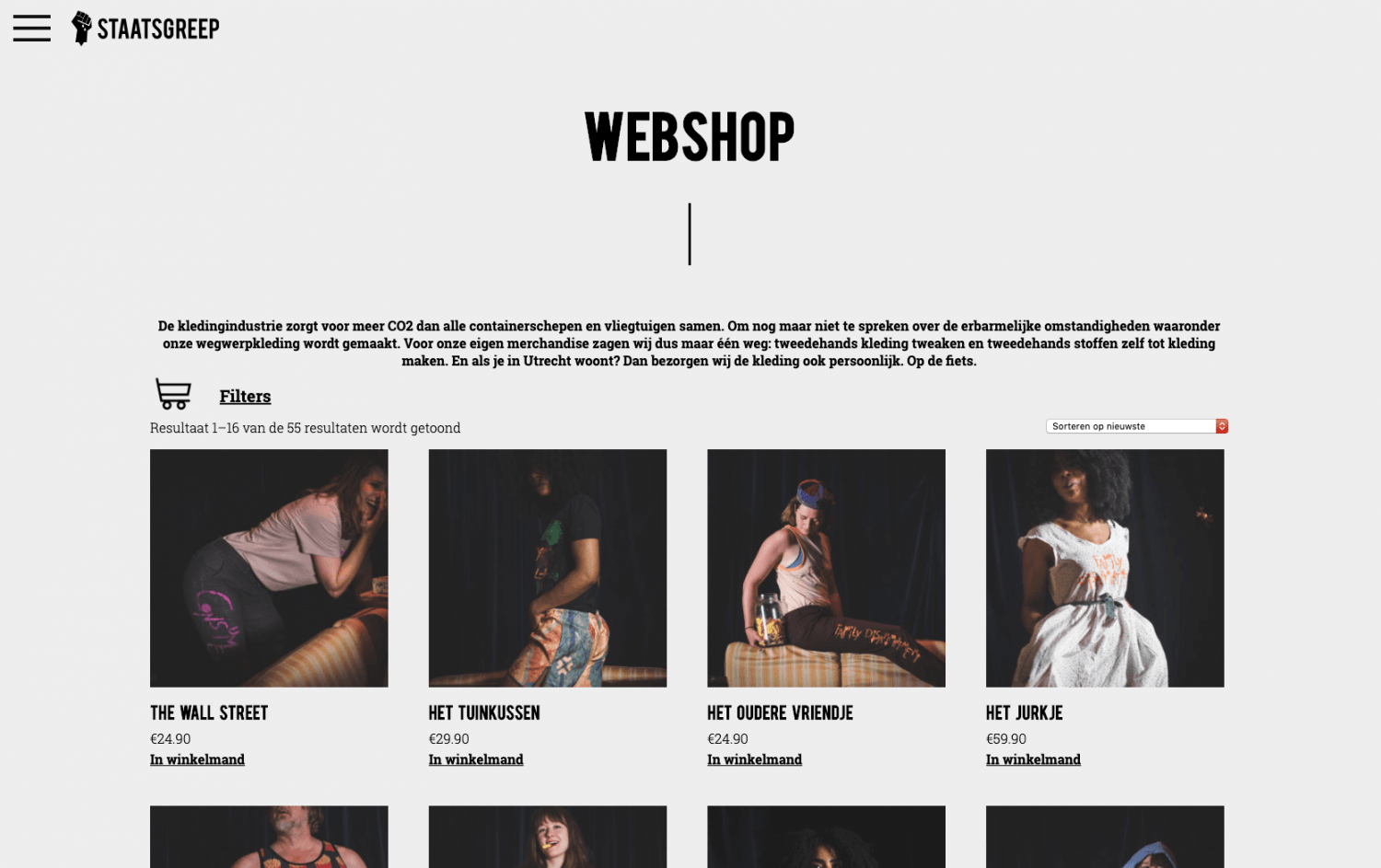
staatsgreep.art
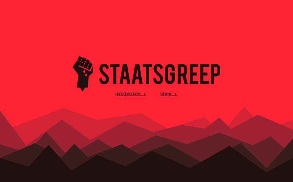
A brand identity and website for STAASGREEP.
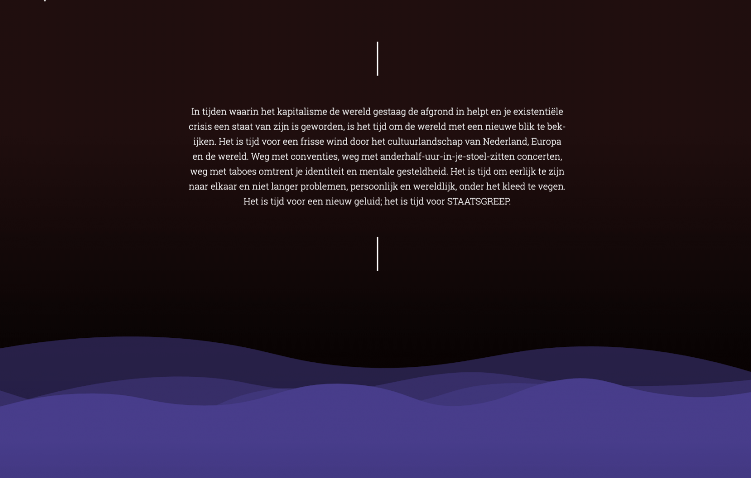
In 2017 together with writer and mezzo-soprano Elea Bekkers I founded “Staatsgreep”, an art collective focussed on radical new art. With Staatsgreep Elea and I want to take modern art out of high-society theatres and operahouses and bring it to the audience instead. By adressing modern issues in a confronting yet accessible way they make art part of modern-day society again.
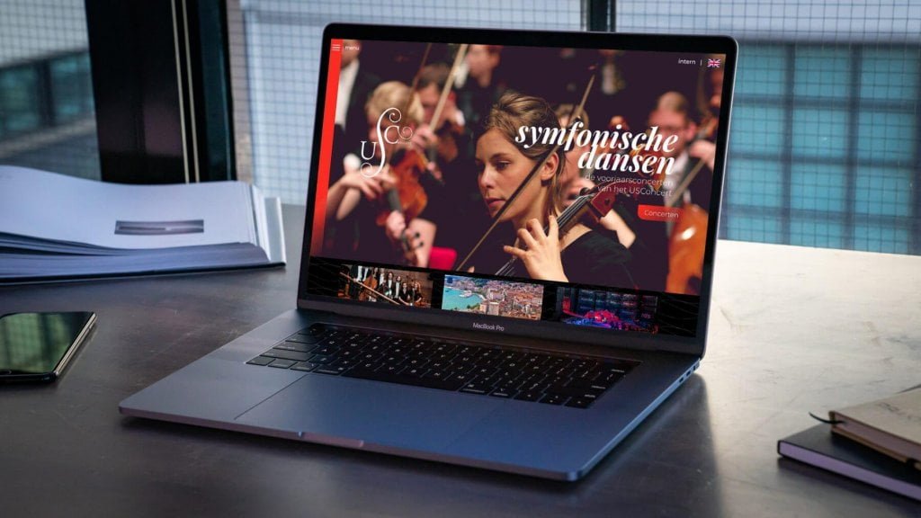
usconcert.nl
A website and visual identity for the Utrecht Student Orchestra, or USConcert. While being the oldest still active orchestra in The Netherlands, founded in 1824, they are young and dynamic; the orchestra solely exists of university students who alongside their studies make time to make music together. The orchestra specialises in late-romantic works with a special emphasis on Dutch composers.
The new website is a step into the future for this historic orchestra, giving it a new and dynamic look, without being too forward about it. The website offers plenty space for the orchestra’s rich history and introduces a new color scheme based on the previous single color story. By adding a warm and earthy purple to the vivid orange/red the historic yet youthful character of the orchestra is emphasised.