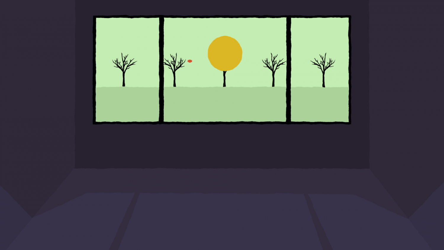
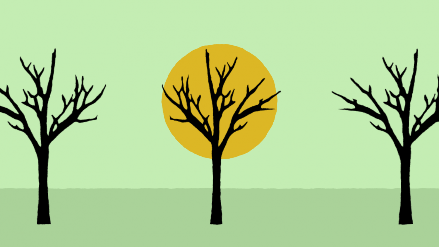
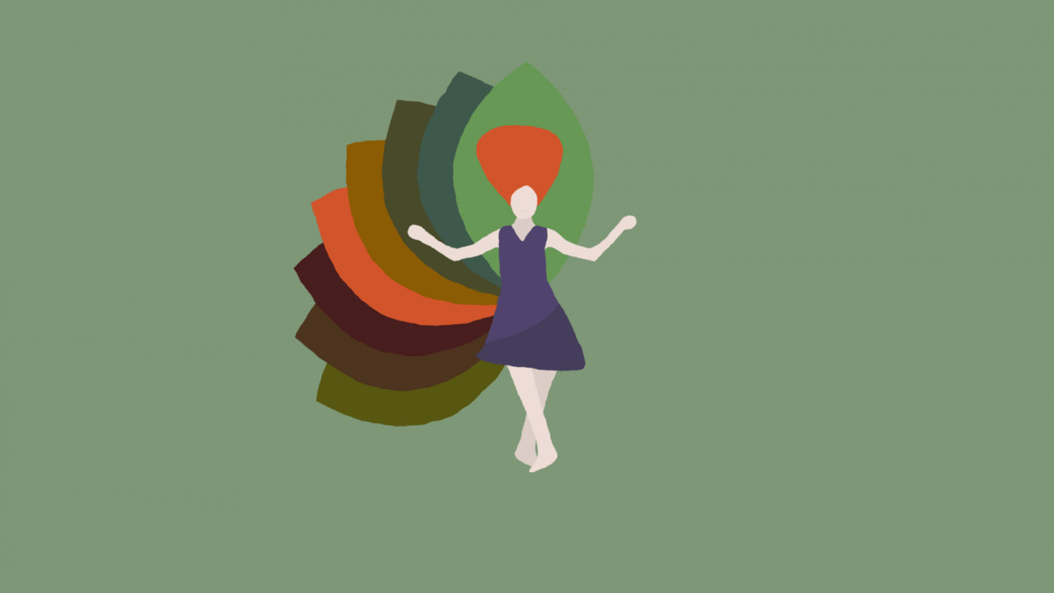
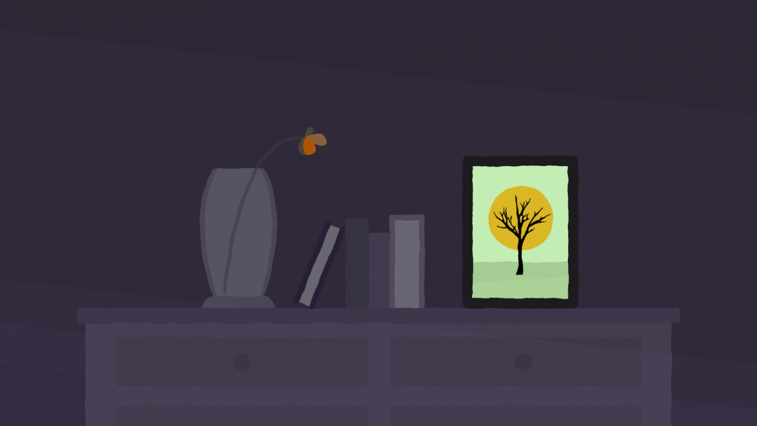
“Distant Light” is an animation created for the choir piece by the same title. Based on Illustrations by Paul van Gemen and on text by Elea Bekkers. Animation and composition by me. Arranged for high voices by Hansje van Welbergen.
Performed by Veronika Akhmetchina, Marleen van Os, Channe Visscher, Viktoria Nikolova, Sylvia Boone, Hansje van Welbergen and Elea Bekkers.
Text:
The trees seem green. The yellow leaves float feebly to the forest floor.
And as she took off she realised she could not fly.
Not even the sun now warmed the city that had killed her dreams.
The light is low and they could only fall.
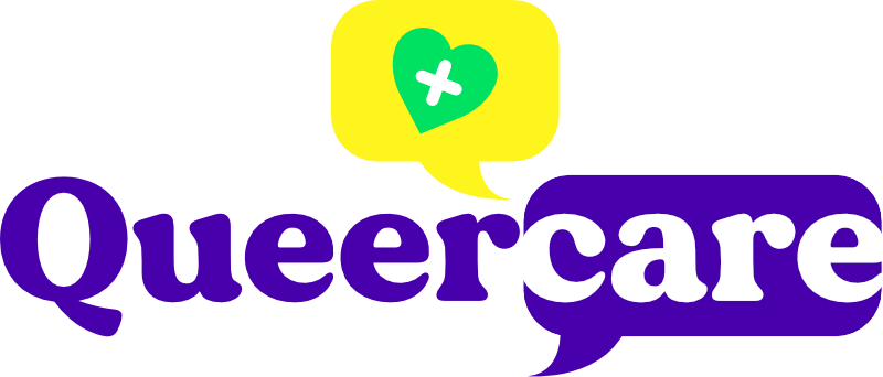
Queercare.nl
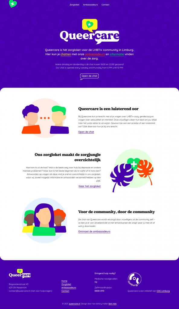
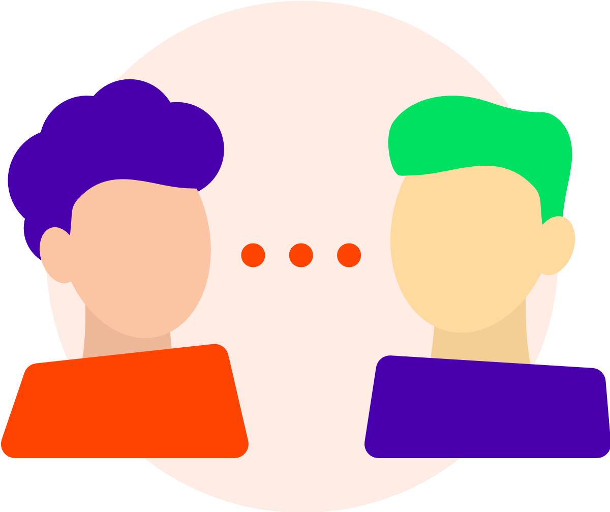
For COC Limburg I designed and developed their Queercare website concept: a place where LGBTQ+ people in Limburg can turn to to chat with other people in the community and find info about available LGBTQ+ care.
Vibrant and active colours are the heart of this design, telling the visitors that your colours are welcome here, just like the community is full of all different colours. Throughout the website abstract avatars are used, sometimes based on the people that run the chat.
Visit the website here and have a look around!
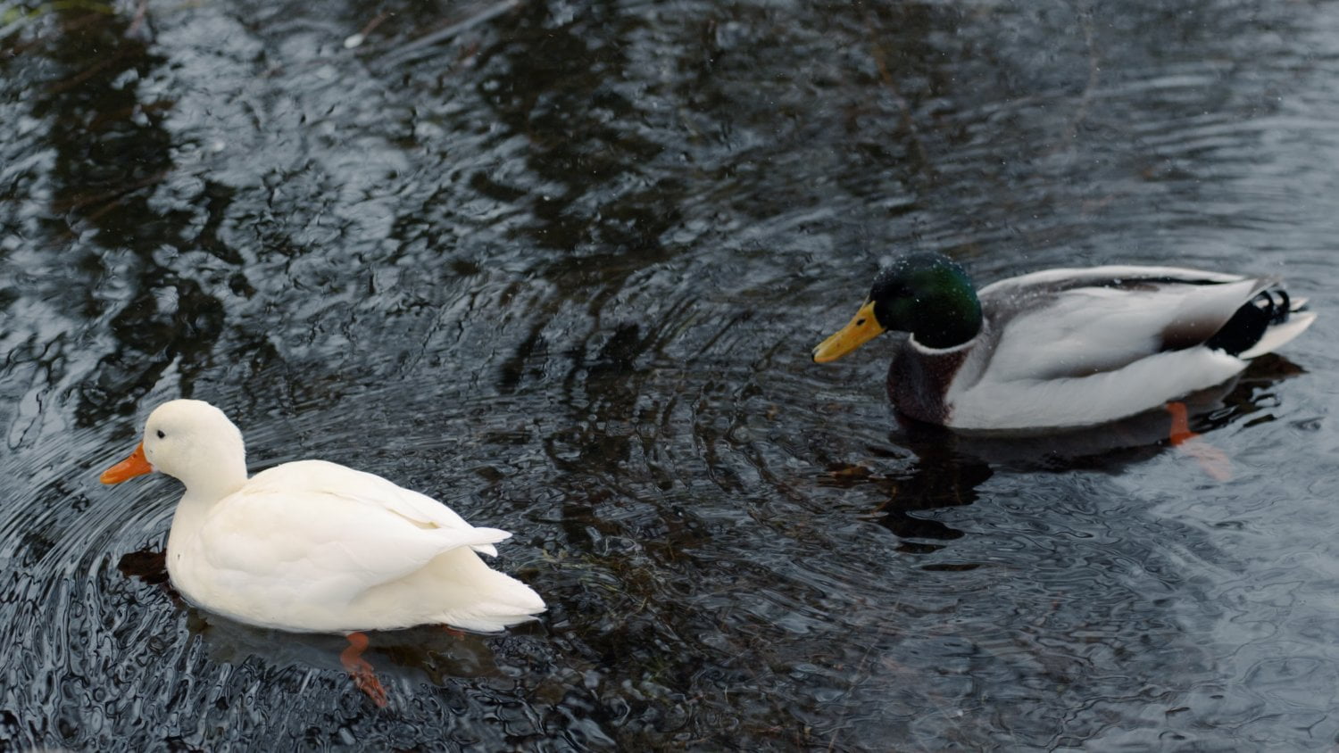
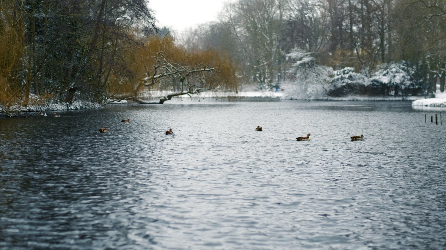
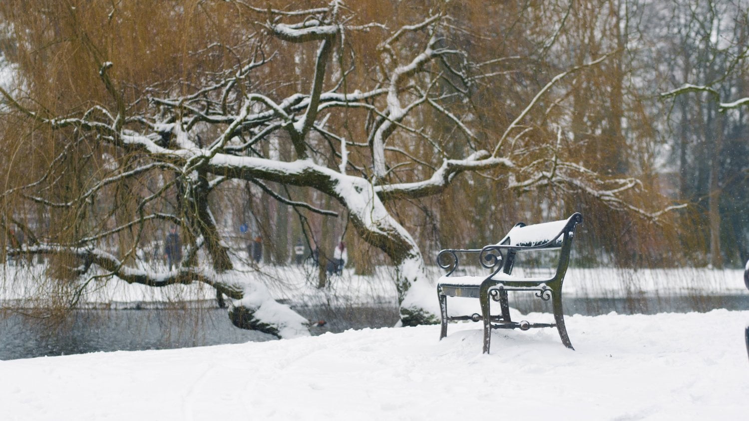
Life in Winter
In february the city of Utrecht was suddenly treated to a thick blanket of snow, resulting in a winter wonderland. I took my amazing Panasonic Lumix S5 camera out, geared with a vintage canon lens (FD 50mm f/1.4) and took it all in through the viewfinder. My fingers froze over, but it was definitely worth it!
Soundtrack, videography and color grading by me.
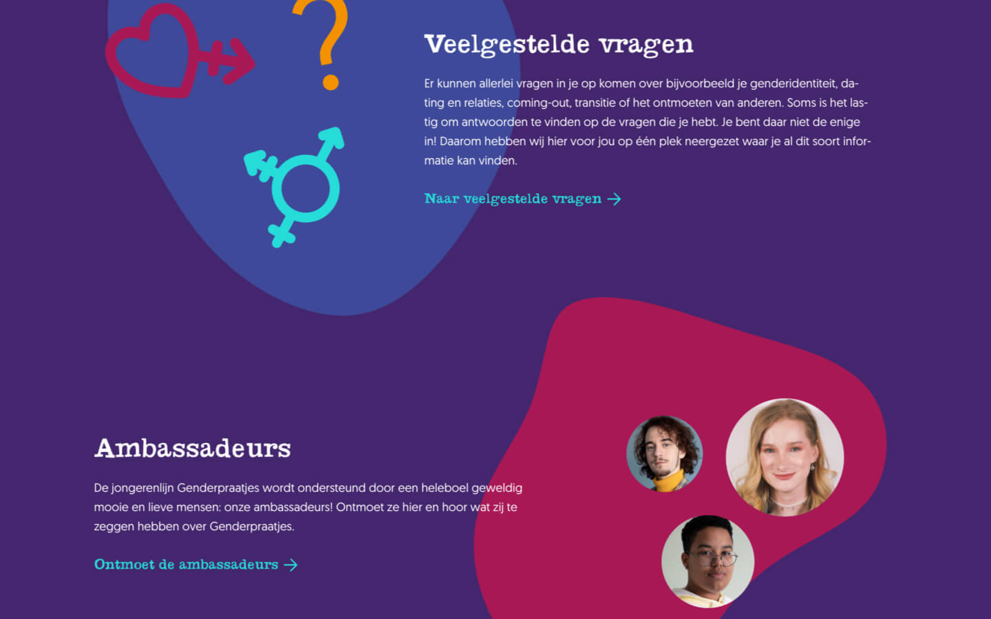
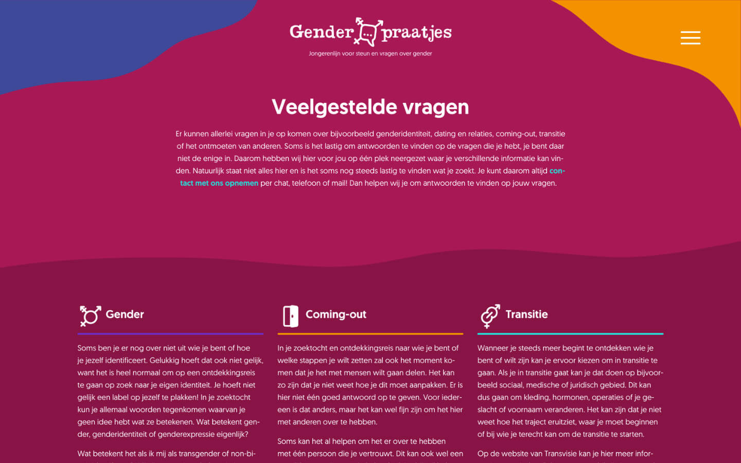
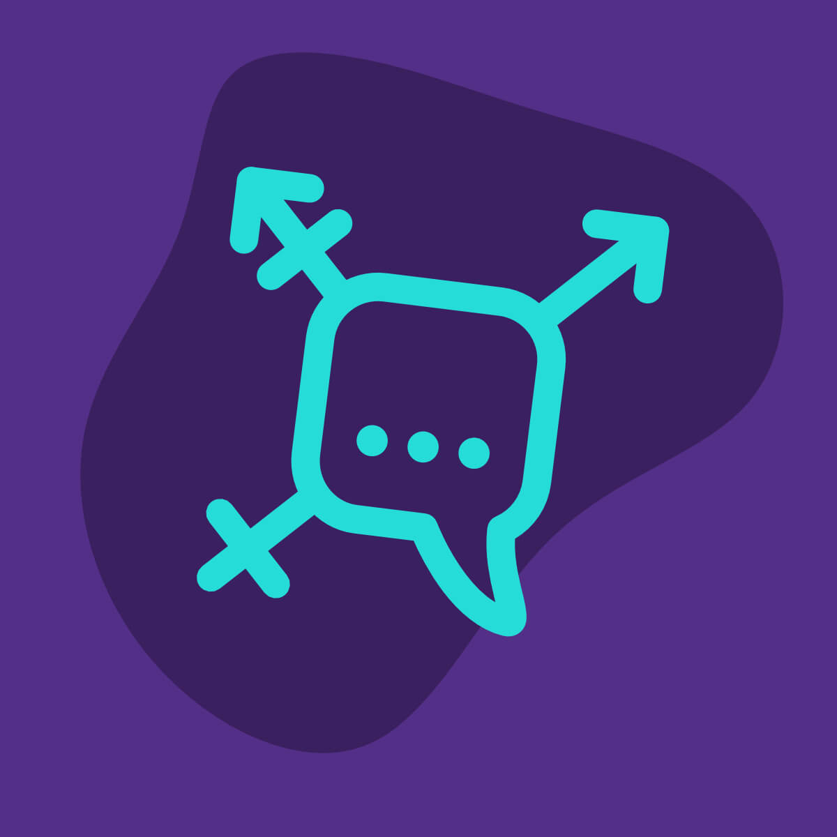
genderpraatjes.nl
Genderpraatjes.nl is a helpline for youth and young adults questioning their gender and seeking help, information or simply someone who listens.
I’m very honoured to be a part of this project as the designer and coder of the website. As a non-binary person myself I feel closely connected to the subject at hand. To be able to help others through building this website means the world to me.
Fluidity
The design relies on fluidity. Straight (pun intended) shapes are scarce. The fluid shapes, lines and colours are a warm, comforting bath while at same time visualising the fluidity of gender. Aimed at young people, the website takes on a fun and dynamic character.
Even more important than design, is of course its functionality. A visitor should be able to reach out for help on any page. Every page should be clear and helpful.
Collaboration
I take great joy in creating websites like these. It’s a collaboration, not a job. I don’t create websites like this to earn money – I do it because I love making websites and making them for the best of causes only further strengthens that joy. Are you looking to strengthen your online presence as a cause, artist or anything else? Let’s talk!

Flower Waltz Recording
For the Utrecht University I recorded a New Year’s video to be sent to their employees and students. A part of Tchaikovski’s Flower Waltz from the Nutcracker Suite was selected and recorded on video and audio by me.
semhak.com
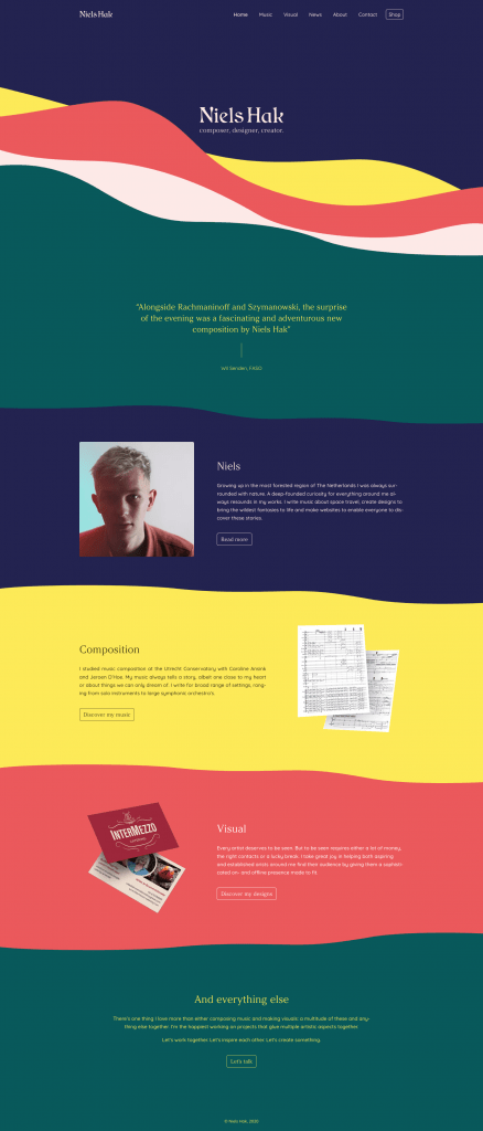
You guessed it, the website you’re browsing is a portfolio in and on itself. It’s the 2021 version of what I’m capable of as a webdesigner and artist.
The website started out with different colorschemes that somehow still relate to eachother. The colors are reminiscent of the seventies, yet wholly modern. Even though the website as a whole seems abundantly colorful, the full color scheme is only made up of 6 basic colors that all intertwine through the different schemes. Red, green, yellow, blue, brown and pink to be exact. Not a color more, unless you count black and white, but we don’t do that here now do we.
Of course the most important principle of a website is usability, and as with any website that’s been at the core of this design. Visual splendor and glitter has only been added in a non-destructive way – the website is still easily navigatable. And yet it feels like a living artwork.
Do as I like to do: go to homepage on a big screen, put your browser in full-screen mode, lean back and let de waves calm you down.
gagipetrovic.com

For composer and musician Gagi Petrovic I developed a minimalist yet recognizable website. By combining a modern font in text and a unique and classic font in titles the website is a combination of both modernity and tradition.
Check out the website here!
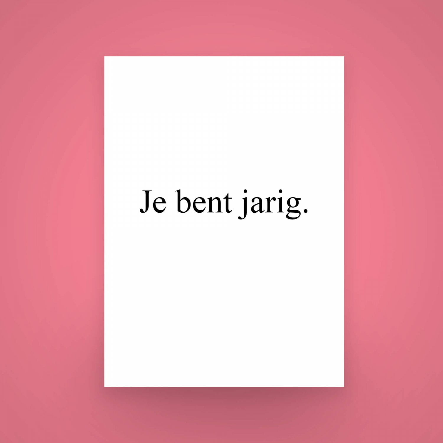
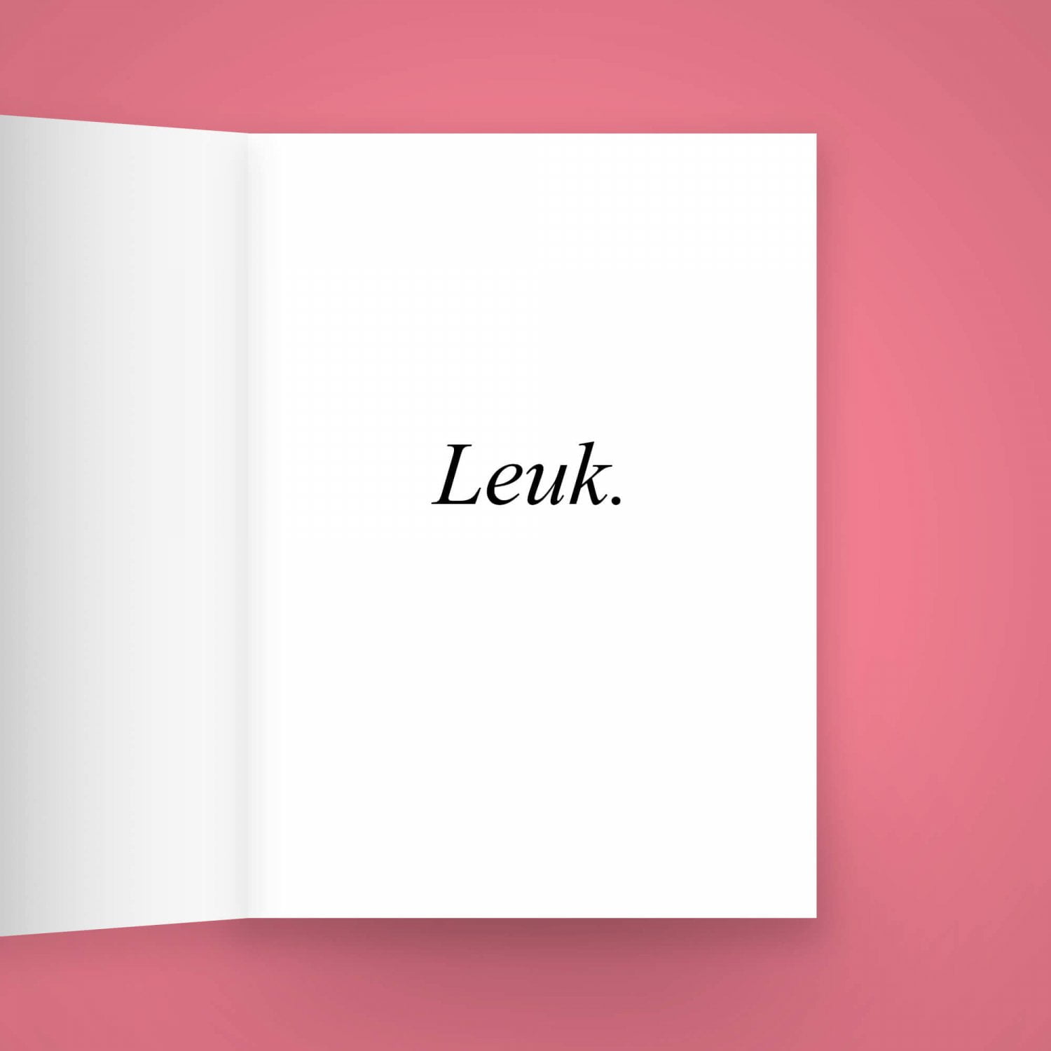
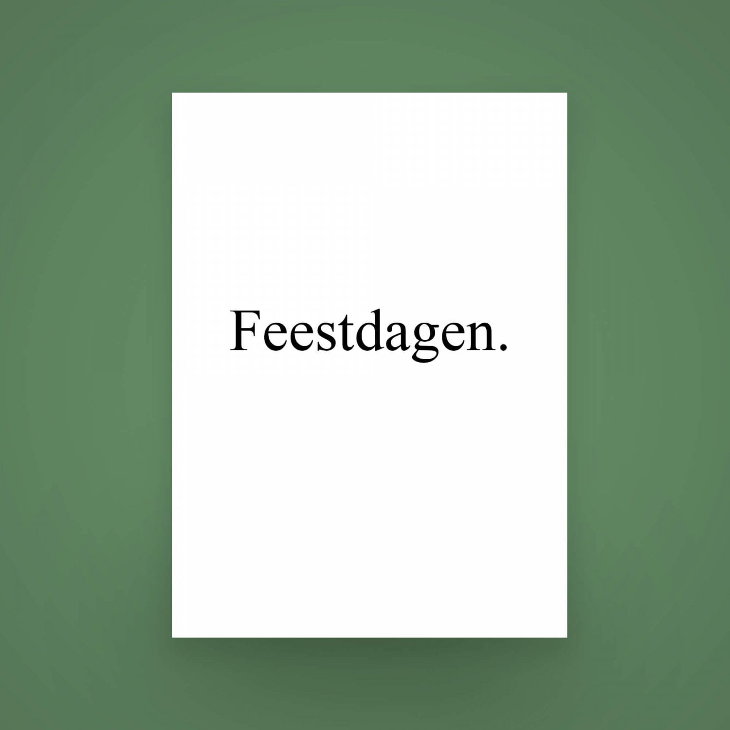
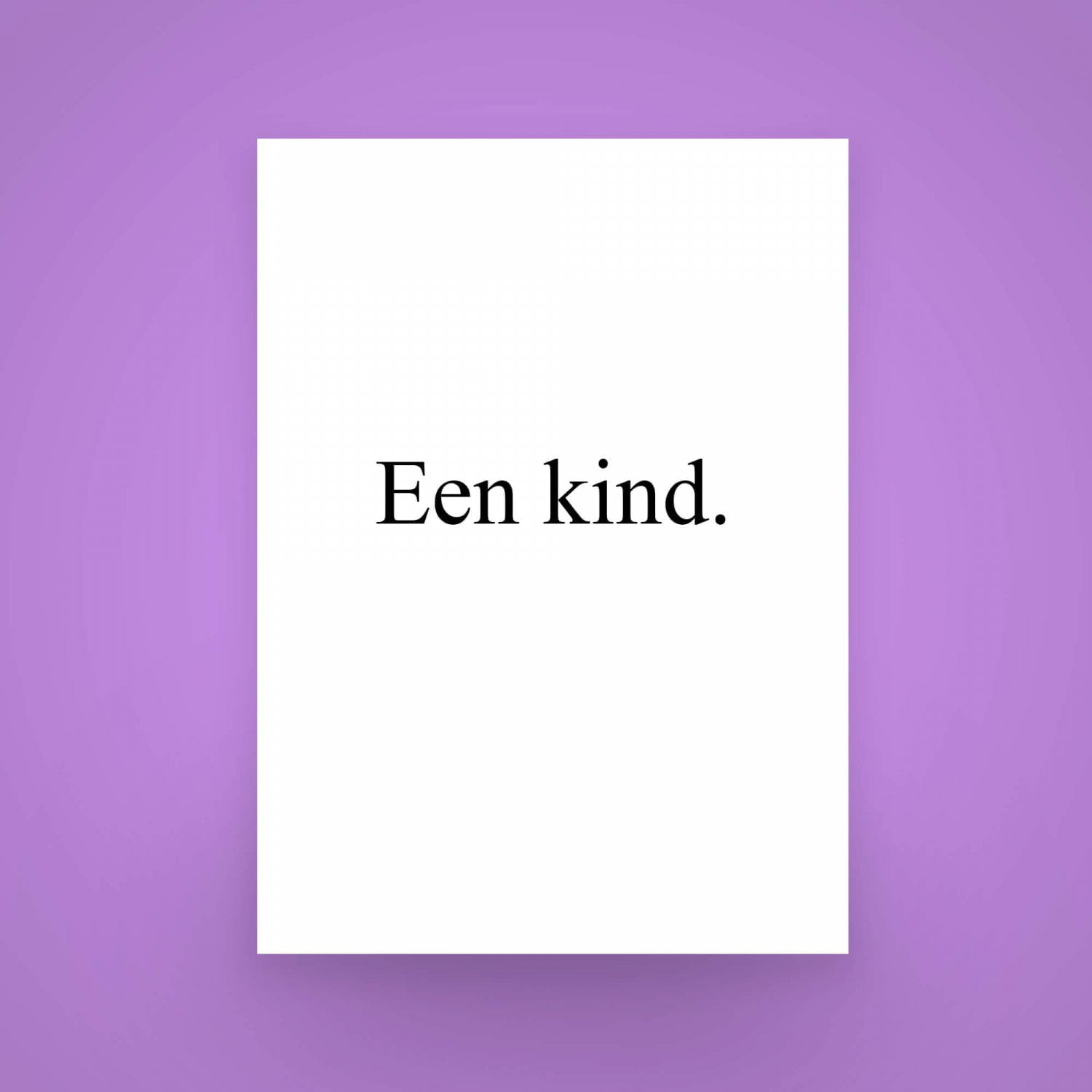
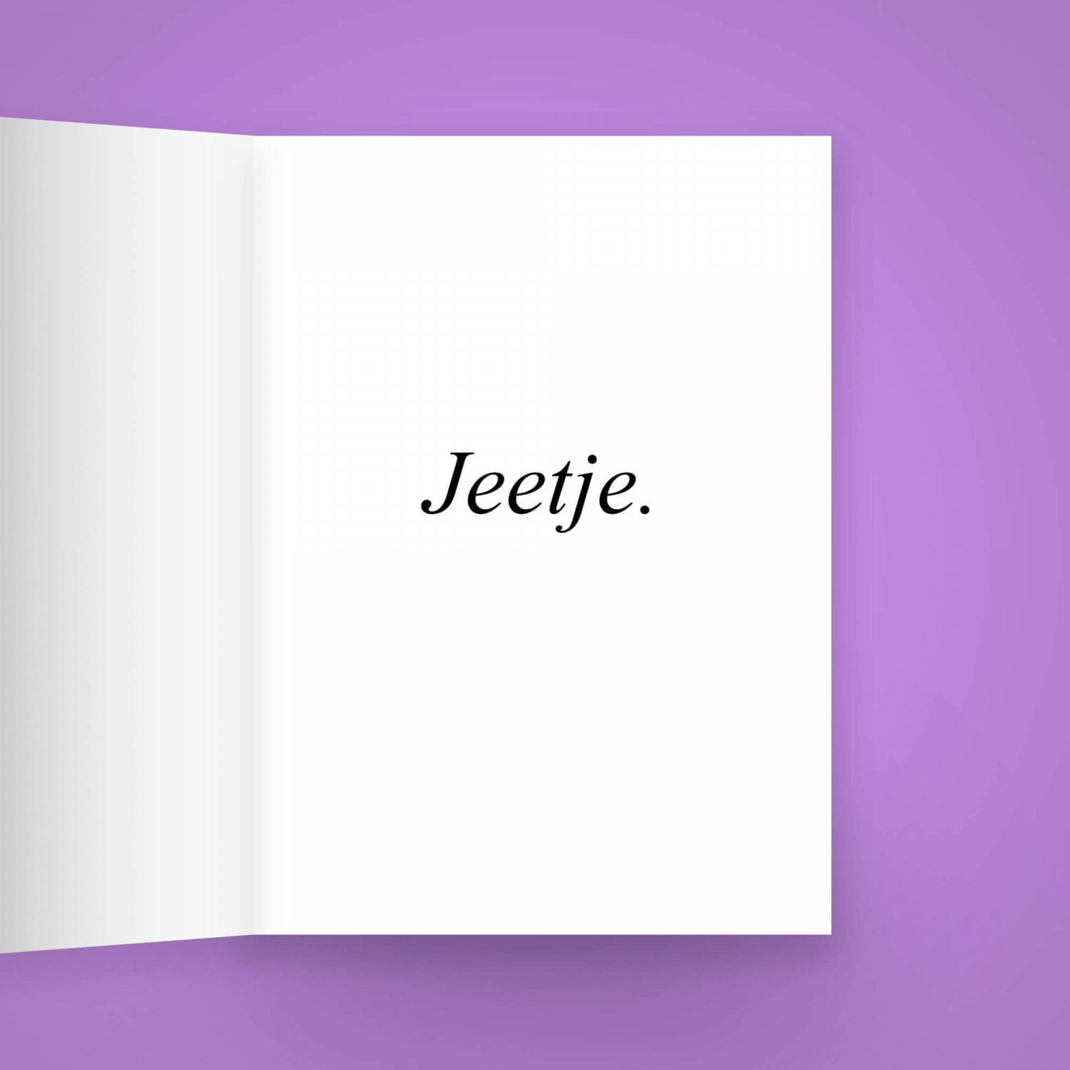
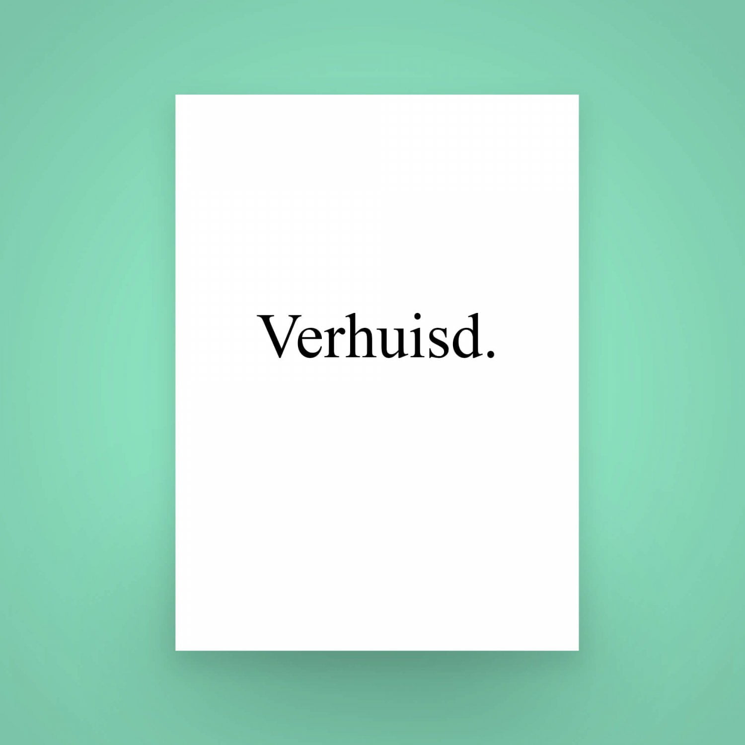
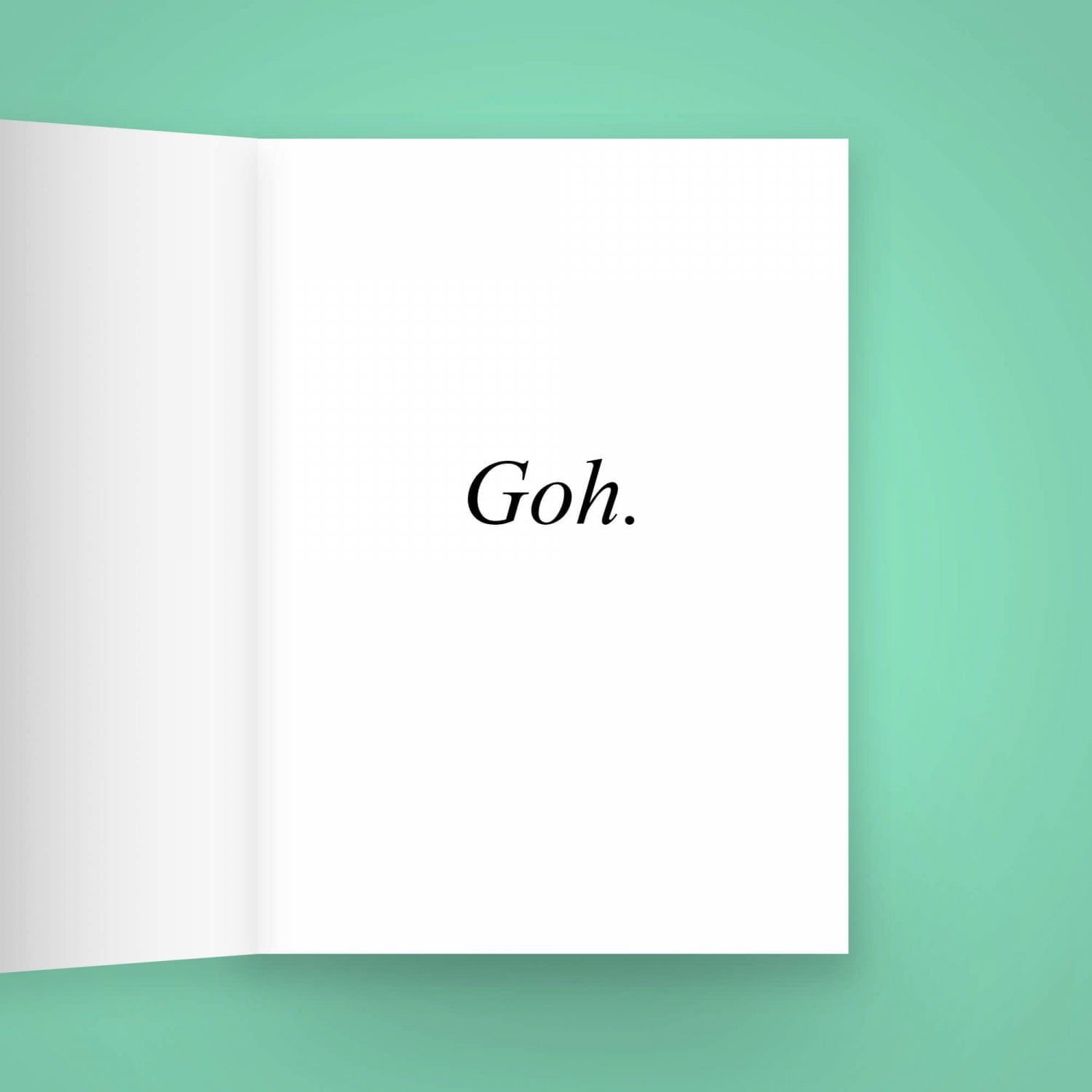
Festive Wishing Cards
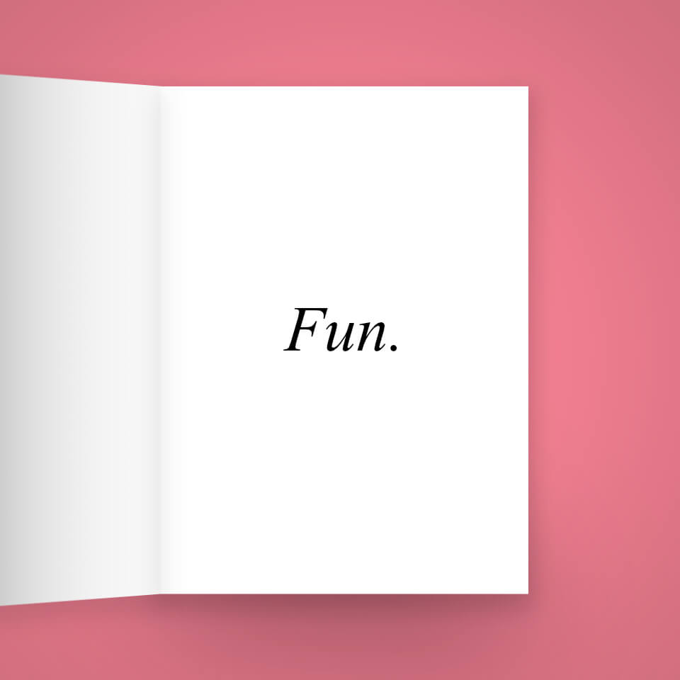
Sometimes, the wishing cards from the shop around the corner just don’t cut it.
You want to give someone a card that says exactly what you mean, without the extra pictures and decorations. You want the subject person to feel special, to feel like you wished them well, right to their heart. That’s where my series of perfectly sane “Festieve Wenskaarten”, or Festive Wishing Cards, comes in. In romantic Times New Roman in resolute black on a sensible white background, the recipient cannot possibly be clueless to your best wishes.
The cards are available in both Dutch and English. Get them using the button above!
Order Festive Wishing Cards
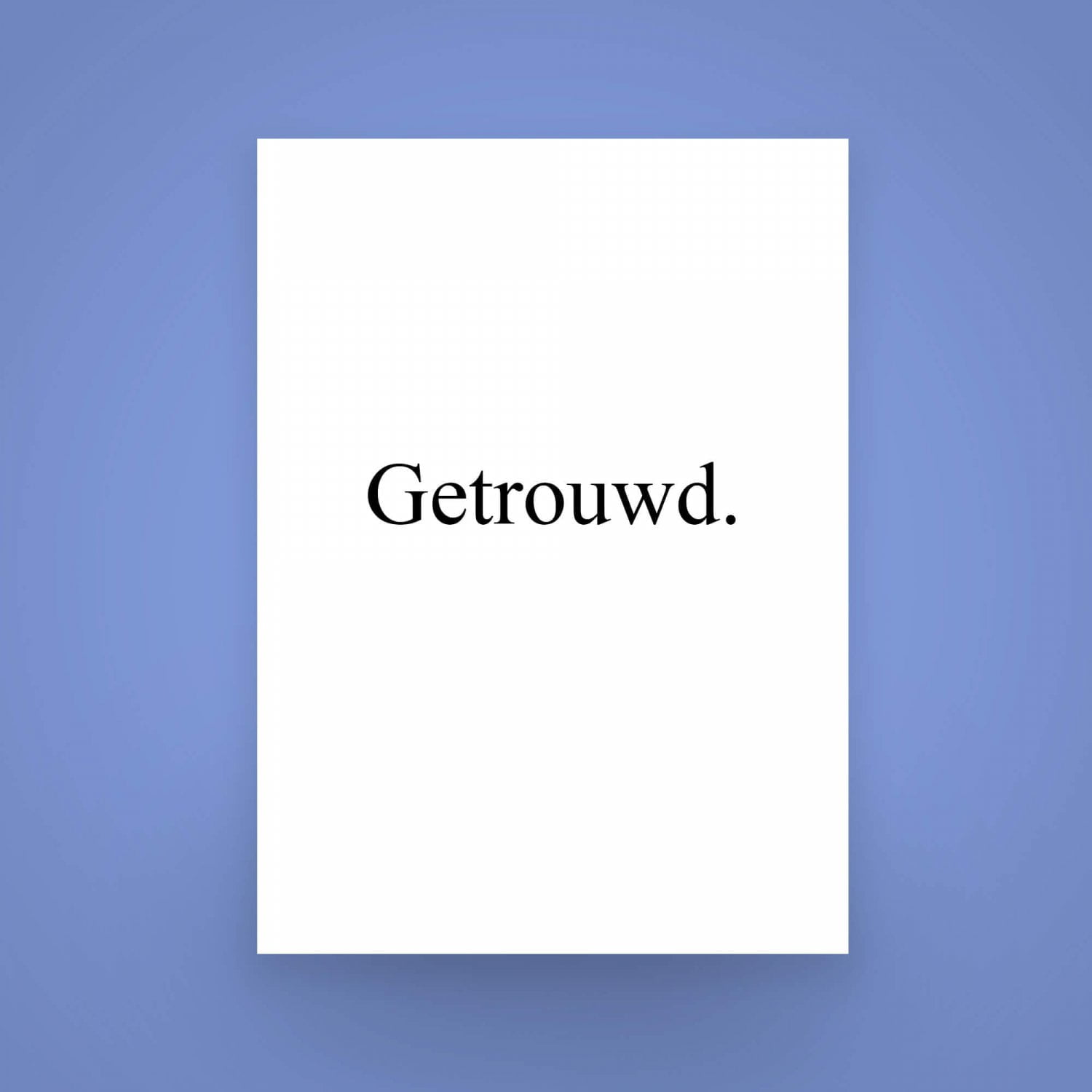

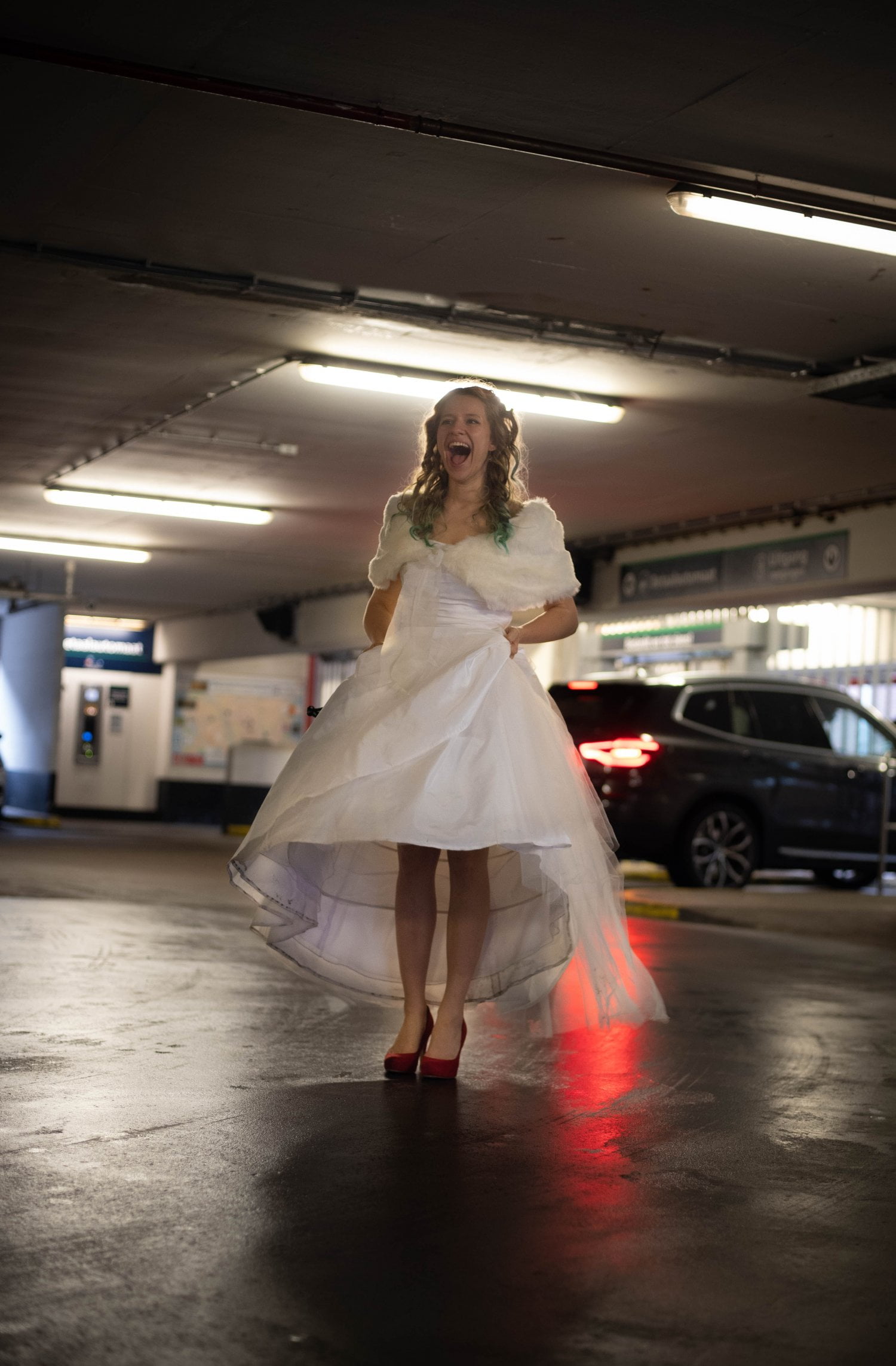
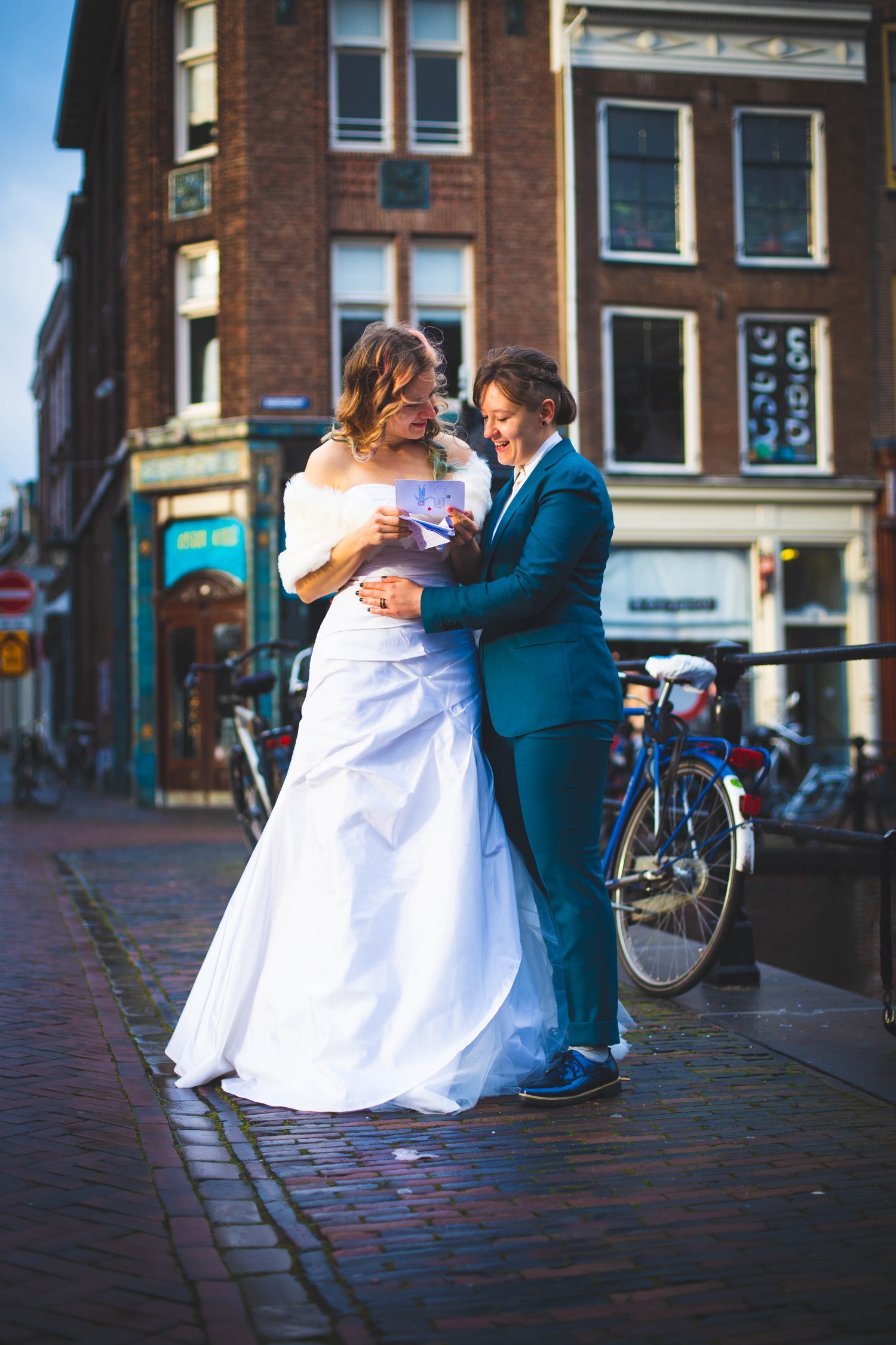
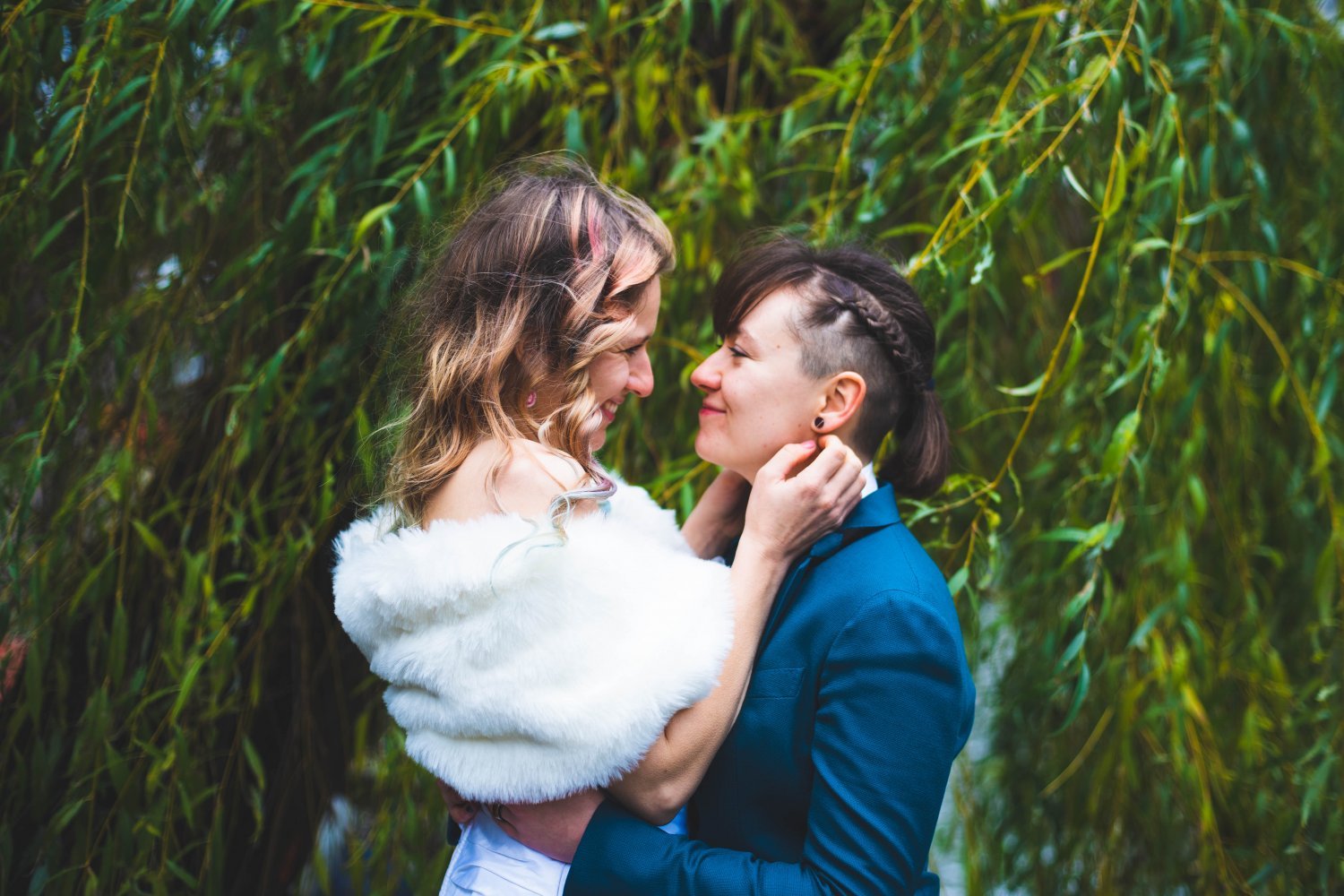
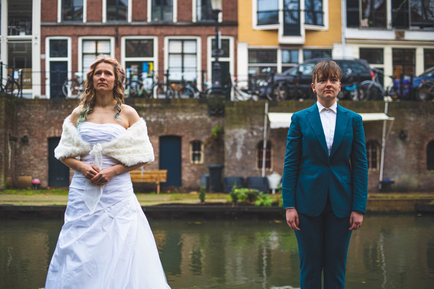
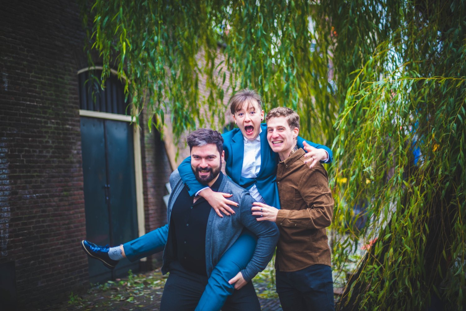
A windy december morning –
two very dear friends of mine are getting married. All dressed up I entered the city hall with them. Turns out the wedding is at the same kind of desk you’d get your ID renewed in the spacious central hall. It has a somewhat comedic effect and our small group (just the to-be-weds and witnesses) definitely lighten up the space. Overdressed, overjoyed and just a little bit out of place – it was a very special moment.
Just after signing we all went out the historic city center of Utrecht. Let’s just say I was very glad I took my camera and my favourite vintage lens (Canon FD 50mm f/1.4) with me! It’s a manual lens, which means that every shot has to be carefully focussed by hand, just like the old days. However, every shot that comes out correctly focussed and well framed is extremely rewarding. See for yourself!

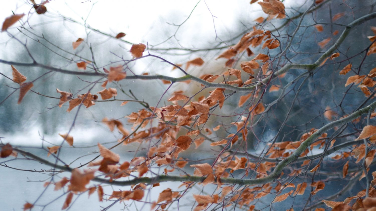
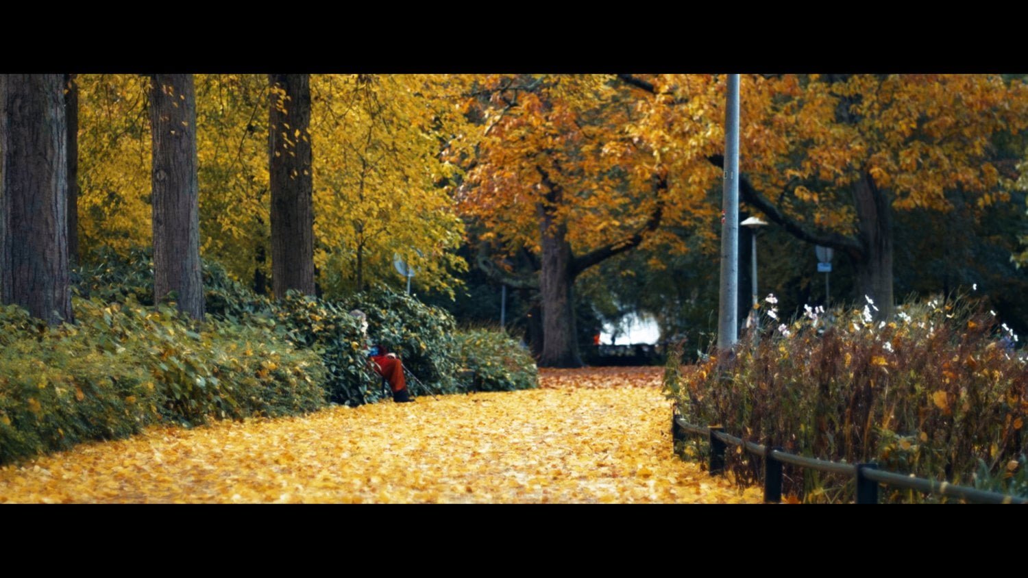
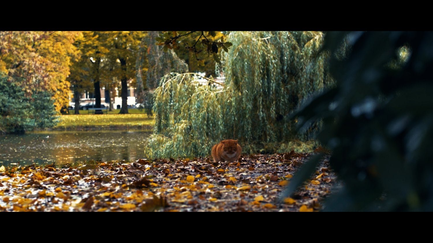
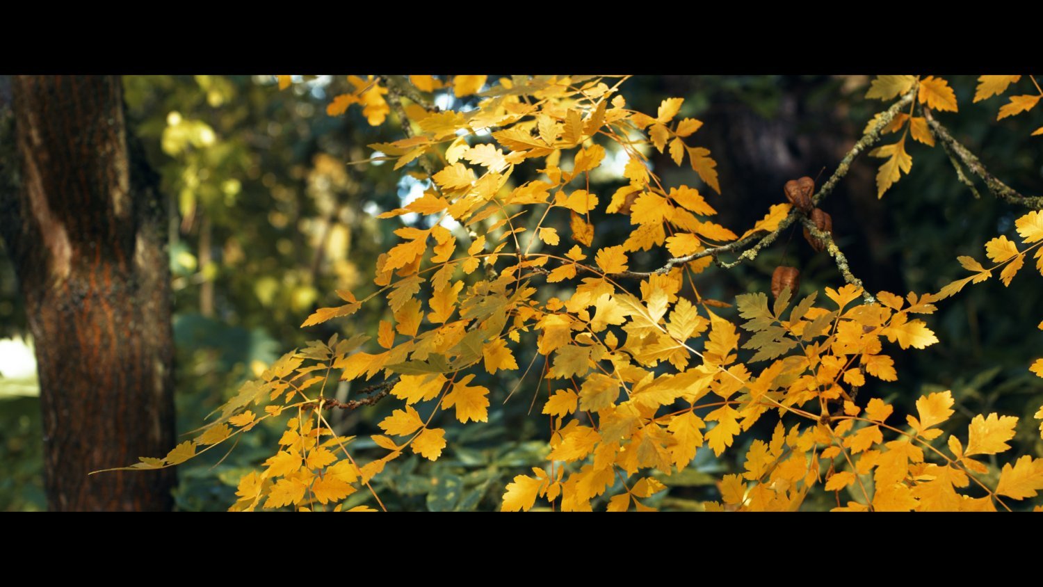
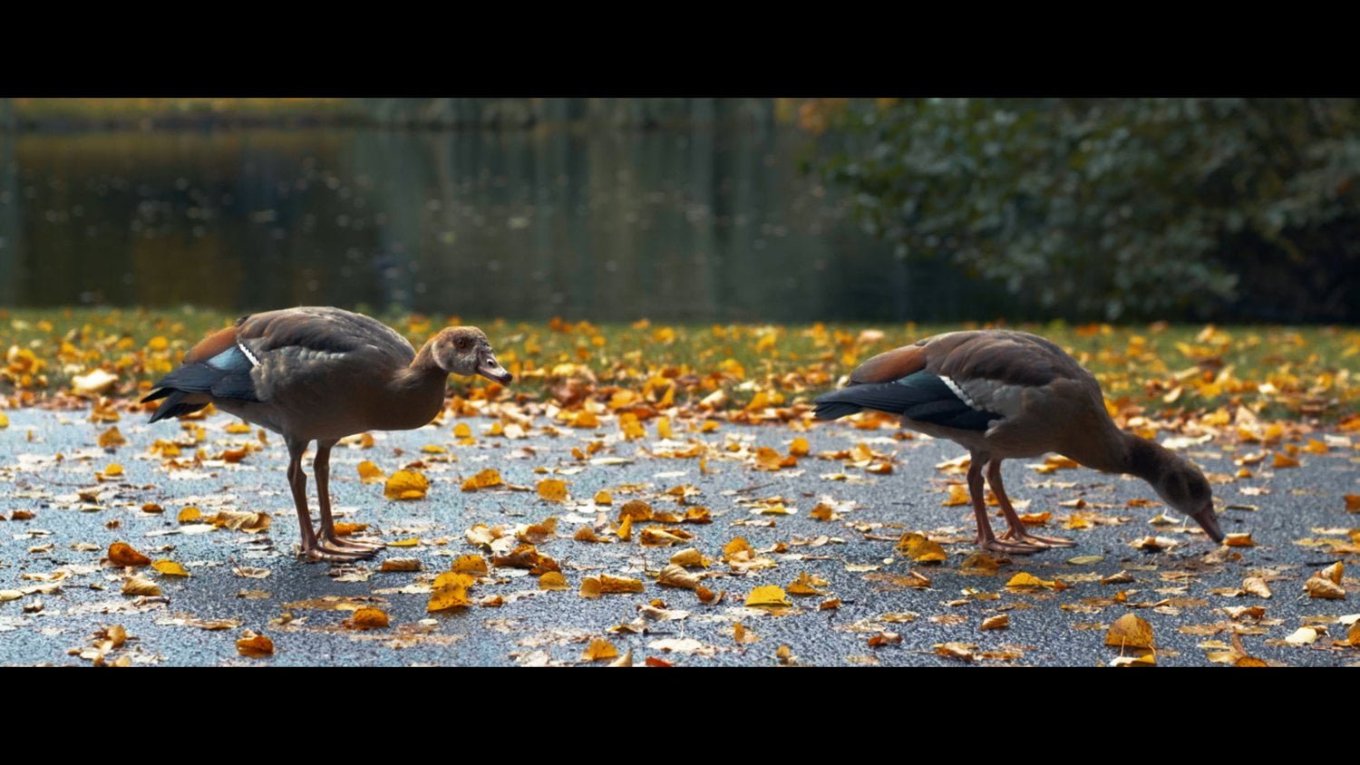
Life in Autumn
In the golden hour of autumn, I went out to capture the beautiful colors and ambience with a vintage Canon lens from the 80’s. The result is truly spectactular.
Videography, color grading and editing by me. The video is accompanied by a new piece of music which finds a home in my Lifelines project.