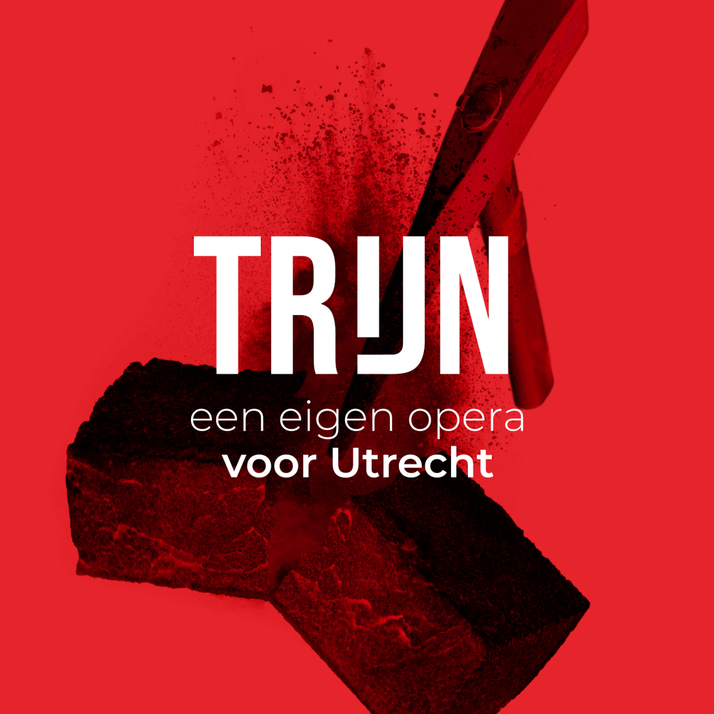
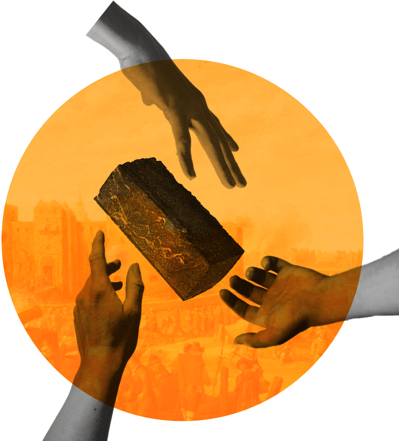
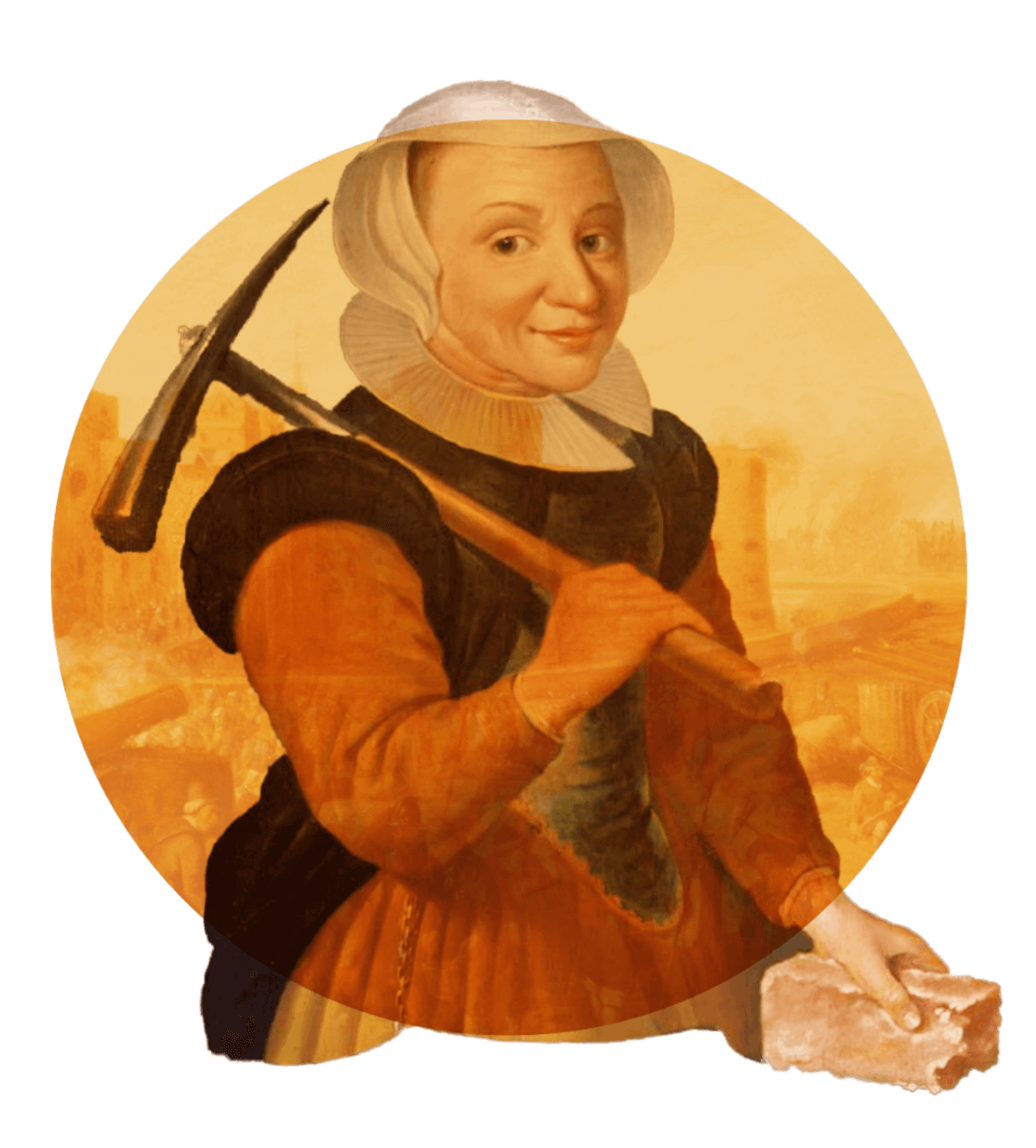
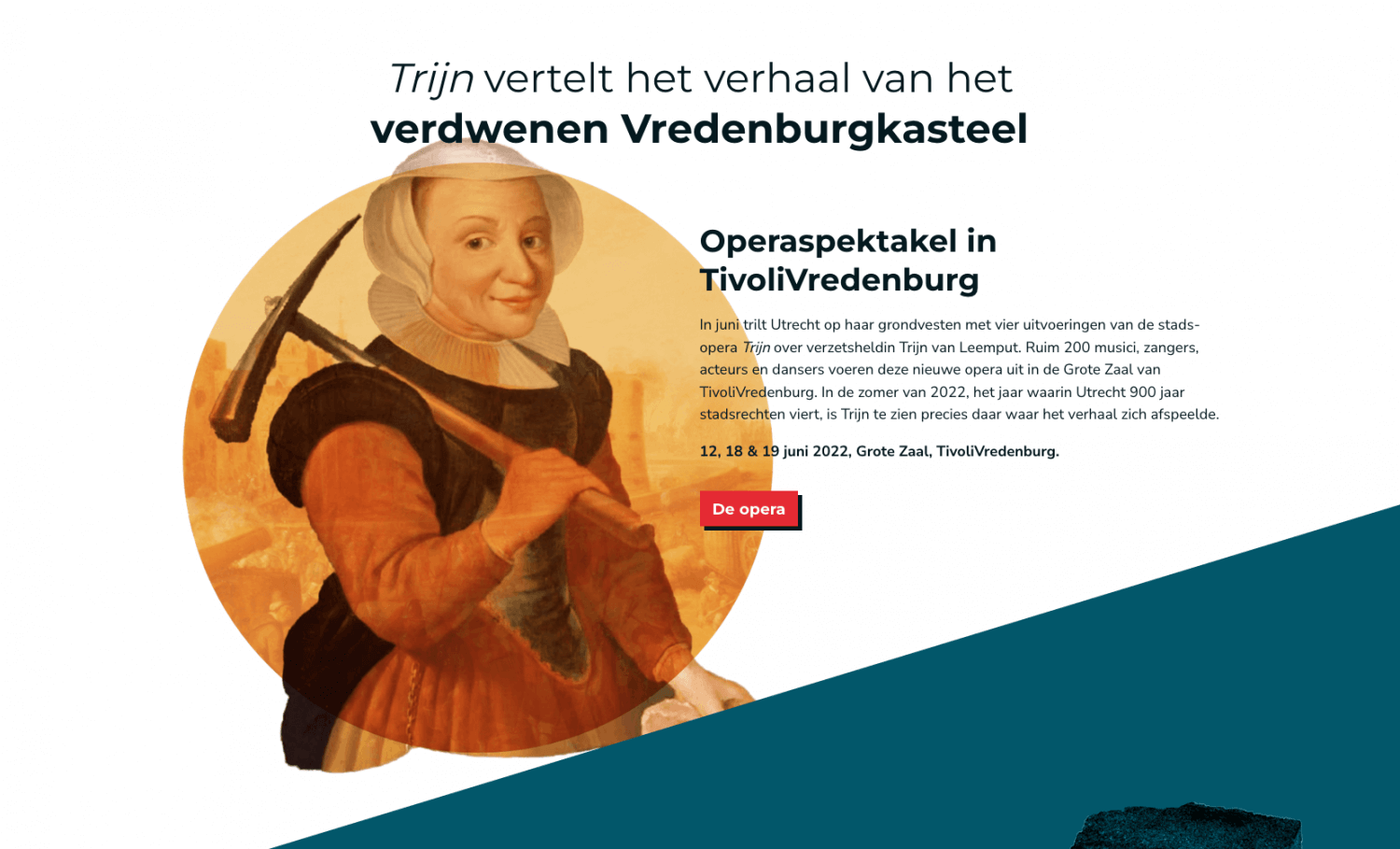
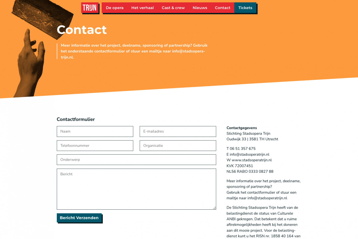
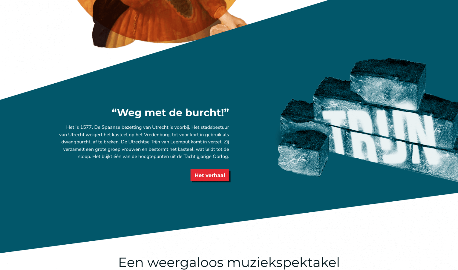
For “Stadsopera Trijn” I designed all visuals and developed their website. The result is a consistent visual language across digital and physical mediums. Stadsopera Trijn produces a newly written opera revolving around Trijn van Leemput, a figure from the 16th century living in Utrecht, who tore down the city’s castle and walls after the conflict with the Spanish ended.
The main colours are red and white – the same as Utrecht’s coat of arms, with the red amped up just a “little” but to give it a bit of a kick. Read on to know more about the process and see more elements that are part of the visuals. Be sure to check out the website!
Breaking down a castle, but make it modern
I always enjoy having to present a dated concept in a new and modern way. It’s an opportunity to bring back history in ways that would otherwise leave it undiscovered. To centre the visual concept around the hilariously simple image of a brick came to me in one of the meetings I had with the organizers of the opera – it just so happened that we sat down in a café with an exposed brick wall. Being a graphics designer is hard y’all!
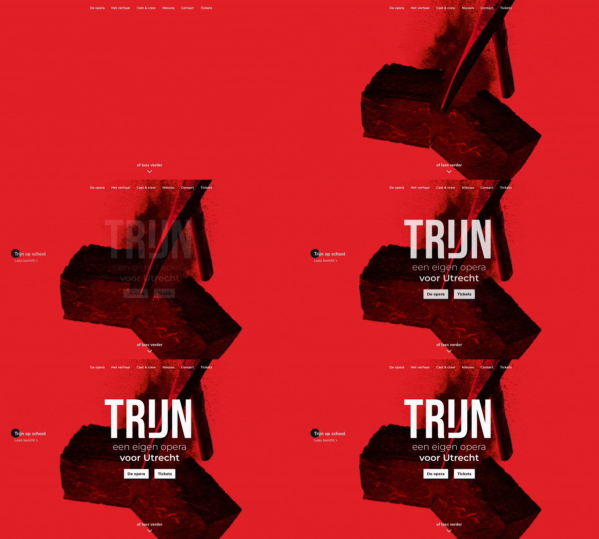
Trijn van Leemput actually tore down the castle and city walls with a pickaxe, I’m not kidding. It’s factually true. Together with a horde of women she stormed the castle with pickaxes in hand and they chopped the whole things down until there was nothing left. I boiled down this whole situation to a simple image: a pickaxe breaking a brick.
Wait, a castle?
Like any modern opera production a big selling point is how relevant the story is in today’s times. We’ve heard it time and time again. For Trijn that is no different. But what does in fact make it relevant is the story’s connection to the city of Utrecht and how many an Utrechter actually has no clue that the city used to have a formidable castle with city walls, let alone what happened to it and that there’s a horrifyingly modern shopping mall on its exact spot right now. Ah, the beauties of urban development.
