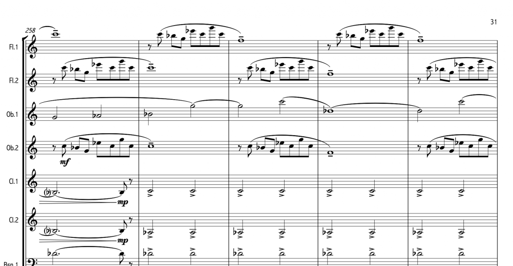
For the ICOS science conference I wrote “Temperature Music”, a piece that translates the current climate crisis to music to better instill its severity in the listener.
Comissioned in 2019 its performance was delayed due to COVID but it finally found its stage in September of 2022, at the ICOS science conference in TivoliVredenburg Utrecht, The Netherlands. The piece was performed by musicians of the Utrechtsch Studenten Concert and was conducted by Sander Teepen. The piece was received to much enthusiasm both from visitors as the (climate) scientists who were present at large.
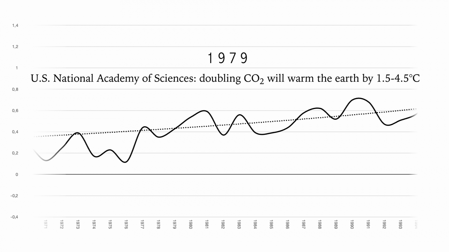
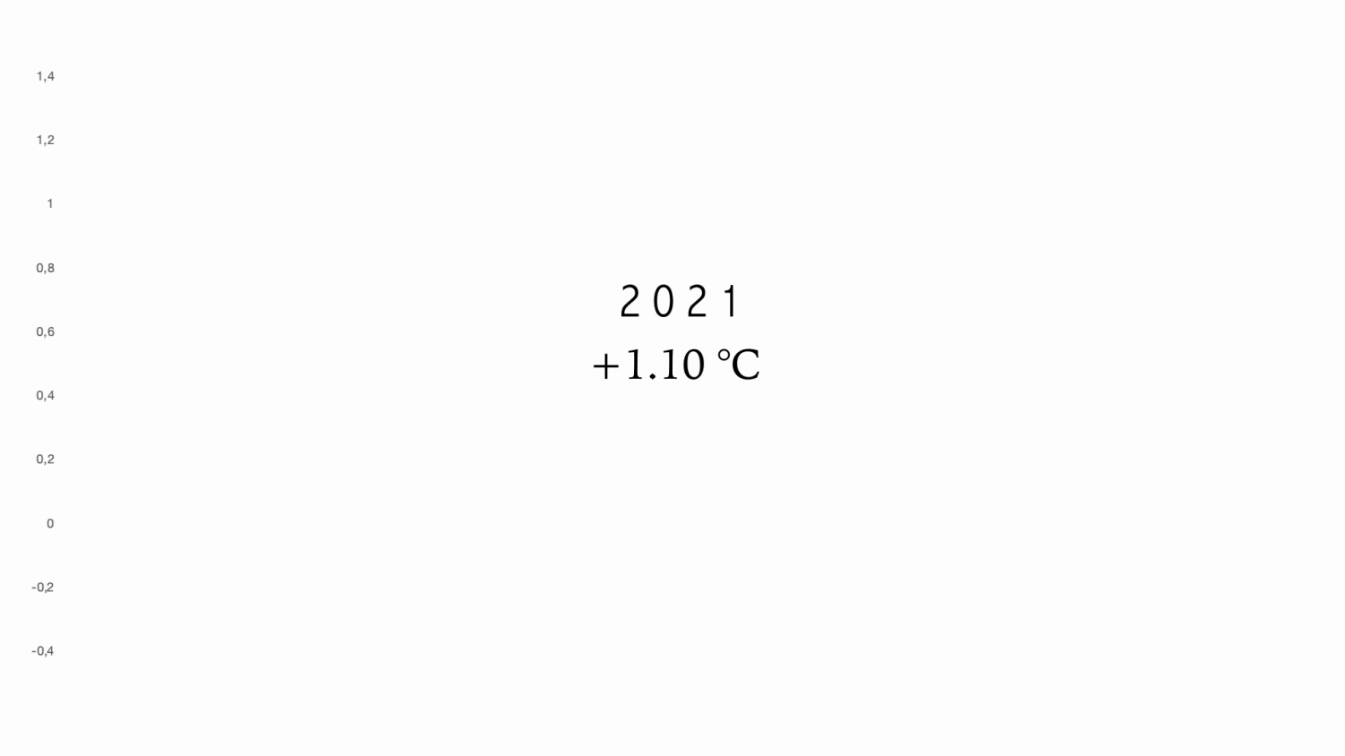
The piece goes through the history of climate change until the present day and is accompanied by an animation displaying several milestones in climate science as well as a graph displaying the increase in temperature over time. With every performance a new snippet of music is added according to the new climate data from the time between the last and the newest performance.
The piece is influenced by minimalism as to display the continuity of the climate crisis.
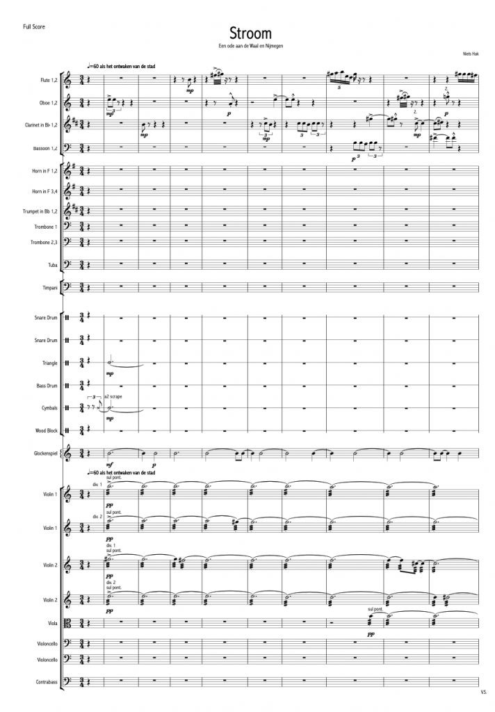
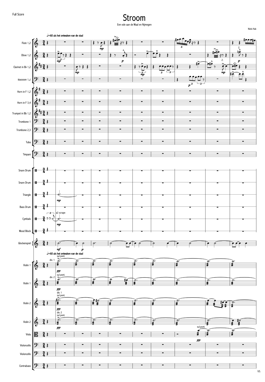
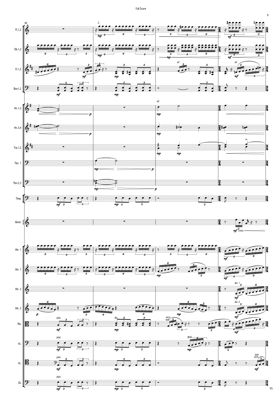
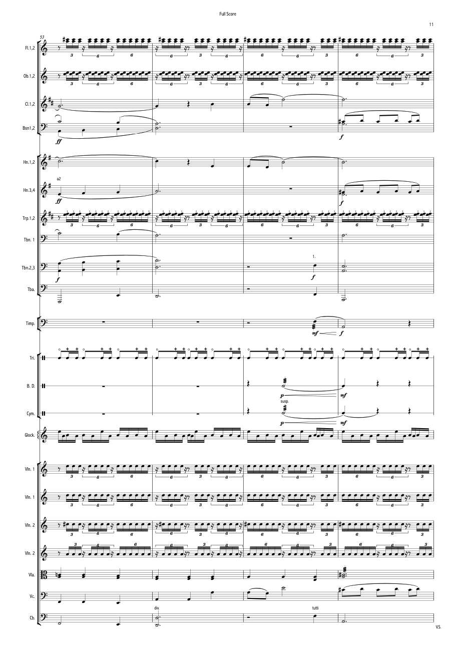
Stroom
Comissioned by “Symfonieorkest Nijmegen”, the symphonic orchestra of Nijmegen, The Netherlands, for their anniversary.
The piece called “Stroom”, or “Stream”, embodies the centuries-old connection between the river Waal and the city of Nijmegen. The piece was commissioned by Symfonieorkest Nijmegen to commemorate their 70-year anniversary. The orchestra is conducted by Frans-Aert Burghgraef. The piece combines natural sounds of the city and nature with sweeping harmonies and unforgiving rhythms, just like how our civilisation has to work together with nature, just like the city of Nijmegen does with the Waal river.
The piece is written for large symphonic orchestra with a duration of 05:30 minutes.
jsConfetti
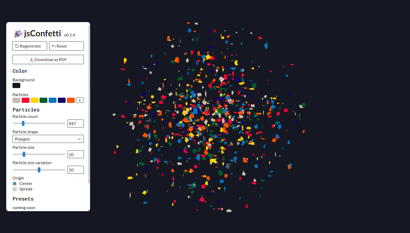
This is an explorative project to challenge myself in javascript codewriting. The project started when I was designing a poster I wanted to decorate with confetti, but I didn’t feel like drawing hundreds of unique confetti flakes to place them randomly around the poster. So, what does one do? You create a generator that does it for you.
Did I actually save time? Probably not. Did I enjoy creating the generator? Most certainly. That’s a win in my books. And on top of that: I have a fun project to work on on and off. Feel free to look around and suggest improvements.
Play around with the live editor here:
Mirage
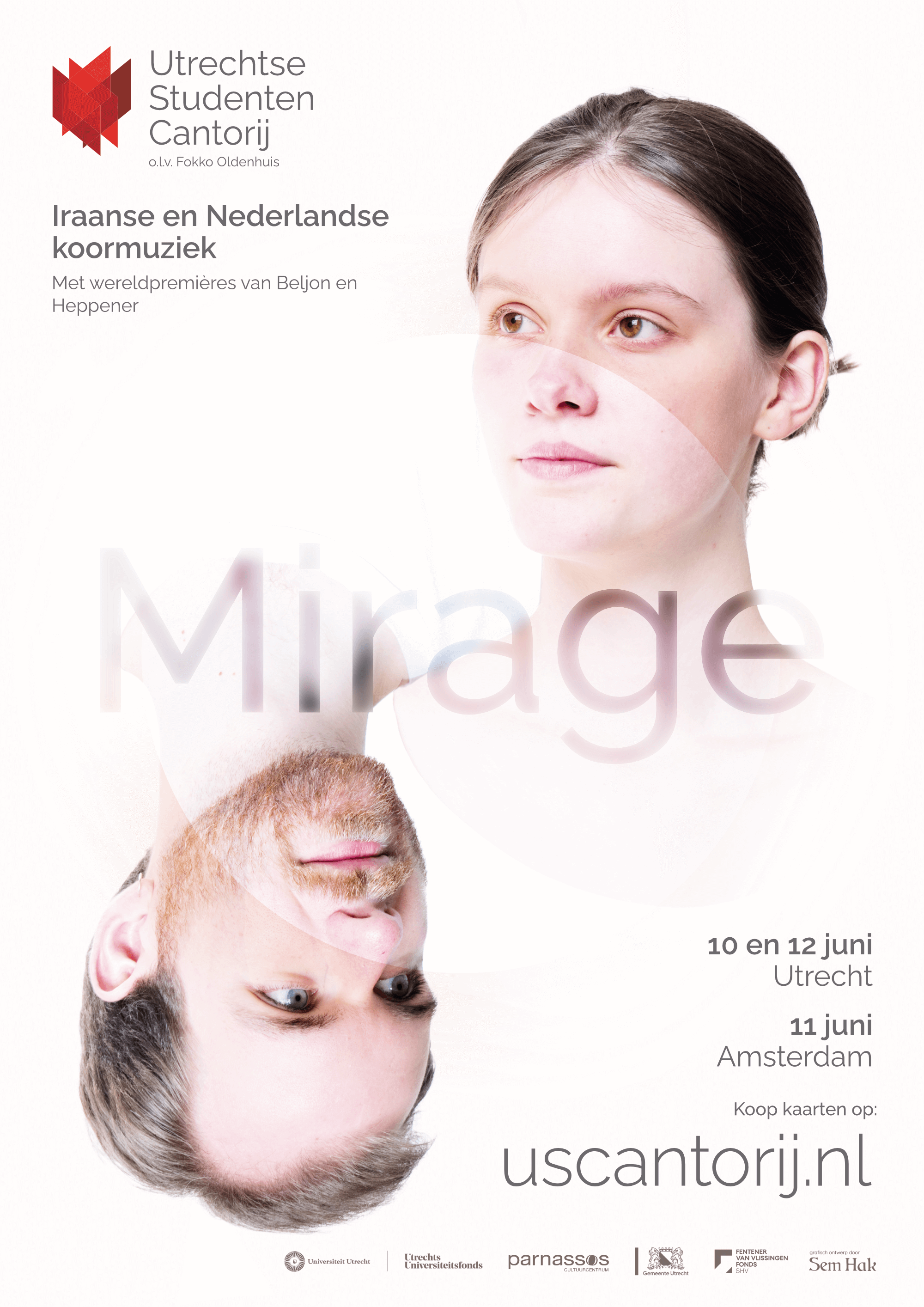
For the Utrechtse Studenten Cantorij I did the photography and graphics design for their marketing campaign for their upcoming program: Mirage.
An open en curious feeling dominates the picture, whereas the white, overflowing circle depicts the mirage. Is it actually there? The porgramme is a combination of Dutch and Iranian compositions, both old and newly written or discovered.
Stadsopera Trijn
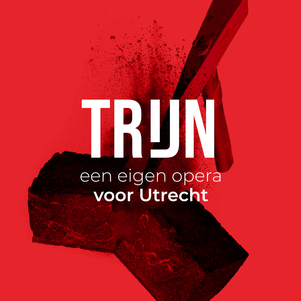
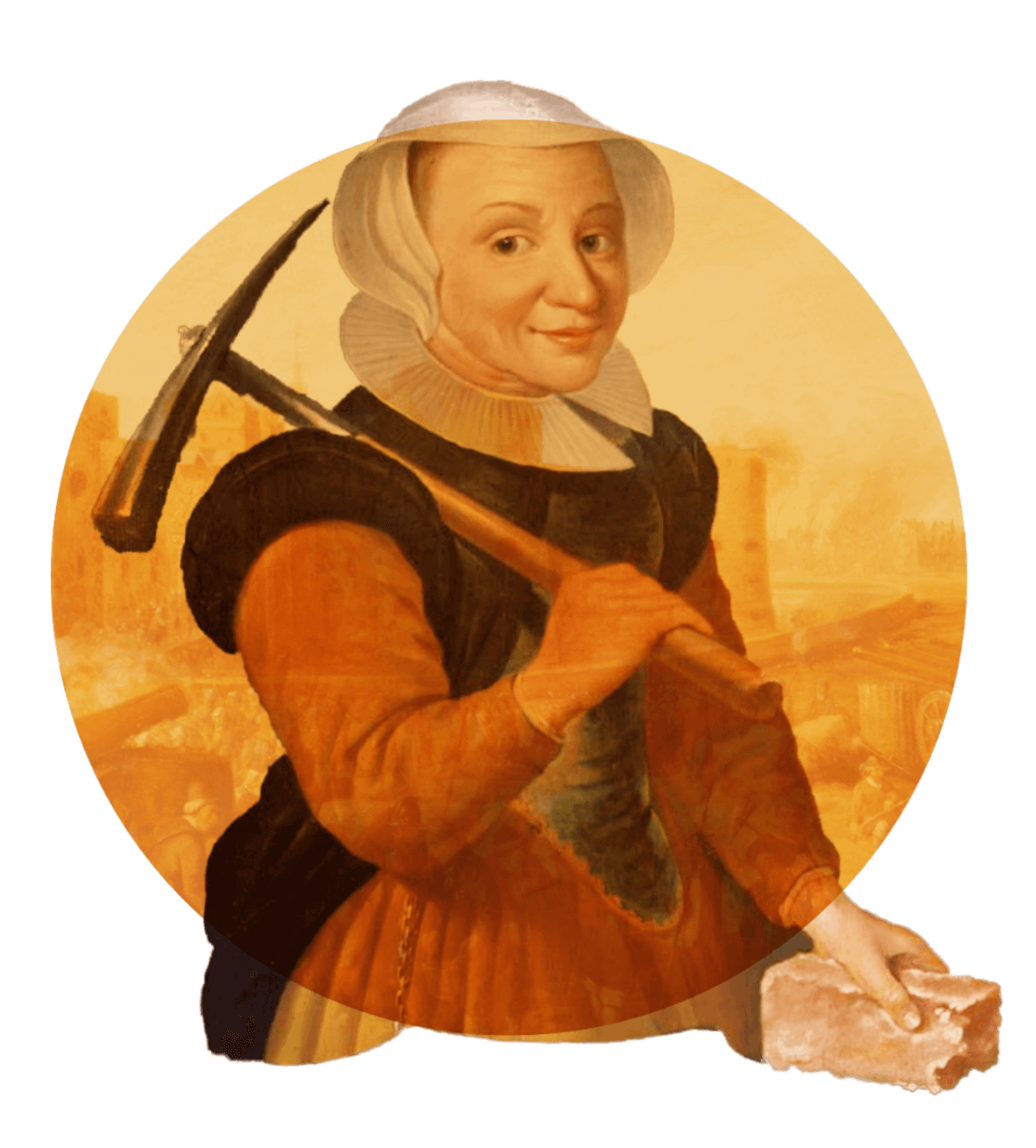
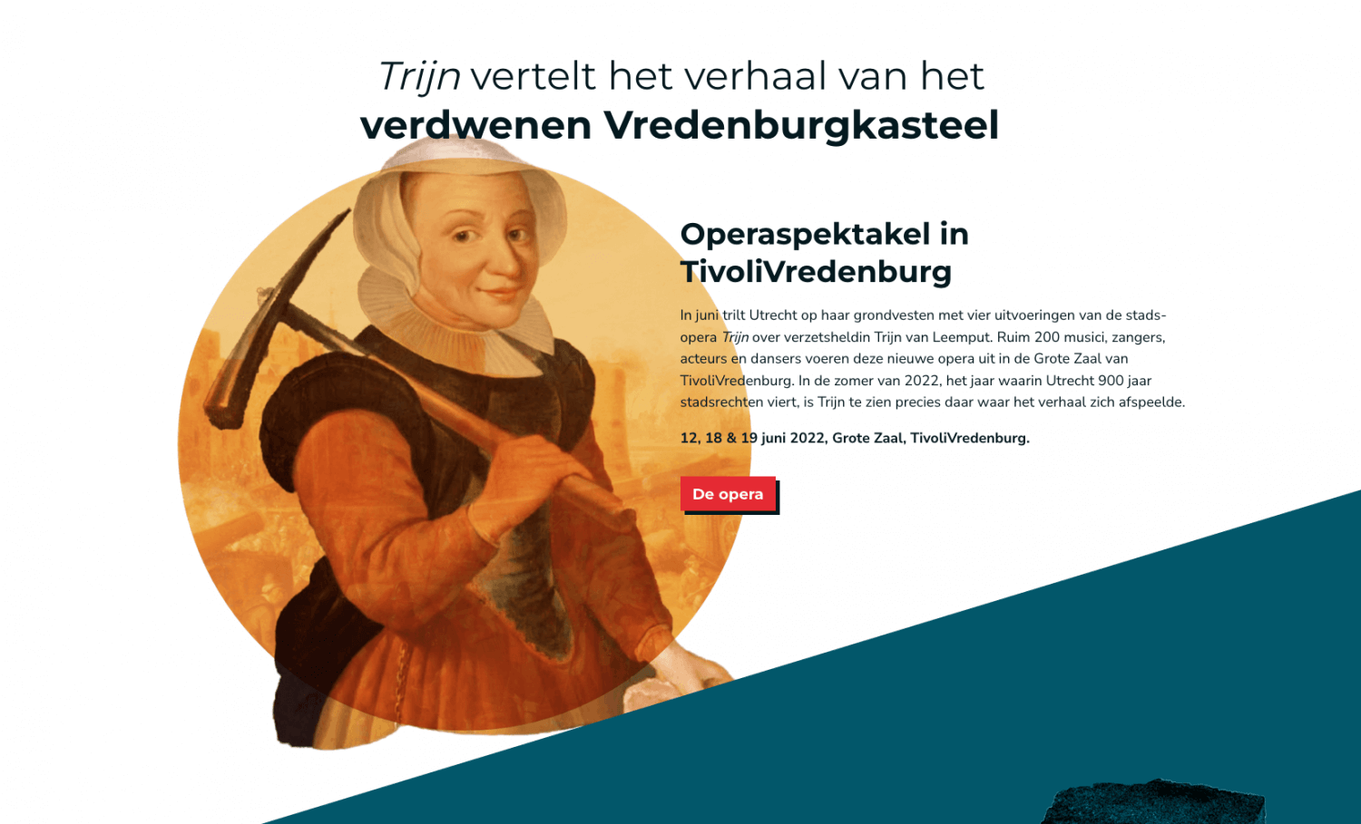
For “Stadsopera Trijn” I designed all visuals and developed their website. The result is a consistent visual language across digital and physical mediums. Stadsopera Trijn produces a newly written opera revolving around Trijn van Leemput, a figure from the 16th century living in Utrecht, who tore down the city’s castle and walls after the conflict with the Spanish ended.
The main colours are red and white – the same as Utrecht’s coat of arms, with the red amped up just a “little” but to give it a bit of a kick. Read on to know more about the process and see more elements that are part of the visuals. Be sure to check out the website!
Breaking down a castle, but make it modern
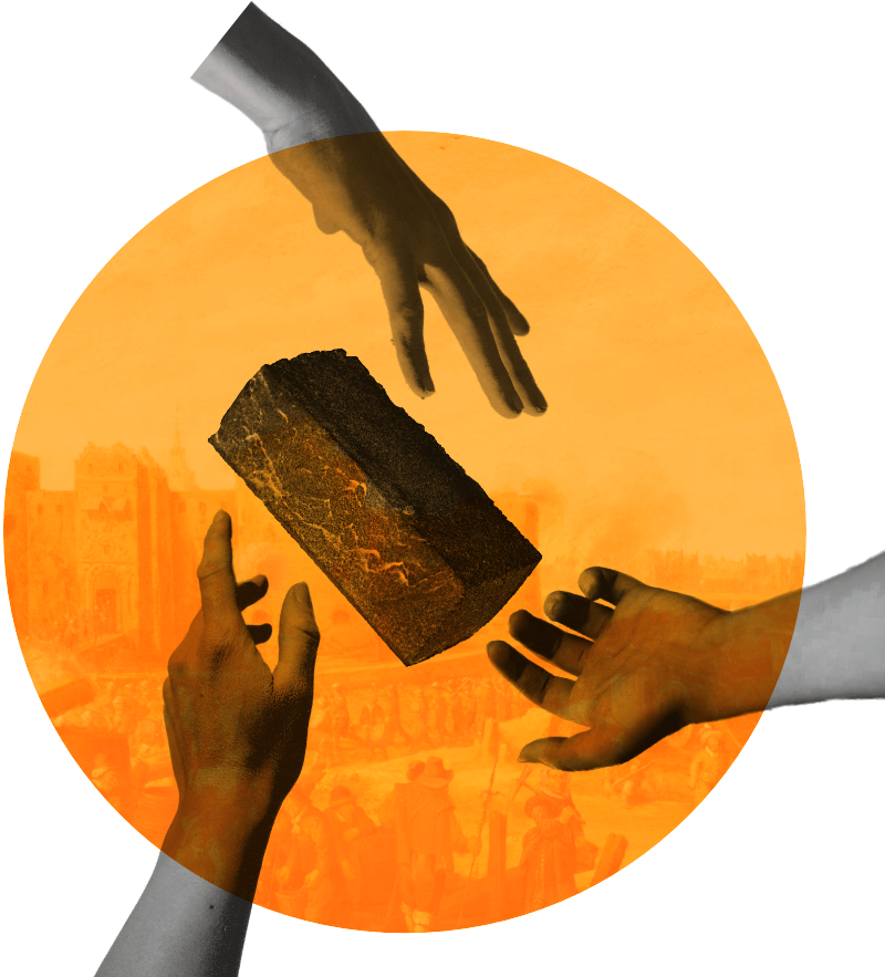
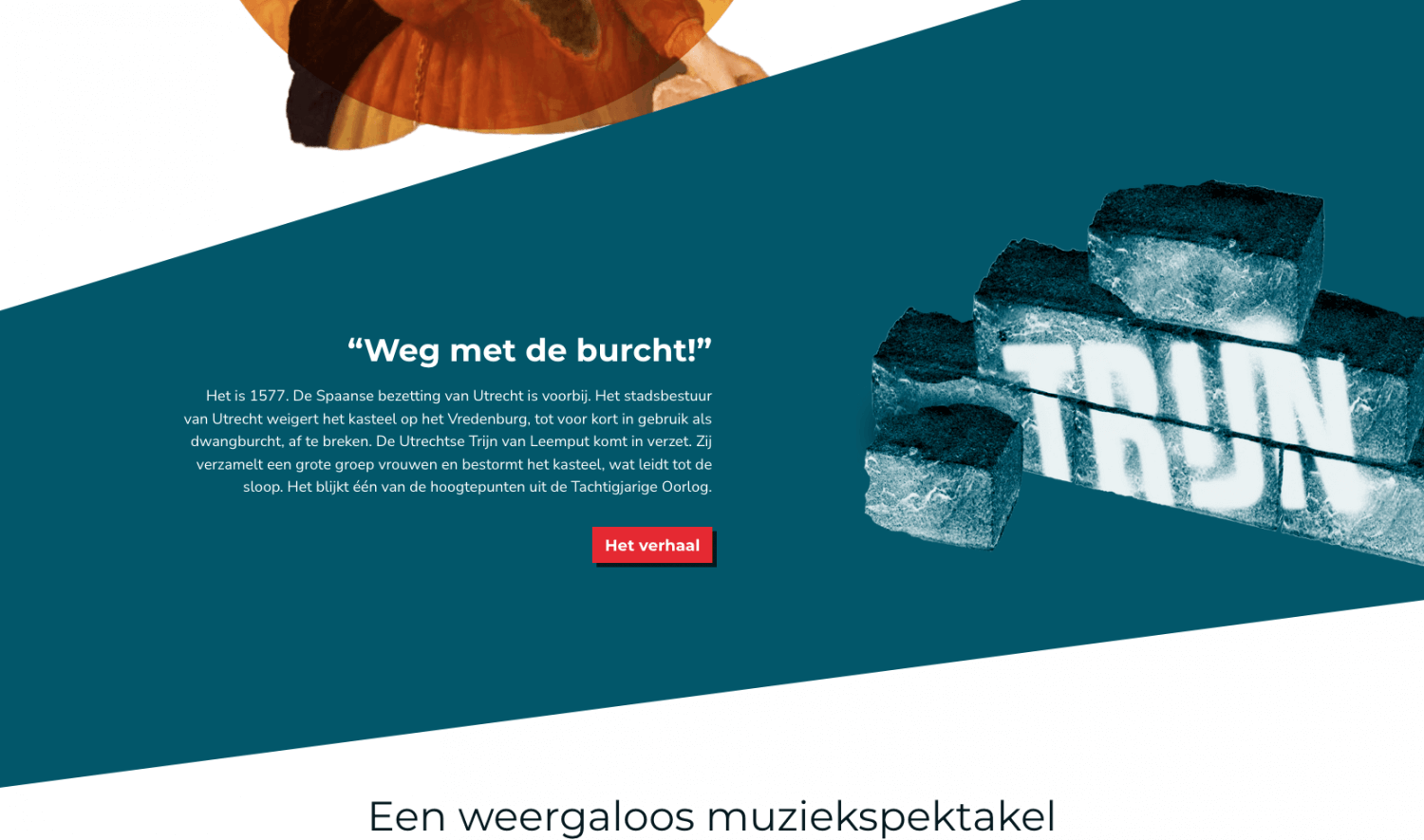
I always enjoy having to present a dated concept in a new and modern way. It’s an opportunity to bring back history in ways that would otherwise leave it undiscovered. To centre the visual concept around the hilariously simple image of a brick came to me in one of the meetings I had with the organizers of the opera – it just so happened that we sat down in a café with an exposed brick wall. Being a graphics designer is hard y’all!
Trijn van Leemput actually tore down the castle and city walls with a pickaxe, I’m not kidding. It’s factually true. Together with a horde of women she stormed the castle with pickaxes in hand and they chopped the whole things down until there was nothing left. I boiled down this whole situation to a simple image: a pickaxe breaking a brick.
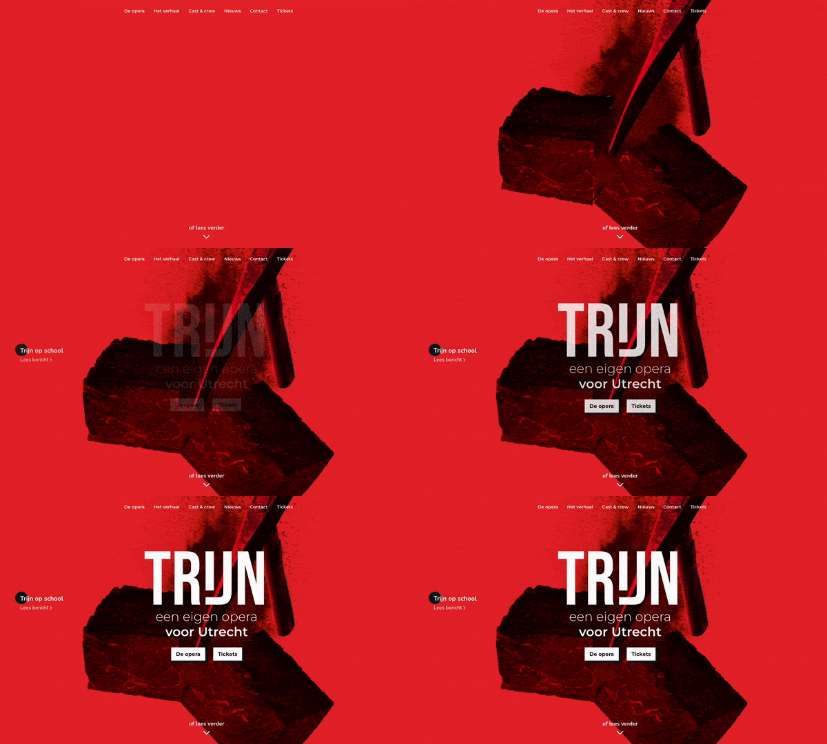
Wait, a castle?
Like any modern opera production a big selling point is how relevant the story is in today’s times. We’ve heard it time and time again. For Trijn that is no different. But what does in fact make it relevant is the story’s connection to the city of Utrecht and how many an Utrechter actually has no clue that the city used to have a formidable castle with city walls, let alone what happened to it and that there’s a horrifyingly modern shopping mall on its exact spot right now. Ah, the beauties of urban development.
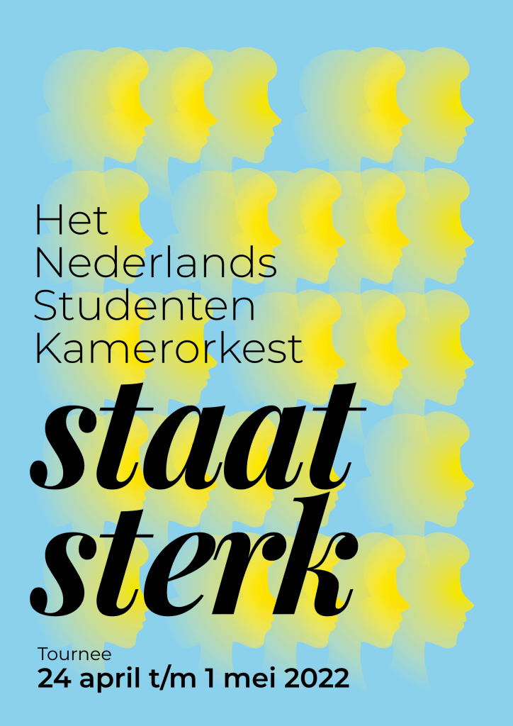
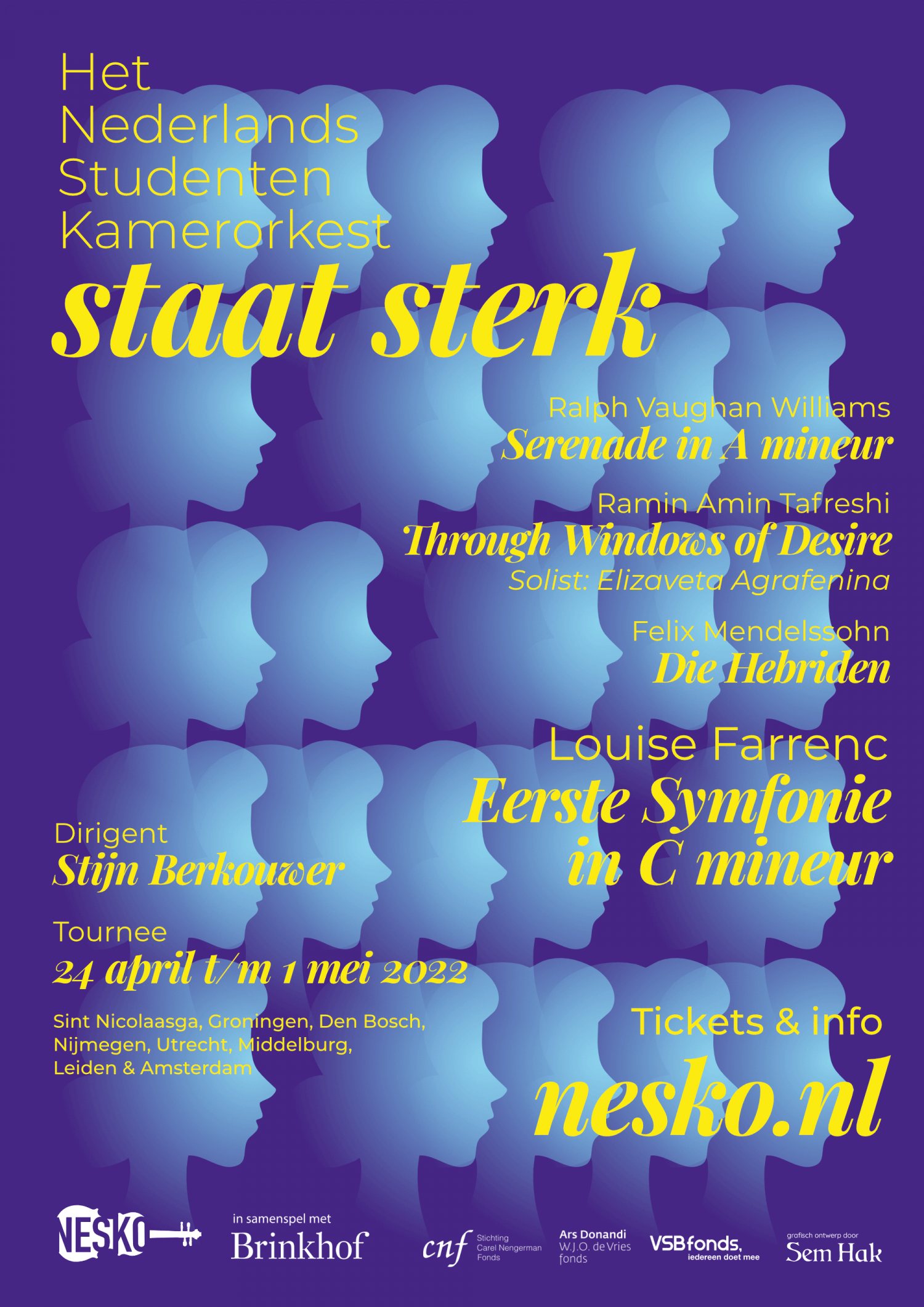
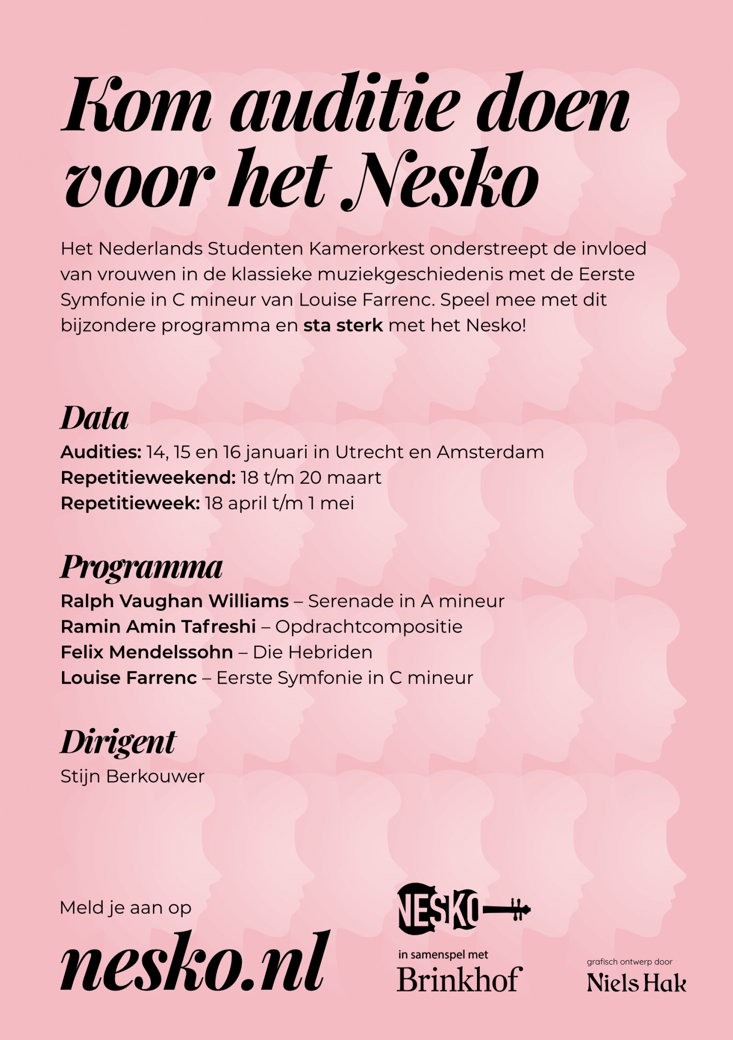
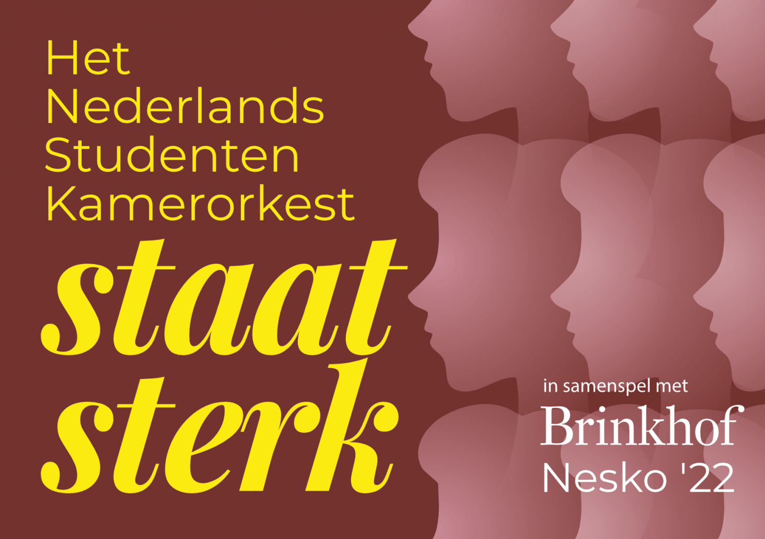
Nesko: Staat Sterk
Since 2018 I have been the in-house designer for the Dutch Student Chamber Orchestra (NESKO), giving every edition its pronounced theme and its comprehensive materials. This includes posters, flyers, stickers, CD-cases and so forth.
The theme of NESKO 2022 is “Staat sterk”, or Stands strong, revolving around their choice for a female composer in the programme.
The Dutch Student Chamber Orchestra is an orchestra which forms yearly from new members to tour The Netherlands and Belgium with classical chamber music.
Oblivion
Dive into a hazy autumn morning.
I can’t get enough of my Lumix camera and the vintage Canon lens I use it with. Waking up one early November morning I found the world shrouded in fog – before I knew I rushed outside with my camera towards the local forest. The result is as mysterious as it is tranquil, almost meditative, video and soundtrack.
Mahler 10
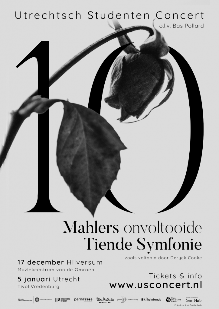
For the Utrechtsch Studenten Concert I designed the visuals for their winter 2021 program.
This winter the USConcert is playing the infamous Tenth Symphony by Gustav Mahler, as completed by Deryck Cooke. This symphony is rarely performed because of its obscurity; Mahler never finished the symphony himself, but a completion was attempted by multiple people, of which Deryck Cooke is one. A performance of the piece is a rare sight already, but a student orchestra performing the piece makes it even more special.
For the visuals I went with a contemplative and solemn feel while still being striking enough to leave an impression on passer-by’s. The symphony, which he wrote during a turbulent personal period, marked the end of Mahler’s life. The music is heavy and gripping, with musicologists suggesting the music at times refers to Mahler’s feelings towards his wife cheating.
The rose is a nod to the visuals I made in 2016 for the same orchestra, but then for Mahler’s Second Symphony, which featured mainly roses in full colour. The sharp ends on the numerals mimic thorns.
Distant Light
“Distant Light” is an animation created for the choir piece by the same title. Based on Illustrations by Paul van Gemen and on text by Elea Bekkers. Animation and composition by me. Arranged for high voices by Hansje van Welbergen.
Performed by Veronika Akhmetchina, Marleen van Os, Channe Visscher, Viktoria Nikolova, Sylvia Boone, Hansje van Welbergen and Elea Bekkers.
Text:
The trees seem green. The yellow leaves float feebly to the forest floor.
And as she took off she realised she could not fly.
Not even the sun now warmed the city that had killed her dreams.
The light is low and they could only fall.
Queercare.nl
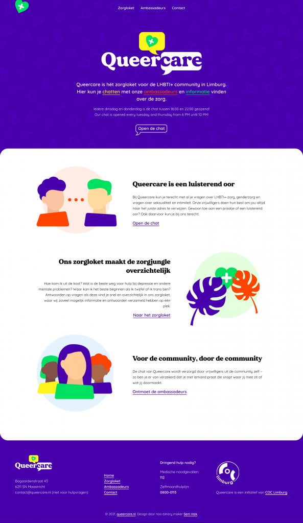
For COC Limburg I designed and developed their Queercare website concept: a place where LGBTQ+ people in Limburg can turn to to chat with other people in the community and find info about available LGBTQ+ care.
Vibrant and active colours are the heart of this design, telling the visitors that your colours are welcome here, just like the community is full of all different colours. Throughout the website abstract avatars are used, sometimes based on the people that run the chat.
Visit the website here and have a look around!
