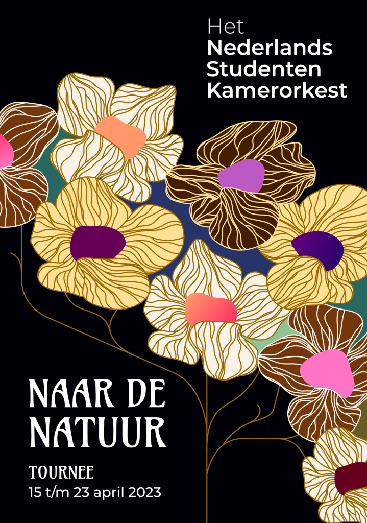
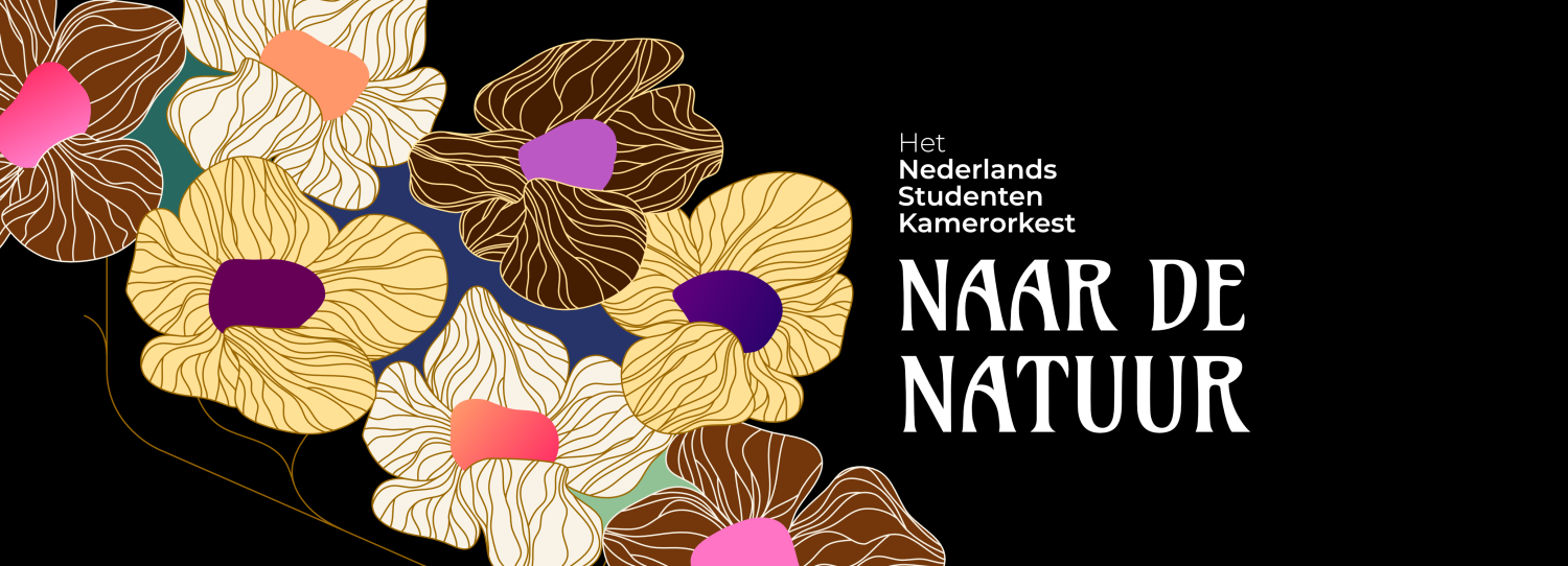
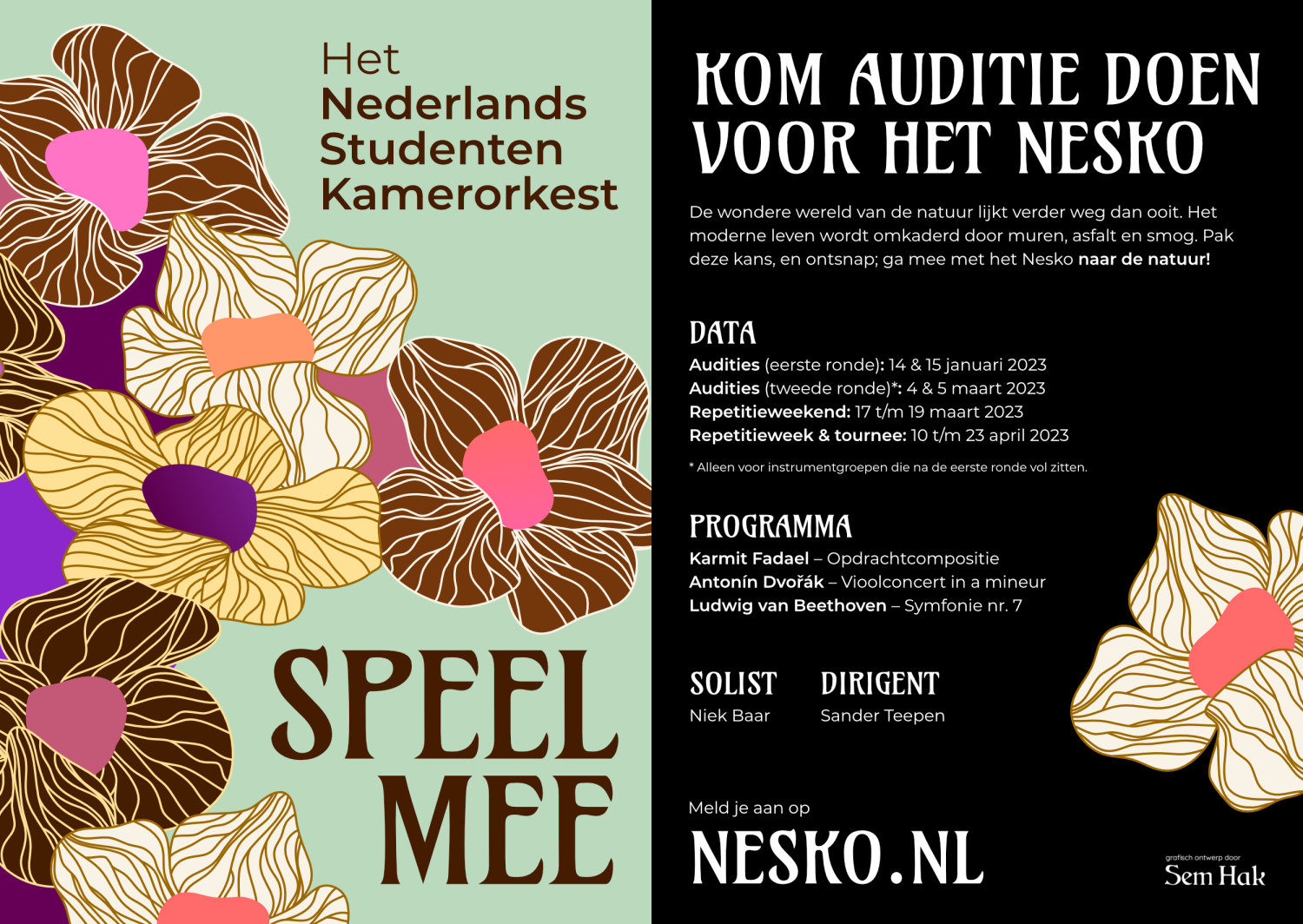
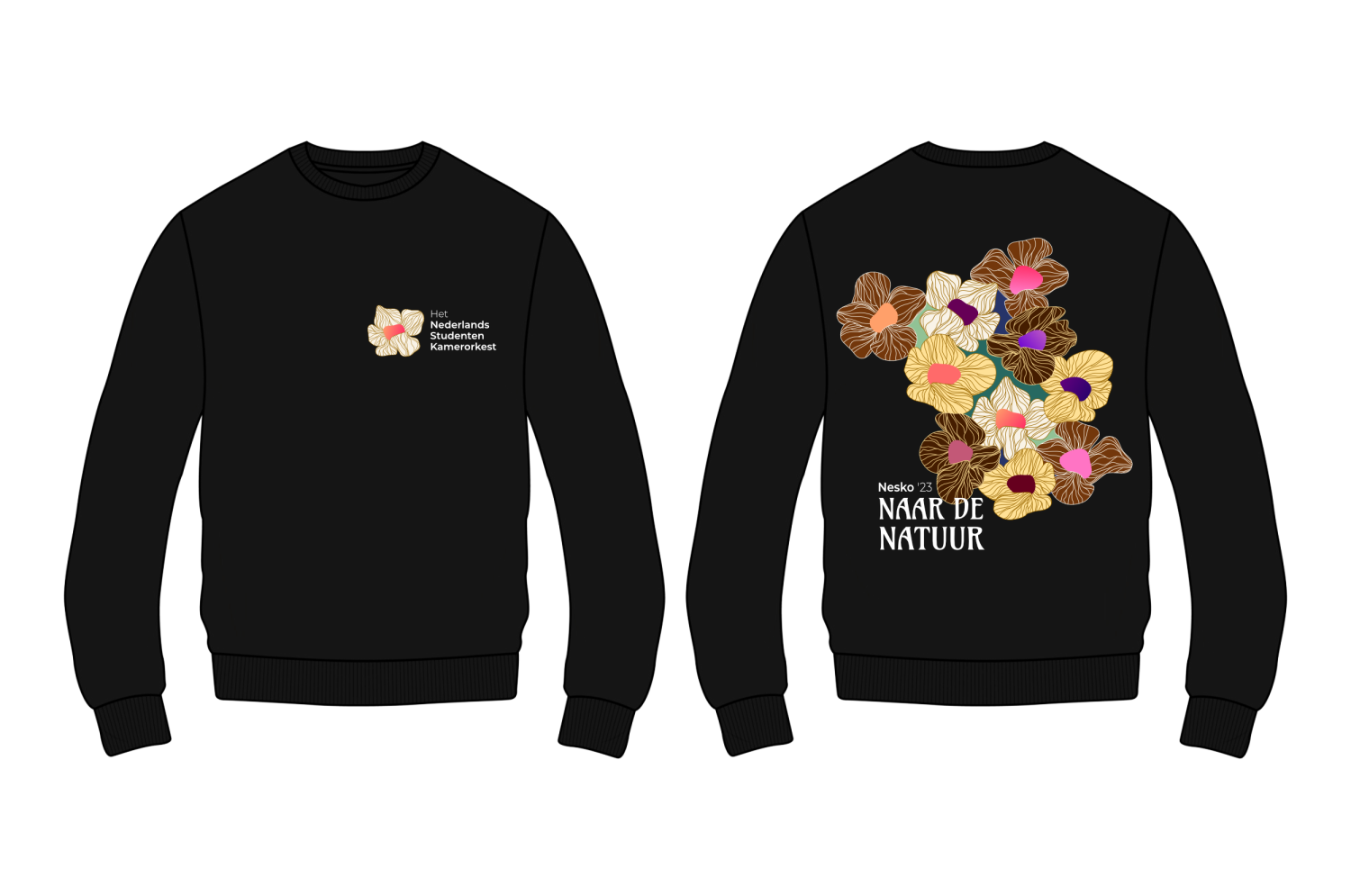
For the Nederlands Studenten Kamerorkest (Dutch Student Chamber Orchestra) I designed the visuals for their 2023 tour, dubbed “Naar de natuur”, into nature, inspired by the 20th century Jugendstil movement. The designs feature variation of abstract flowers and stalks, in a mix of artificial and natural colors.
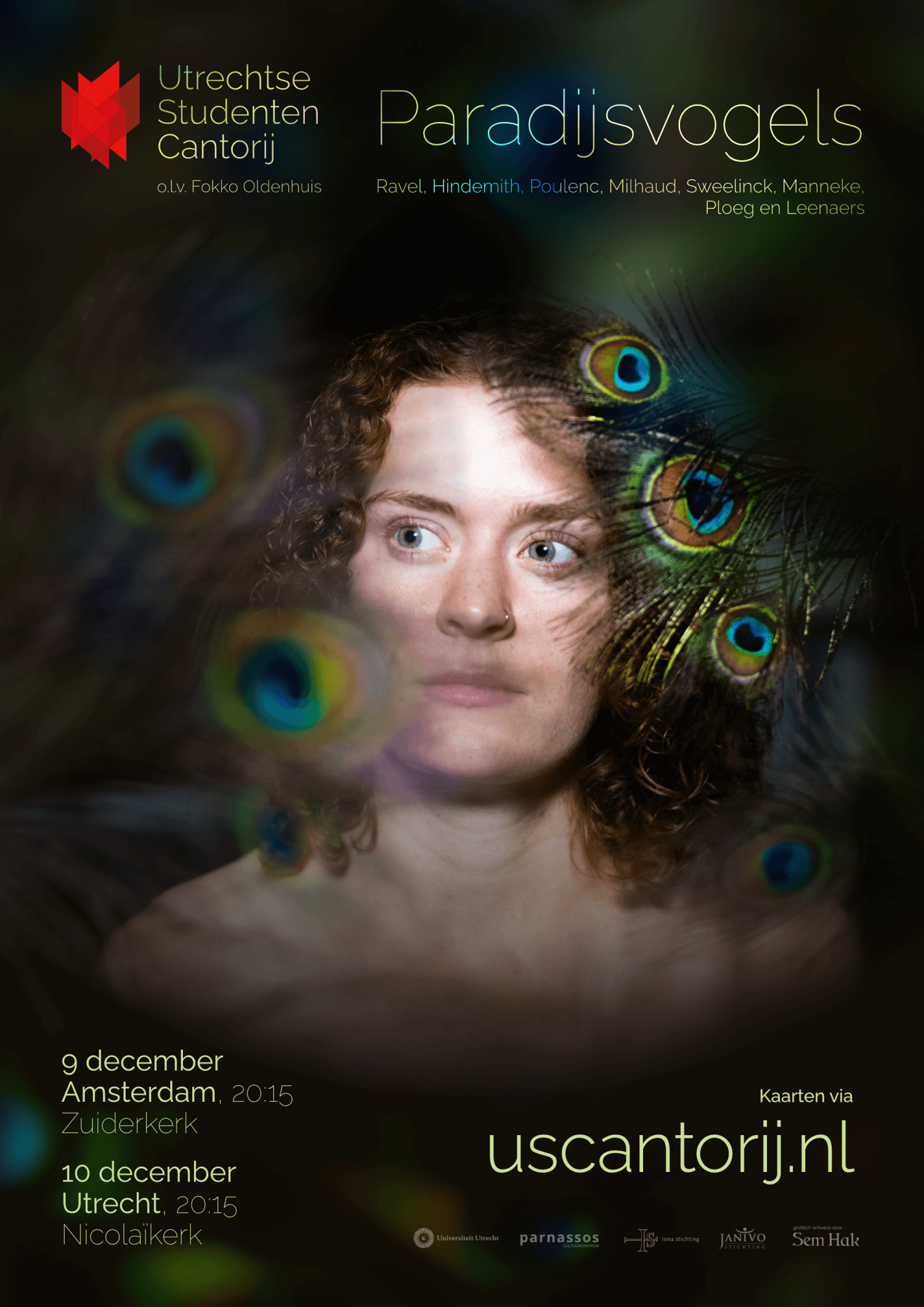
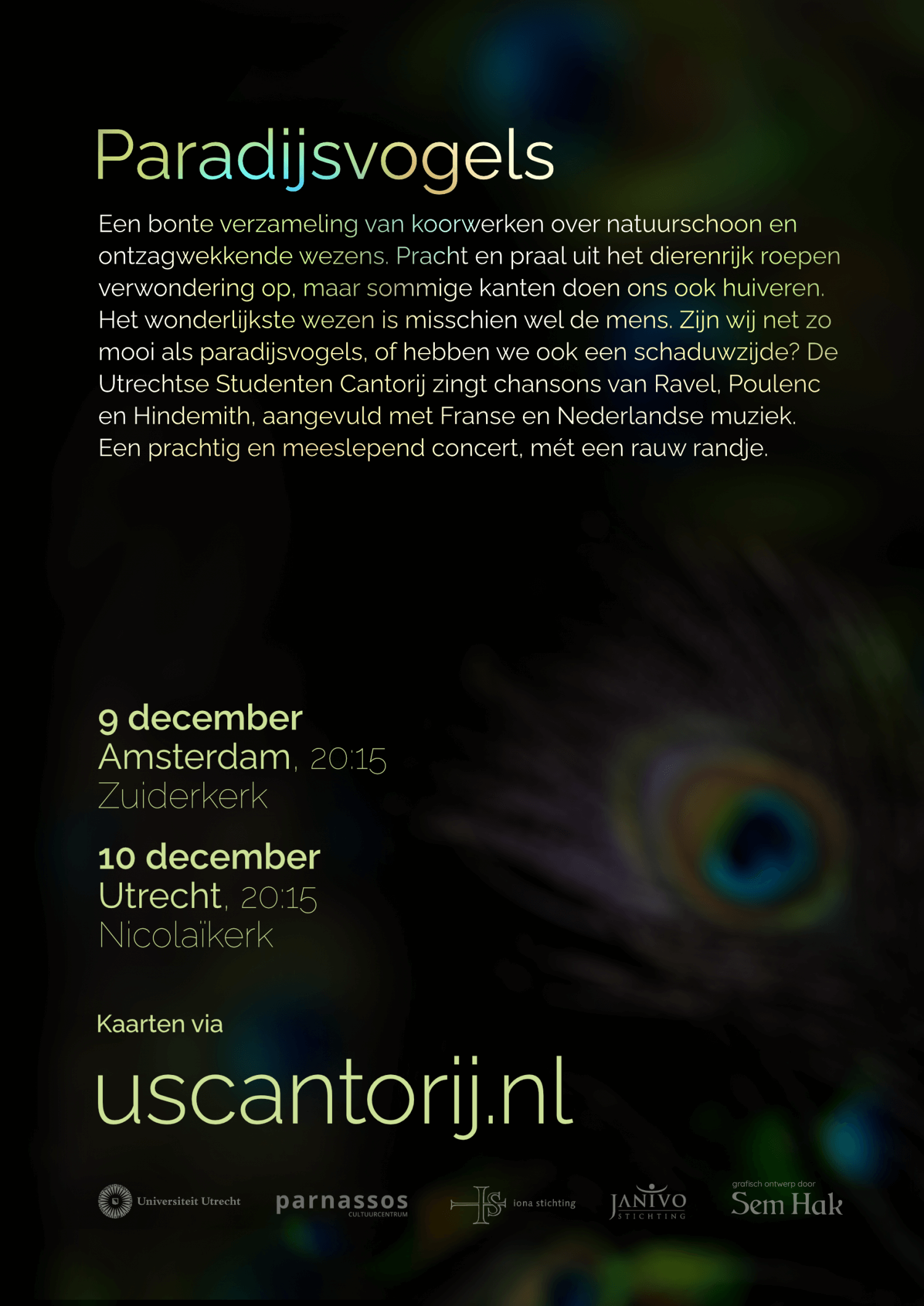
Birds of Paradise

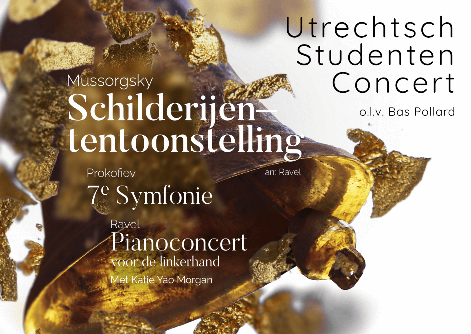
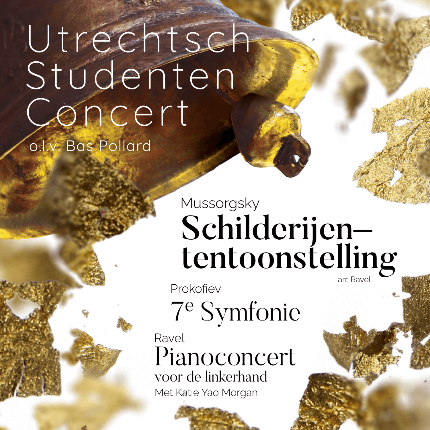
The Great Gate of Kiev

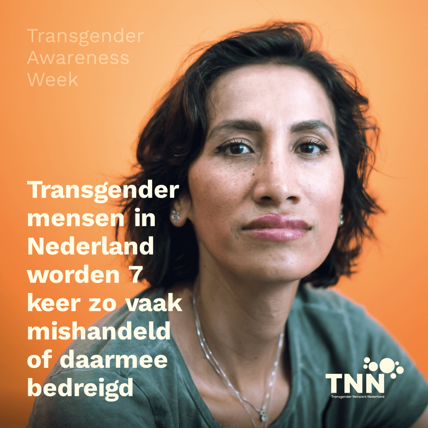
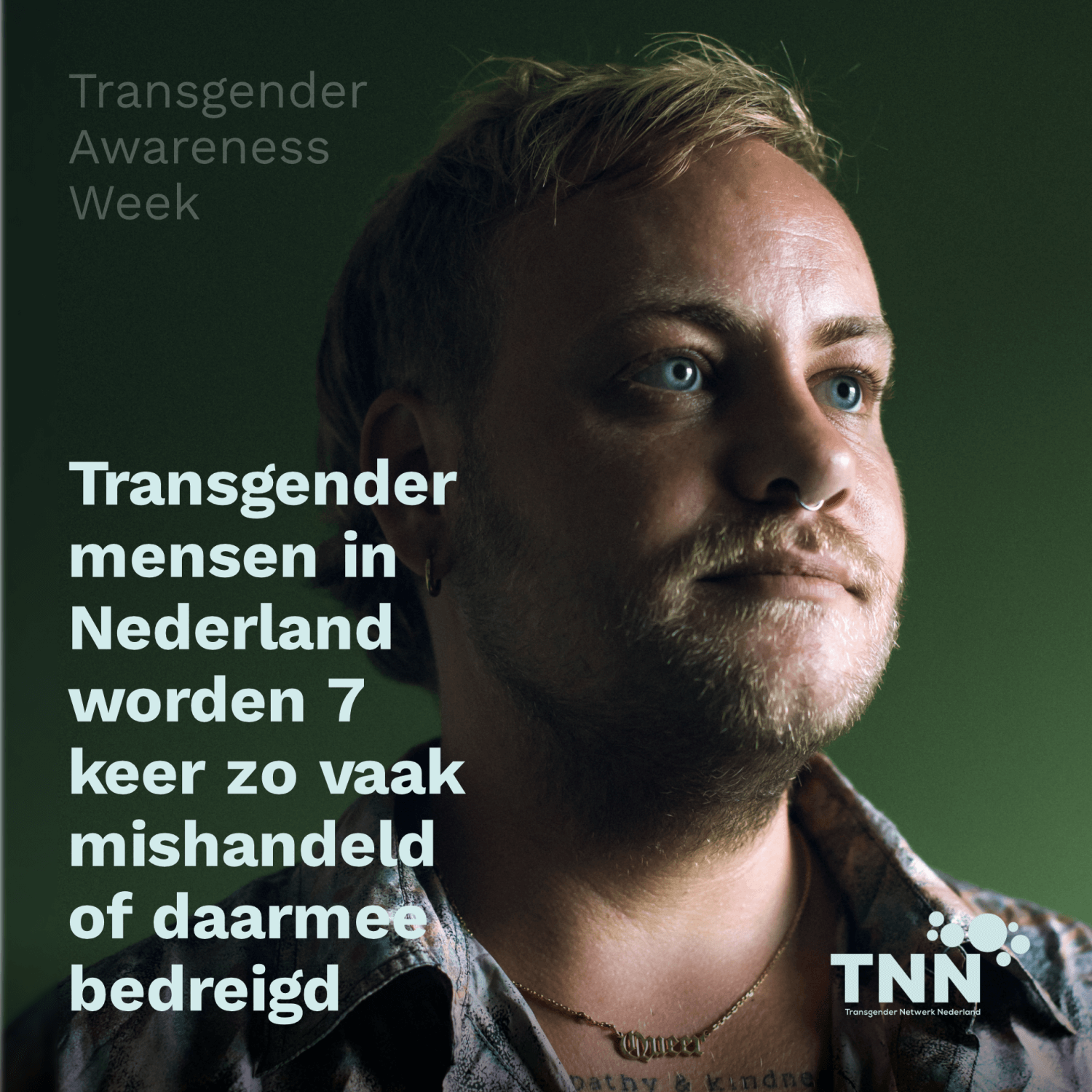
Transgender Awareness
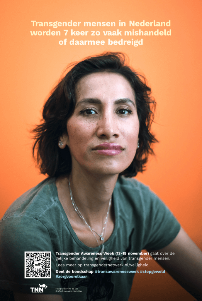
Together with the brilliant photographer Prins de Vos I created two posters commissioned by Transgender Netwerk Nederland (Dutch Transgender Network) to be spread around Rotterdam in bus stops.
Transgender Awareness Week is a week when transgender people and their allies take action to bring attention to the community by educating the public about who transgender people are, sharing stories and experiences, and advancing advocacy around issues of prejudice, discrimination, and violence that affect the transgender community.

Mirage
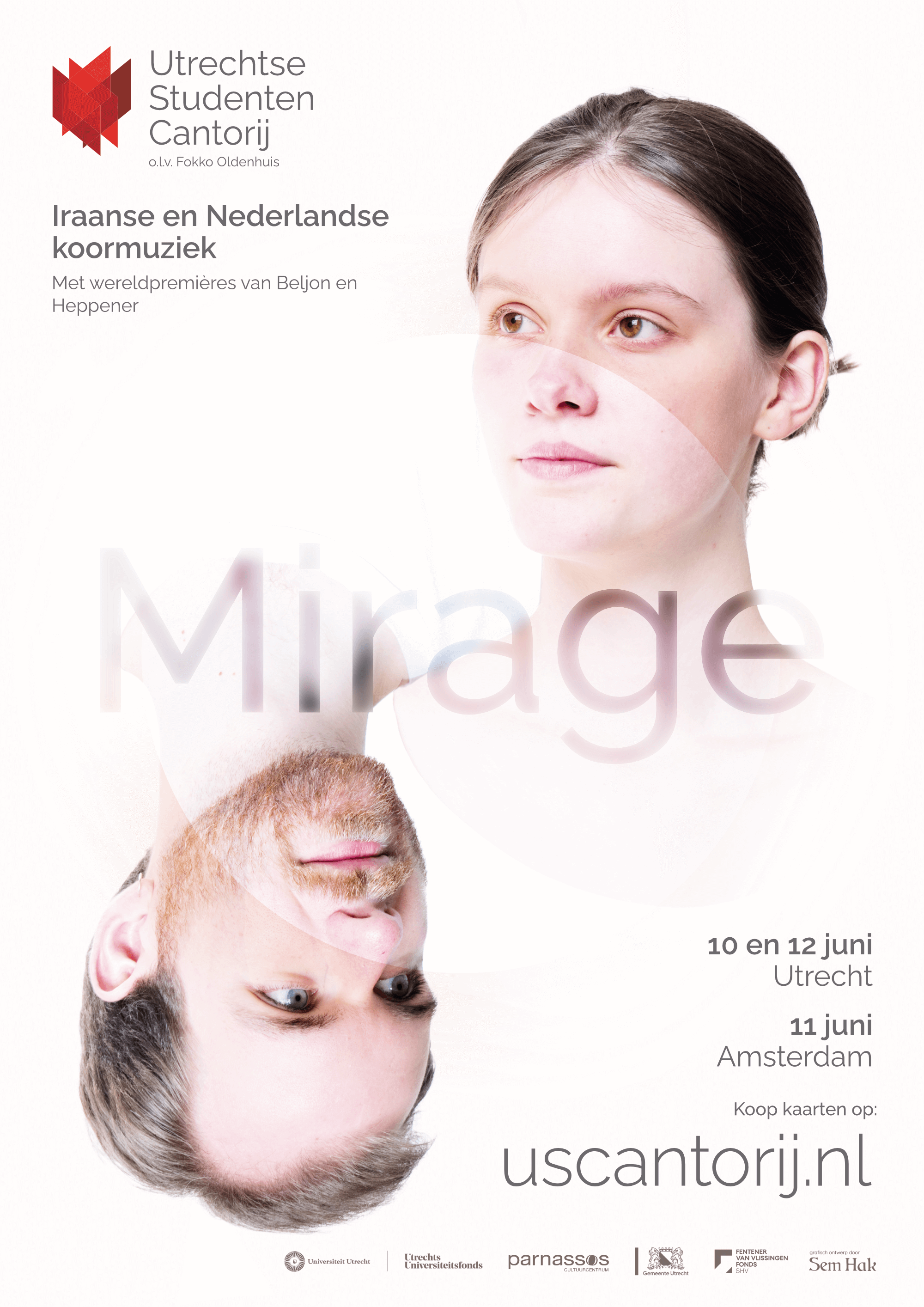
For the Utrechtse Studenten Cantorij I did the photography and graphics design for their marketing campaign for their upcoming program: Mirage.
An open en curious feeling dominates the picture, whereas the white, overflowing circle depicts the mirage. Is it actually there? The porgramme is a combination of Dutch and Iranian compositions, both old and newly written or discovered.
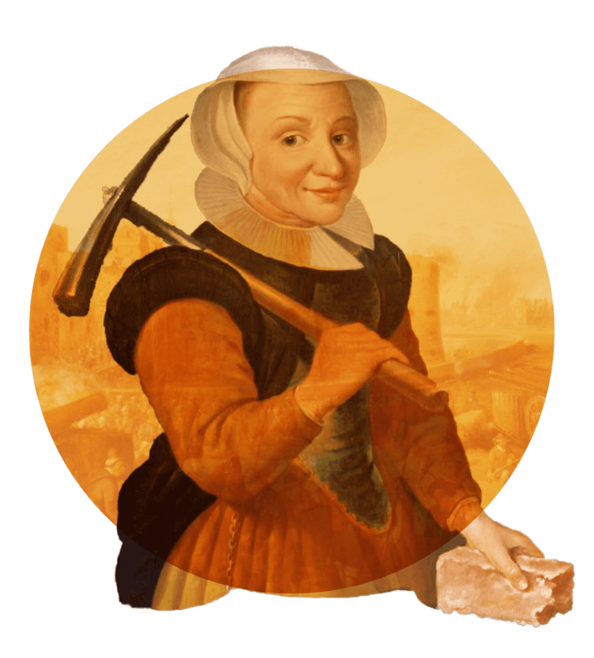
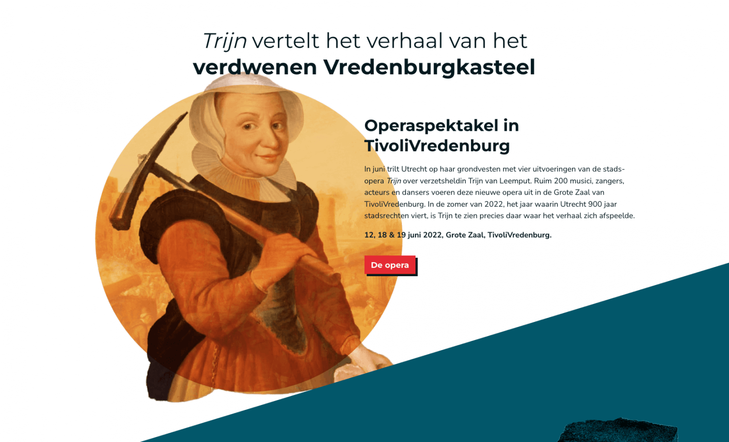
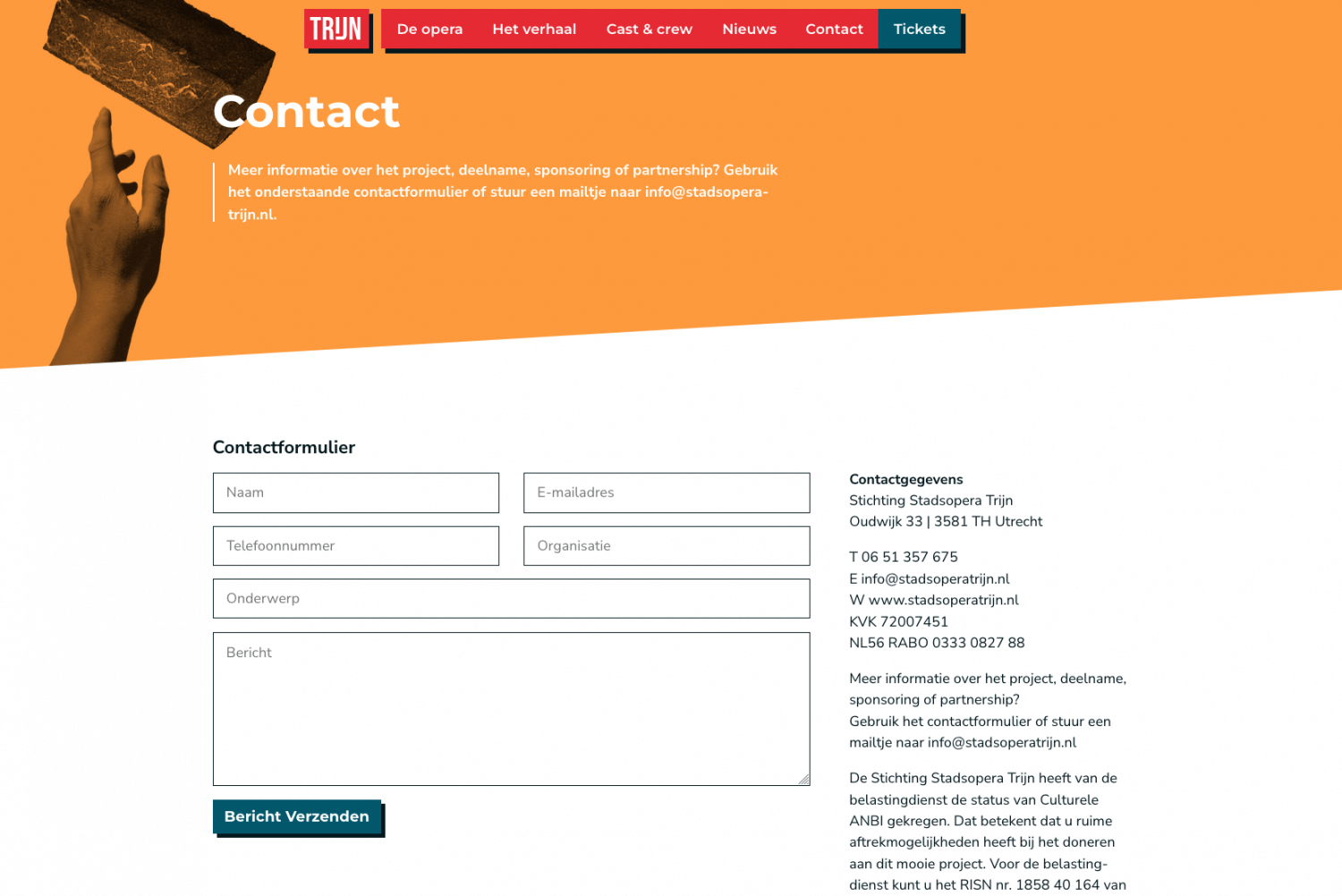
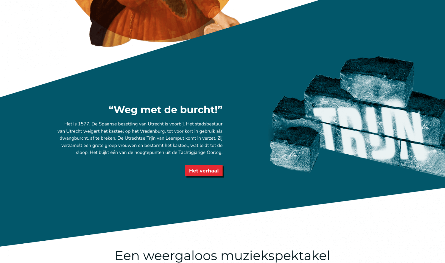
Stadsopera Trijn
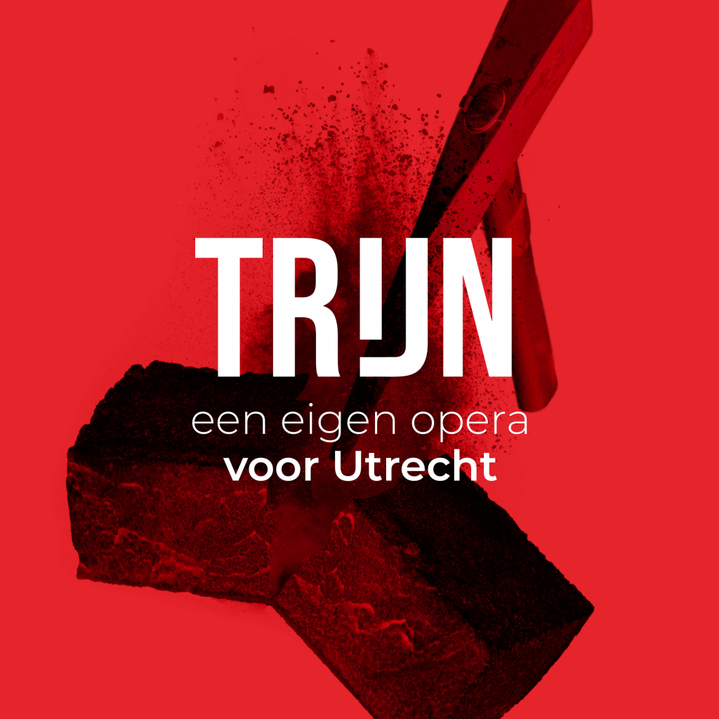
For “Stadsopera Trijn” I designed all visuals and developed their website. The result is a consistent visual language across digital and physical mediums. Stadsopera Trijn produces a newly written opera revolving around Trijn van Leemput, a figure from the 16th century living in Utrecht, who tore down the city’s castle and walls after the conflict with the Spanish ended.
The main colours are red and white – the same as Utrecht’s coat of arms, with the red amped up just a “little” but to give it a bit of a kick. Read on to know more about the process and see more elements that are part of the visuals. Be sure to check out the website!
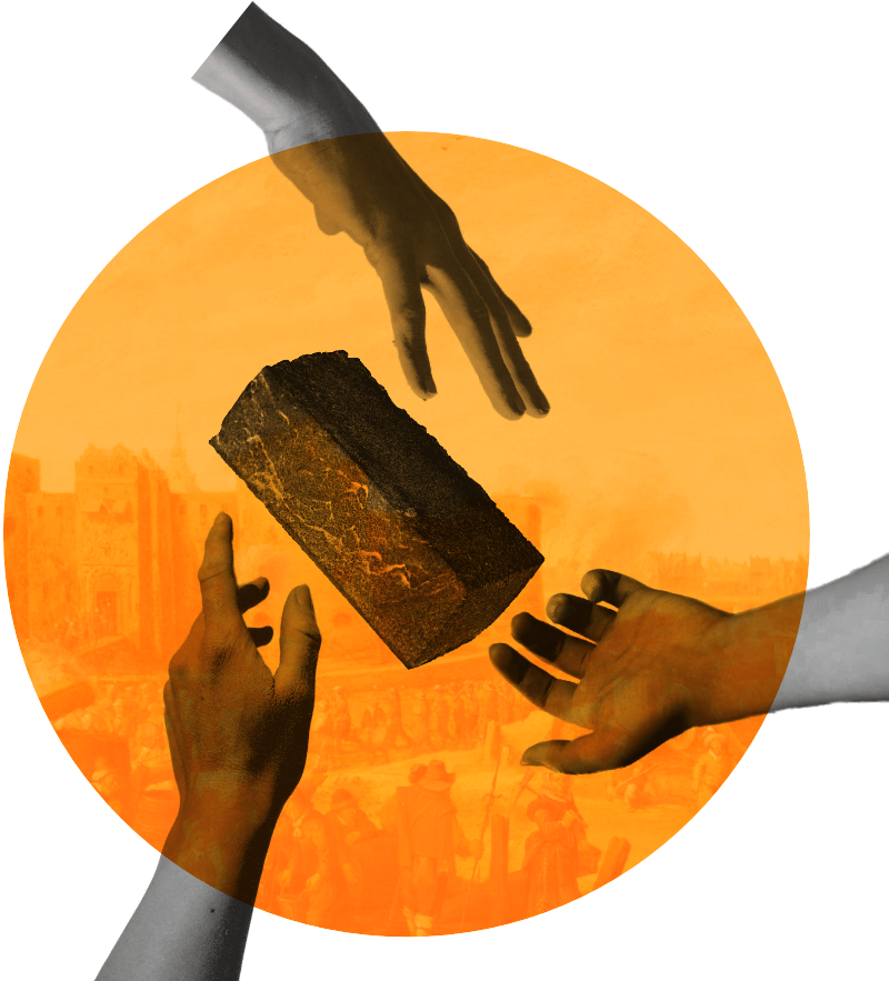
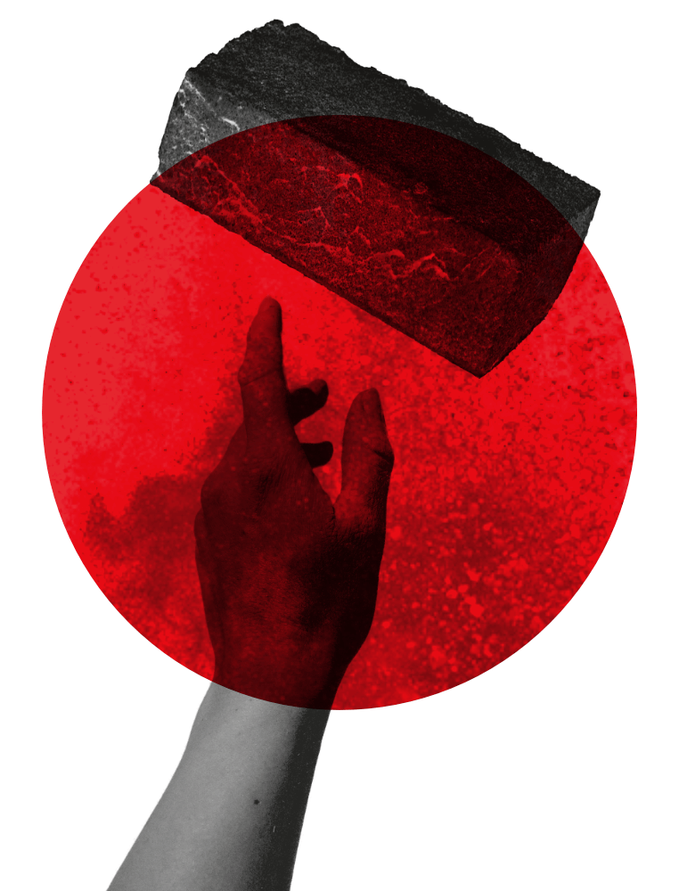
Breaking down a castle, but make it modern
I always enjoy having to present a dated concept in a new and modern way. It’s an opportunity to bring back history in ways that would otherwise leave it undiscovered. To centre the visual concept around the hilariously simple image of a brick came to me in one of the meetings I had with the organizers of the opera – it just so happened that we sat down in a café with an exposed brick wall. Being a graphics designer is hard y’all!
Trijn van Leemput actually tore down the castle and city walls with a pickaxe, I’m not kidding. It’s factually true. Together with a horde of women she stormed the castle with pickaxes in hand and they chopped the whole things down until there was nothing left. I boiled down this whole situation to a simple image: a pickaxe breaking a brick.
Wait, a castle?
Like any modern opera production a big selling point is how relevant the story is in today’s times. We’ve heard it time and time again. For Trijn that is no different. But what does in fact make it relevant is the story’s connection to the city of Utrecht and how many an Utrechter actually has no clue that the city used to have a formidable castle with city walls, let alone what happened to it and that there’s a horrifyingly modern shopping mall on its exact spot right now. Ah, the beauties of urban development.
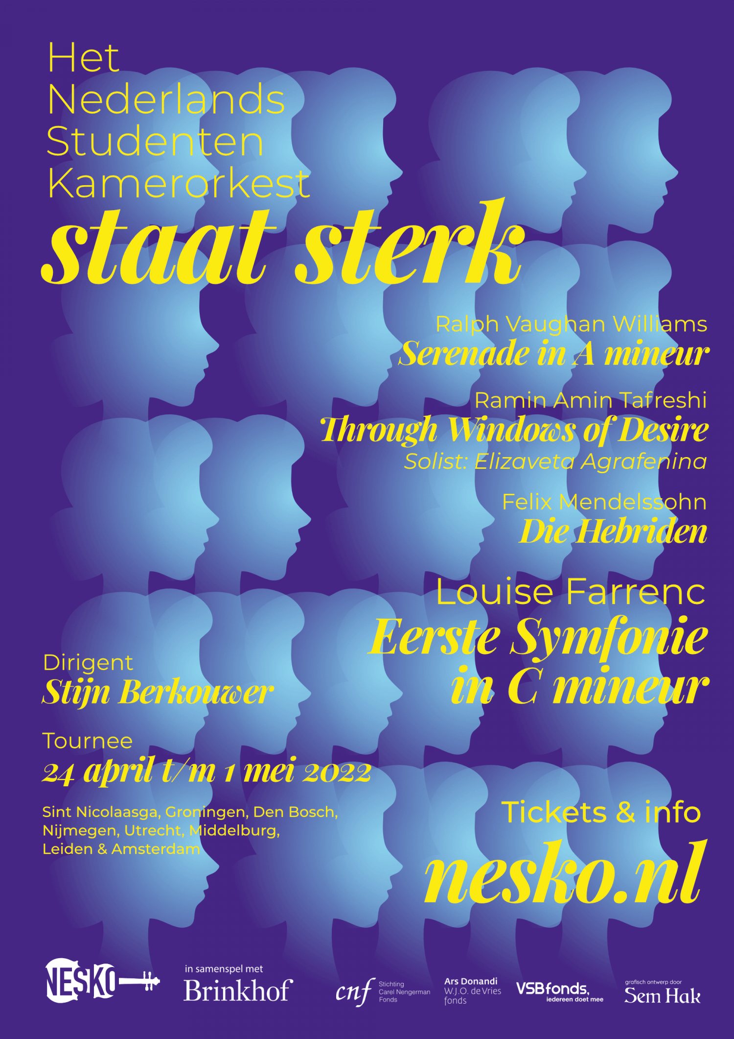
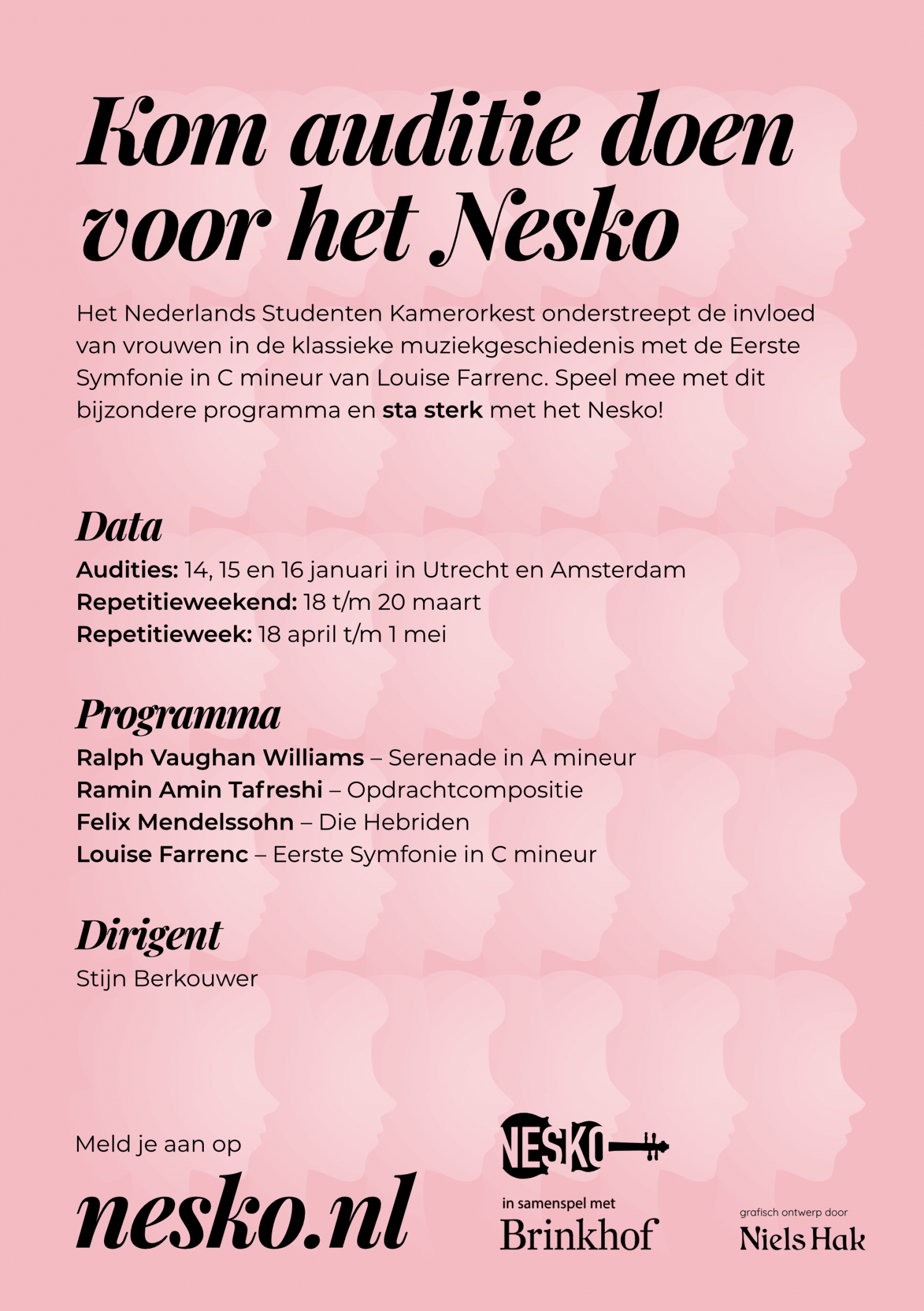
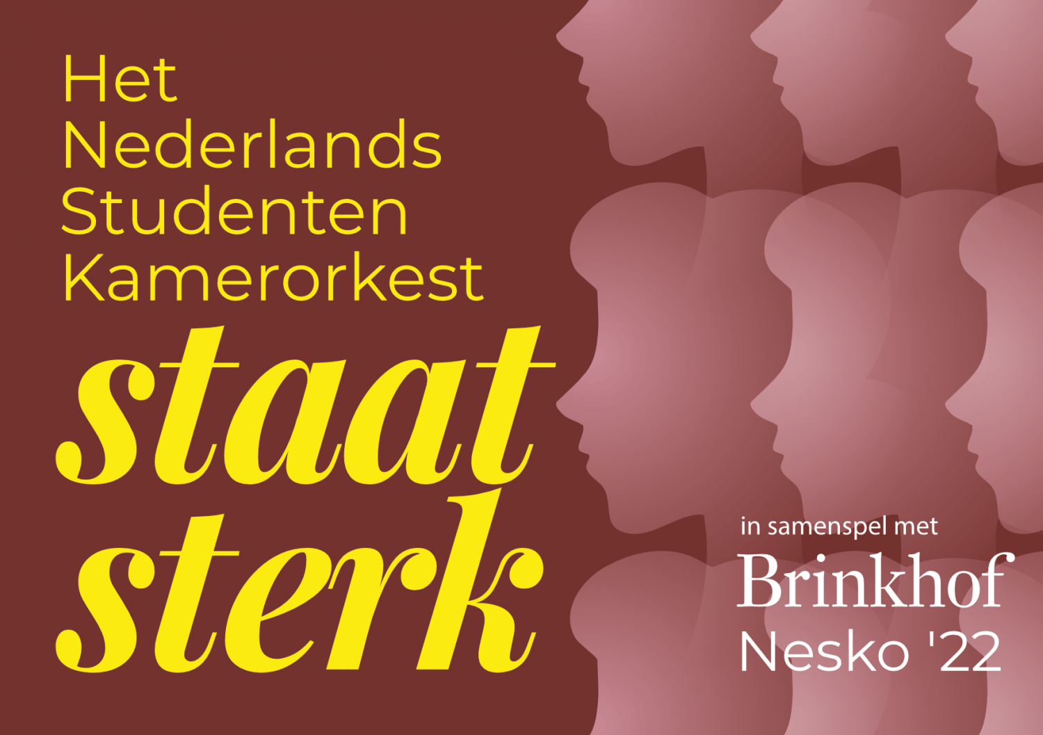
Nesko: Staat Sterk
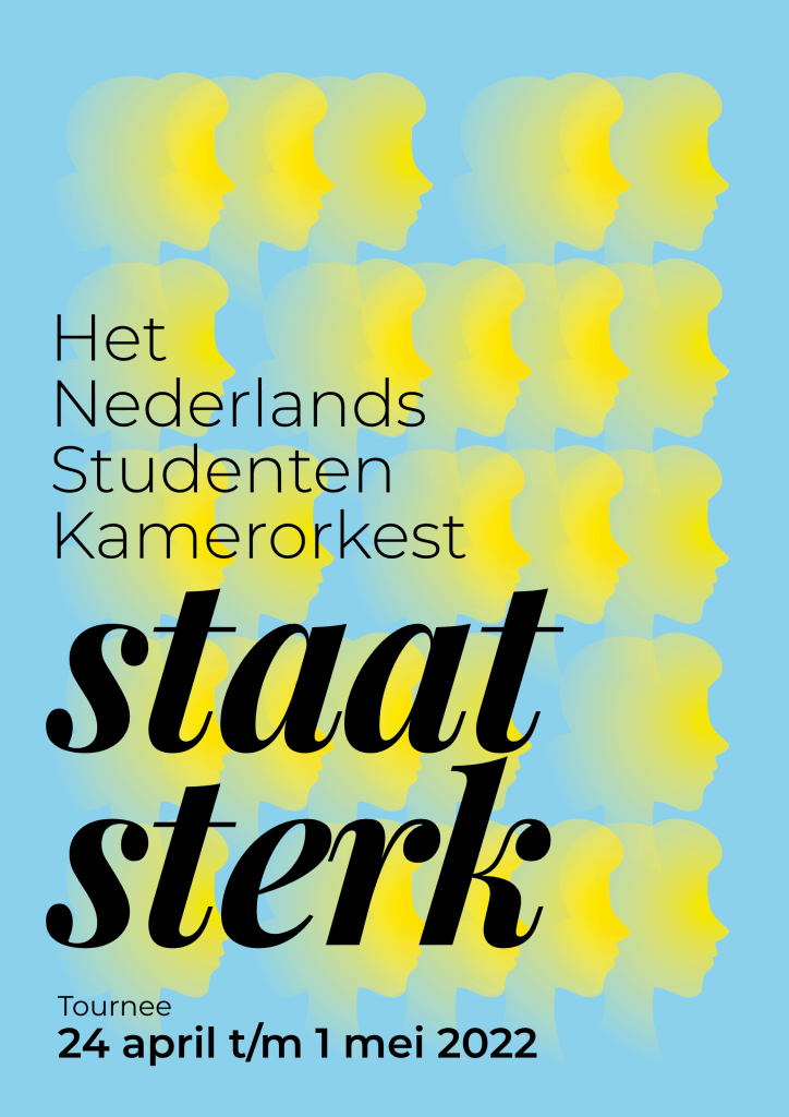
Since 2018 I have been the in-house designer for the Dutch Student Chamber Orchestra (NESKO), giving every edition its pronounced theme and its comprehensive materials. This includes posters, flyers, stickers, CD-cases and so forth.
The theme of NESKO 2022 is “Staat sterk”, or Stands strong, revolving around their choice for a female composer in the programme.
The Dutch Student Chamber Orchestra is an orchestra which forms yearly from new members to tour The Netherlands and Belgium with classical chamber music.

Festive Wishing Cards
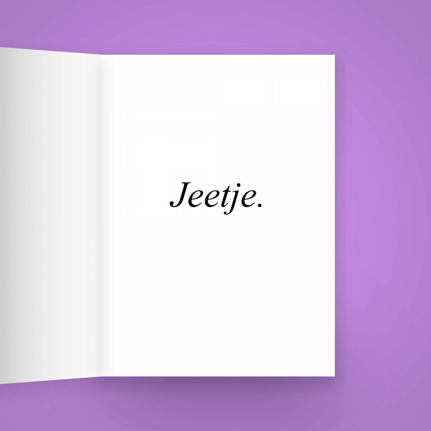
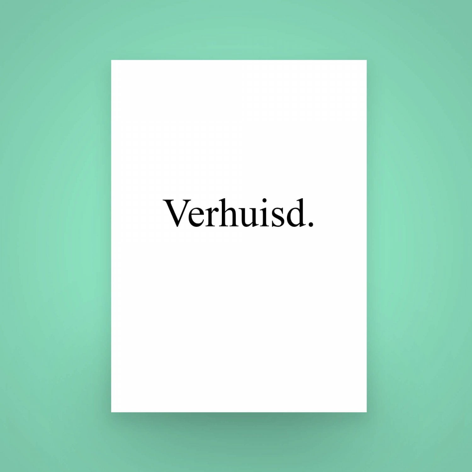
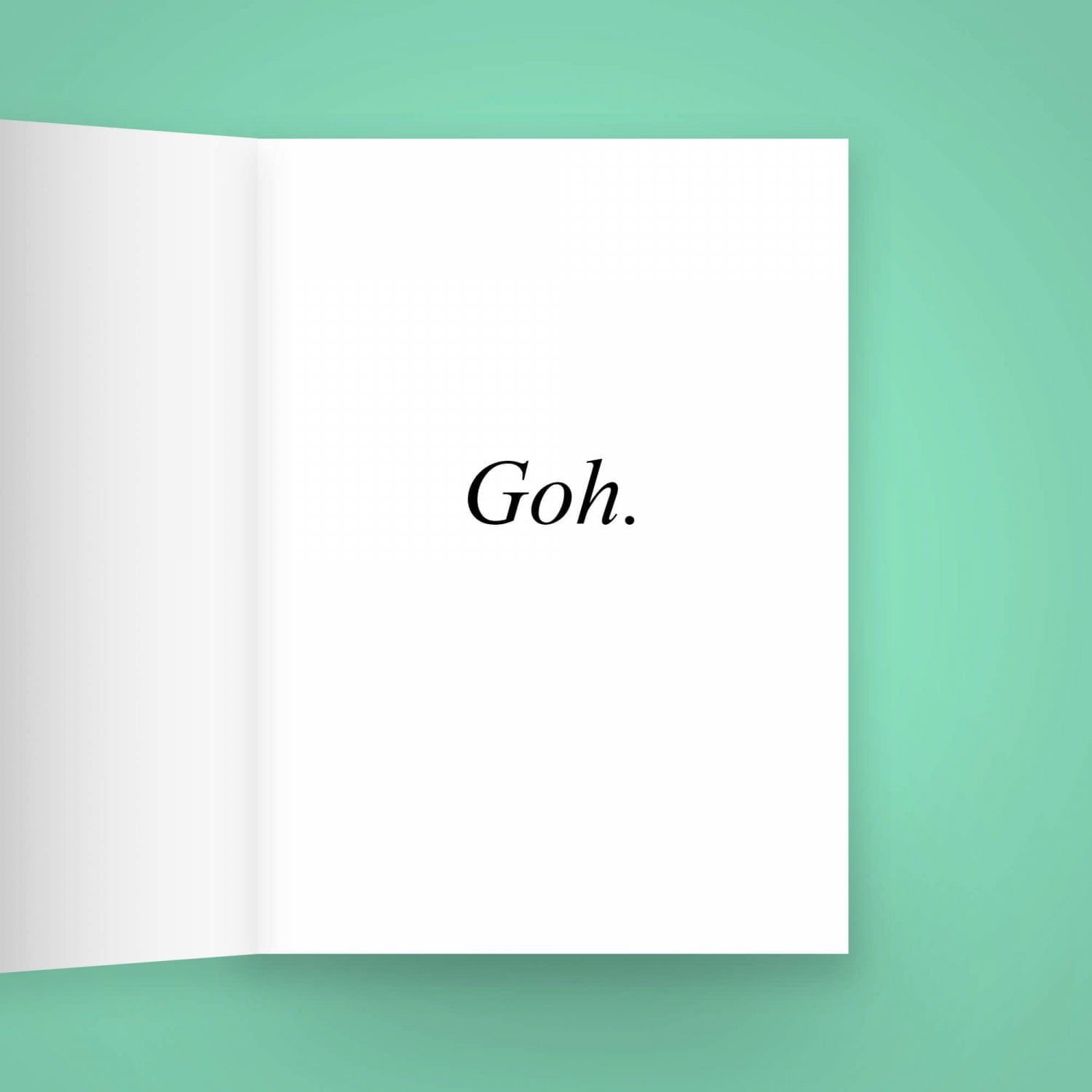
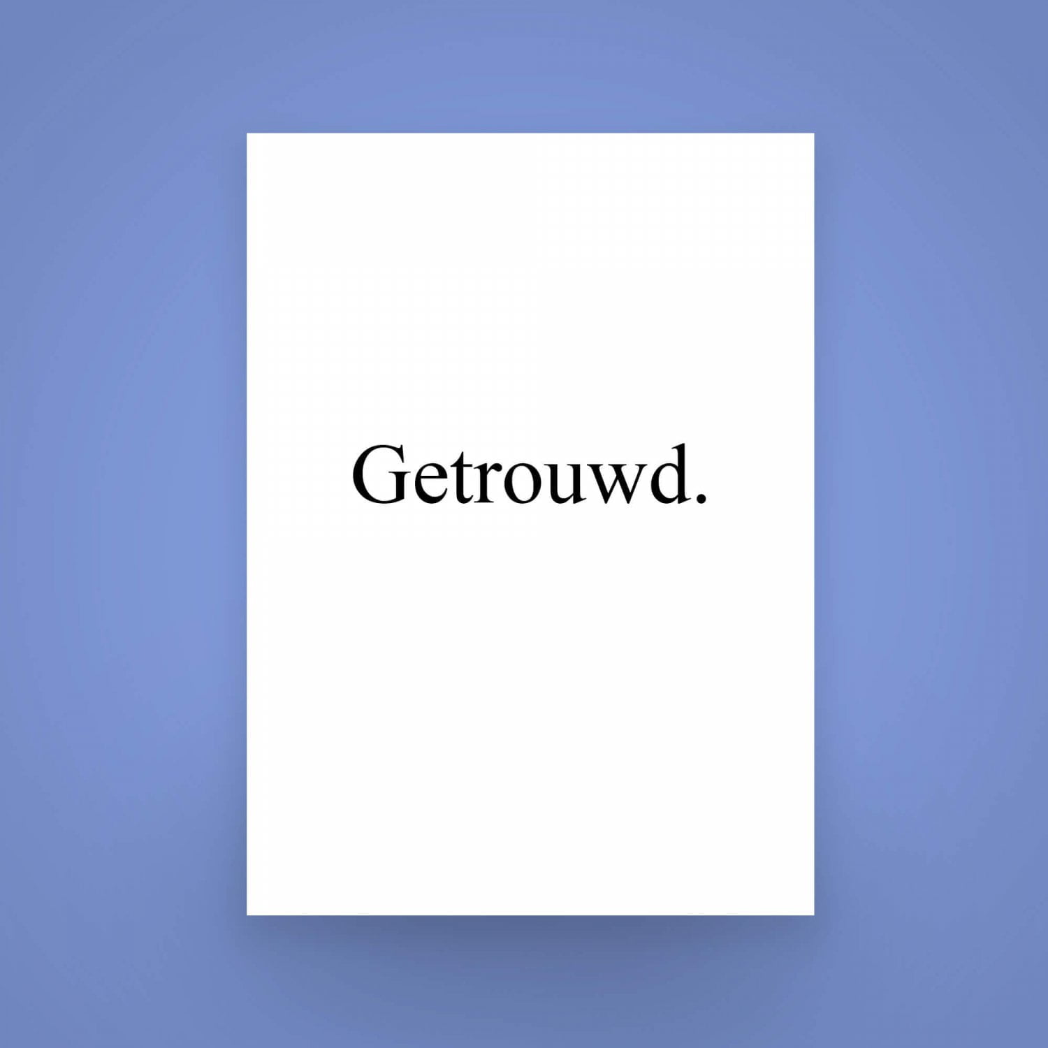
Sometimes, the wishing cards from the shop around the corner just don’t cut it.
You want to give someone a card that says exactly what you mean, without the extra pictures and decorations. You want the subject person to feel special, to feel like you wished them well, right to their heart. That’s where my series of perfectly sane “Festieve Wenskaarten”, or Festive Wishing Cards, comes in. In romantic Times New Roman in resolute black on a sensible white background, the recipient cannot possibly be clueless to your best wishes.
The cards are available in both Dutch and English. Get them using the button above!
Order Festive Wishing Cards

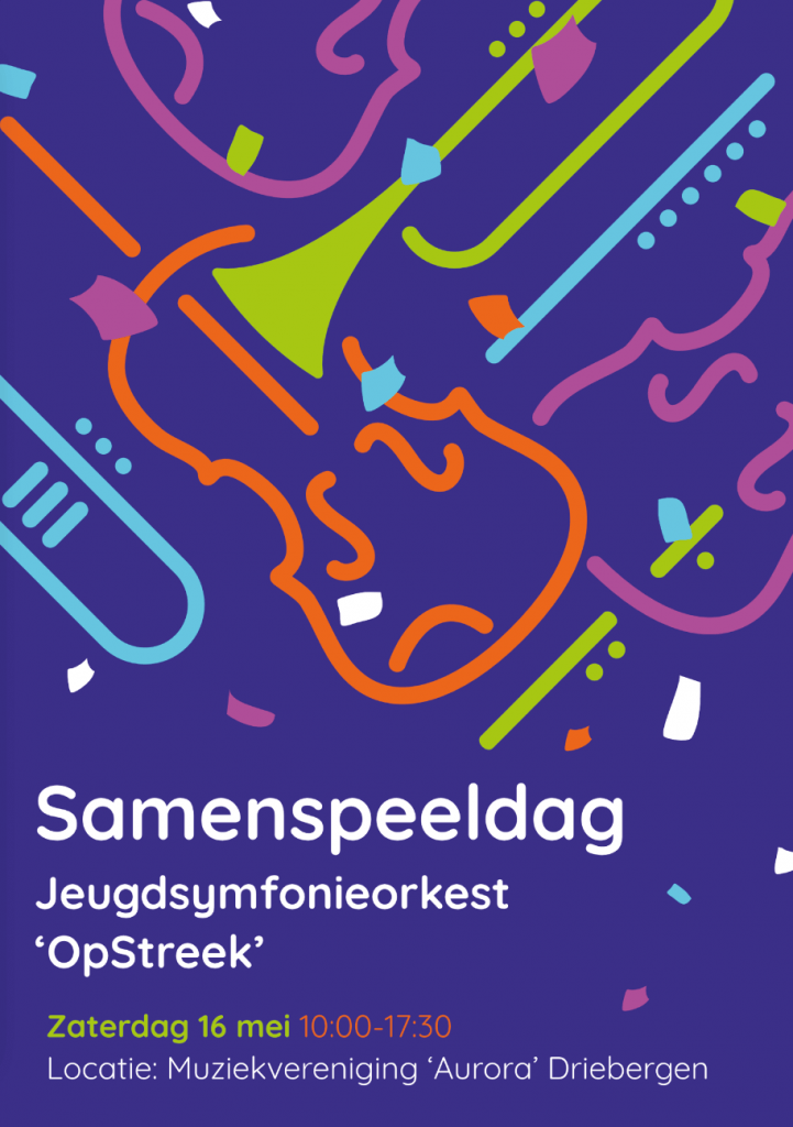
Samenspeeldag Opstreek
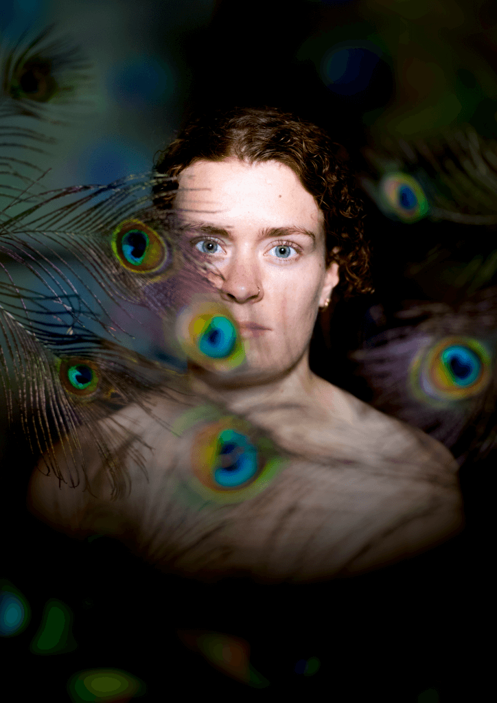
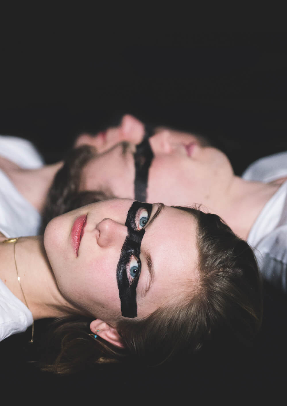
Utrechtse Studenten Cantorij
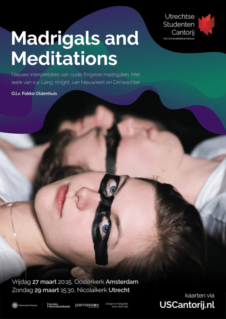
From 2020 onwards I design the promotional materials for the Utrechtse Studenten Cantorij, such as posters and flyers for their concerts.
The assignment is a new and interesting challenge for my skills to combine photography with graphical elements to create a uniform style which continues through the different iterations of the posters.